版权声明:本文为博主原创文章,遵循 CC 4.0 BY-SA 版权协议,转载请附上原文出处链接和本声明。
3D变形-移动
transform: translateZ()
数值越大,越靠近人的眼睛。与perspective一起使用才有效果
translateZ()为元素到屏蔽的距离,而perspective为眼睛到屏幕的距离;
还可以简写成:
transform: translate3d(x,y,z);
代码如下:
<!DOCTYPE html>
<html lang="en">
<head>
<meta charset="UTF-8">
<title>Document</title>
<style type="text/css">
div:first-child{
margin: 0 auto;
width: 100px;
height: 100px;
background-color: green;
}
div:nth-child(2) {
margin: 0 auto;
width: 100px;
height: 100px;
background-color: pink;
transition: all 1s; /*过渡*/
}
div:nth-child(2):hover {
transform: translateZ(100px);
}
body {
perspective: 300px;
}
</style>
</head>
<body>
<div>原图</div>
<div>3D-</div>
</body>
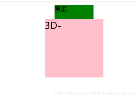
</html>效果如下: