版权声明:本文为博主原创文章,未经博主允许不得转载。 https://blog.csdn.net/caishu1995/article/details/89355456
首先灰常感谢 你所不知道的 CSS 滤镜技巧与细节 。我看完这个filter属性后还是迷迷糊糊的。因为不清楚能干什么。但看完这篇文章的例子后发现filter属性真的很厉害。
现在记录一些我的理解。
融合效果
如果你想直接看动图效果建议去上面的文章看,因为我不会做动图。不过可以大致截个图。
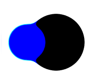 前面的图是有融合效果的,那正常的如果两个圆交叠是什么样子的呢?
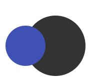 就是这个样子,你们可以对比一下,发现了么?
为什么会有这种粘稠的感觉呢?他是先通过模糊,让一定区域内都有颜色,然后当两个圆交汇的时候,两个颜色融合也会形成颜色。然后再通过加强对比度,让边缘颜色不深的地方变得不明显,这样就形成了粘稠的效果。不懂?来上步骤。
<!doctype html>
<html lang="zh">
<head>
    <style>
        .base {
            background: #fff;
            height: 200px;
            position: absolute;
            width: 300px;
        }
        .base::before {
            background: #333;
            border-radius: 50%;
            content: "";
            height: 120px;
            left: 50px;
            position: absolute;
            top: 40px;
            width: 120px;
        }
        .base::after {
            background: #3F51B5;
            border-radius: 50%;
            content: "";
            height: 80px;
            left: 10px;
            position: absolute;
            top: 60px;
            width: 80px;
        }
    </style>
</head>
<body>
    <div class="base"></div>
</body>
</html> 先定义两个圆。然后加模糊。代码就是给before和after的样式加
filter: blur(6px); 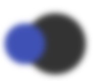 看到毛边没,这个其实就是粘稠感的根源。这个时候我们不能一直这样模糊的呀,不然什么也看不清。加大对比度,让毛边看不清。这时候我们给base加样式
filter: contrast(20); 您要的粘稠感已送达,请注意查收。一波代码正在来袭,请做好准备。
<!doctype html>
<html lang="zh">
<head>
    <style>
        .base {
            background: #fff;
            filter: contrast(20);
            height: 200px;
            position: absolute;
            width: 300px;
        }
        .base::before {
            background: #333;
            border-radius: 50%;
            content: "";
            filter: blur(6px);
            height: 120px;
            left: 50px;
            position: absolute;
            top: 40px;
            width: 120px;
        }
        .base::after {
            background: #3F51B5;
            border-radius: 50%;
            content: "";
            filter: blur(6px);
            height: 80px;
            left: 10px;
            position: absolute;
            top: 60px;
            width: 80px;
        }
    </style>
</head>
<body>
    <div class="base"></div>
</body>
</html>