版权声明:本文为博主原创文章,未经博主允许不得转载。 https://blog.csdn.net/caishu1995/article/details/89355565
首先灰常感谢 你所不知道的 CSS 滤镜技巧与细节 。我看完filter属性后还是迷迷糊糊的。因为不清楚能干什么。但看完这篇文章的例子后发现filter属性真的很厉害。
现在记录一些我的理解。
火焰效果
1、先画个带弧形的尖角。至于为什么需要带弧,只是因为带弧看起来更柔和一点,不太生硬。
<!DOCTYPE html>
<html lang="en">
<head>
<title>Title</title>
<style>
.firePart{ background-color: #b5932f; border: 200px solid black; border-bottom-color: transparent; border-radius: 50%; height: 0; position: absolute; top: 0; width: 0; }
</style>
</head>
<body>
<div style="float: left; position: relative;">
<div class="firePart"></div>
</div>
</body>
</html> 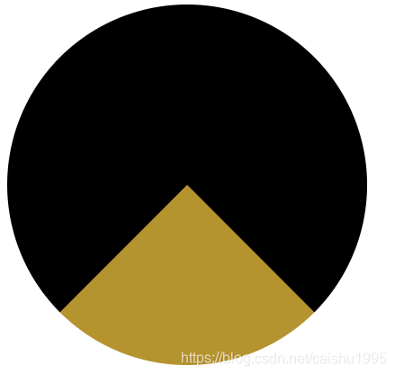 橘黄色区域就是我们的火焰所在的位置。
2、但我们想让火焰更高更窄点,我们可以让这个旋转一点角度。那我们给firePart的样式加入
transform: translate(-25%, -55%) scaleX(.4);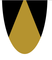
3、接下来我们想让橘黄色和黑色融合一点,然后形成类似火光边缘的红色。知道怎么做么?先模糊,然后增加对比度。这回依然给firePart的样式加入
-webkit-filter: blur(20px) contrast(30); filter: blur(20px) contrast(30); 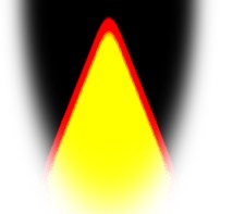 火光做好了。我们接下来做会动的火光。由于我不会做动图,想看动图的可以看文章开头的网址,我这里截了一张图。
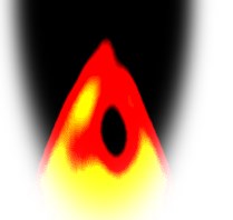 看出什么了么?其实他火焰外面没变,变了的是中间好像有一些黑点,然后和黄色一起产生了红色,就好像是红色边框会动一样。
4、那我们加入一些点
<style>
    .firePart span{ background: black; border-radius: 50%; bottom: -170px; height: 20px; position: absolute; width: 20px; }

    @keyframes move {
        100% { transform: translateY(-145px); }
    }
</style>
<script>
    var HTMLStr = "";
    for(var i = 0; i < 20; i++){
        HTMLStr += "<span style='left: " + (Math.random() * 160 - 80) + "px; animation: move 1s infinite " + Math.random() + "s linear;'></span>";
    }
    document.getElementsByClassName("firePart")[0].innerHTML = HTMLStr;
</script>
这里有一个地方需要注意,因为我们同样需要将黑色和我们之前的橘黄色融合,所以我们需要把这些点加入到火光的区域内。如果把点放到其他位置是没有效果的。
火光做好了。为了更像火把,我加了两个框当火把的把手和底座。源码来咯!
<!DOCTYPE html>
<html lang="en">
<head>
<title>Title</title>
<style>
.firePart{
background-color: #b5932f; border: 200px solid black; border-bottom-color: transparent; border-radius: 50%; height: 0; left: -30px; position: absolute; top: 0; transform: translate(-25%, -55%) scaleX(.4); width: 0;
-webkit-filter: blur(20px) contrast(30); filter: blur(20px) contrast(30);
}
.firePart span{ background: black; border-radius: 50%; bottom: -170px; height: 20px; position: absolute; width: 20px; }
@keyframes move {
100% {
transform: translateY(-145px);
}
}
</style>
</head>
<body>
<div style="background: black; float: left; height: 280px; overflow: hidden; width: 140px;">
<div style="float: left; height: 145px; overflow: hidden; position: relative; width: 140px;">
<div class="firePart"></div>
</div>
<div style="float: left; margin: 0 10px; width: 120px;">
<span style="background-color: rgb(93, 71, 57); float: left; height: 30px; width: 100%;"></span>
<span style="background-color: rgb(141, 110, 89); float: left; height: 100px; margin: 0 calc(50% - 10px); width: 20px;"></span>
</div>
</div>
<script>
var HTMLStr = "";
for(var i = 0; i < 20; i++){
HTMLStr += "<span style='left: " + (Math.random() * 160 - 80) + "px; animation: move 1s infinite " + Math.random() + "s linear;'></span>";
}
document.getElementsByClassName("firePart")[0].innerHTML = HTMLStr;
</script>
</body>
</html> 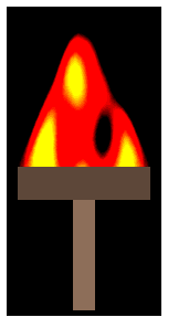 哇,我也是个会做火把的人呢,哈哈。filter真好玩。