CSS3 渐变(gradients)可以让你在两个或多个指定的颜色之间显示平稳的过渡。 以前,你必须使用图像来实现这些效果,现在通过使用 CSS3 的渐变(gradients)即可实现。此外,渐变效果的元素在放大时看起来效果更好,因为渐变(gradient)是由浏览器生成的。
本文只讲述表准的语法,要想兼容更多浏览器可以到网上搜索出很多解决方案,逻辑基本一致。
1.语法
background: linear-gradient(direction, color-stop1, color-stop2, ...);direction:默认为to bottom,即从上向下的渐变;
stop:颜色的分布位置,默认均匀分布,例如有3个颜色,各个颜色的stop均为33.33%。
2.示例:to left、top right、to bottom、to top
div { background:linear-gradient(to left, red , blue) }
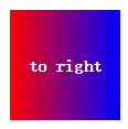
div { background:linear-gradient(to right, red , blue) }
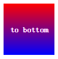
div { background:linear-gradient(to bottom, red , blue) } /* 浏览器默认值 */
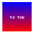
div { background:linear-gradient(to top, red , blue) }
分别产生“从右到左”、“从左到右”、“从上到下”、“从下到上”的“红色–绿色”渐变,效果如下图:

3.示例:to right bottom、top right top、top left bottom、top left top
div { background: linear-gradient(to right bottom, red , blue); }
div { background: linear-gradient(to right top, red , blue); }
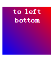
div { background: linear-gradient(to left bottom, red , blue); }
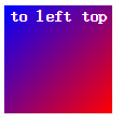
div { background: linear-gradient(to left top, red , blue); }
分别产生到“右下角”、“右上角”、“左下角”、“左上角”的渐变,效果如下图:


注意:top right bottom和top bottom right是等同的
4.使用角度
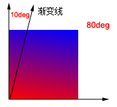
div { background: linear-gradient(10deg, red, blue) }效果如下图:
5.多个渐变点
5.1 多个渐变点默认均匀分布
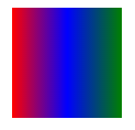
div { background: linear-gradient(to right, red, blue, green) }理论上渐变点数目不受限制,实际效果如下图:
5.2 多个渐变点不均匀分布
div { background: linear-gradient(red 5%, green 15%, blue 60%) }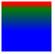
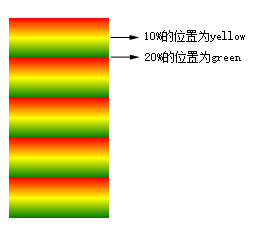
6.重复性渐变
div { background: repeating-linear-gradient(red, yellow 10%, green 20%); }
10%的位置为yellow,20%的位置为green,然后按照这20%向下重复,效果如下图:
7.使用rgba
div { background:linear-gradient(to right, rgba(255, 0 ,0, 1), rgba(255, 0 ,0 , 0)) }
从红色的不透明,到全透明的渐变,效果图如下:

转载于:https://www.cnblogs.com/rainman/p/5113242.html