css语法
background: linear-gradient(direction,color-stop1,color-stop2,...);
direction:用角度值指定渐变的方向(或角度);
color-stop1,color-stop2,...:用于指定渐变的起止颜色
ps:至少需要两种颜色
1   background: -webkit-linear-gradient(red,yellow,blue); /* Safari 5.1-6.0 */
2   background: -o-linear-gradient(red,yellow,blue); /* Opera 11.1-12.0 */
3   background: -moz-linear-gradient(red,yellow,blue); /* Firefox 3.6-15 */
4   background: linear-gradient(red,yellow,blue); /* 标准语法 */
兼容性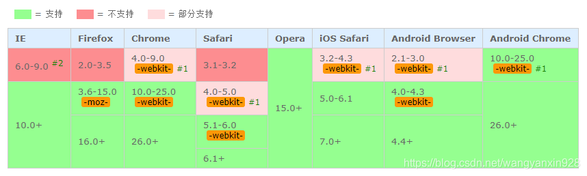
实例
1、background: linear-gradient(to left,#d3959b,#bfe6ba);
to left 设置渐变从右到左,相当于270deg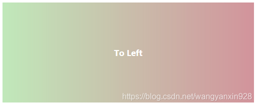](https://img-blog.csdnimg.cn/20191206160101969.png?x-oss-process=image/watermark,type_ZmFuZ3poZW5naGVpdGk,shadow_10,text_aHR0cHM6Ly9ibG9nLmNzZG4ubmV0L3dhbmd5YW54aW45Mjg=,size_16,color_FFFFFF,t_70)
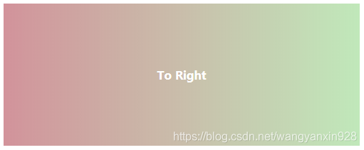
2、background: linear-gradient(to right,#d3959b,#bfe6ba);
to right设置渐变从左到右,相当于90deg
3、background: linear-gradient(to top,#d3959b,#bfe6ba);
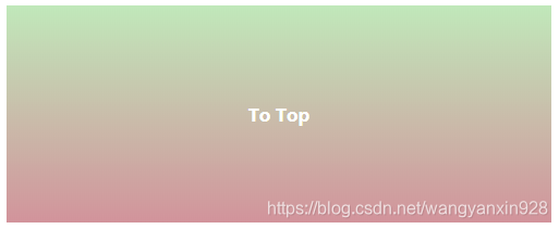
to top 设置渐变从下到上,相当于0deg
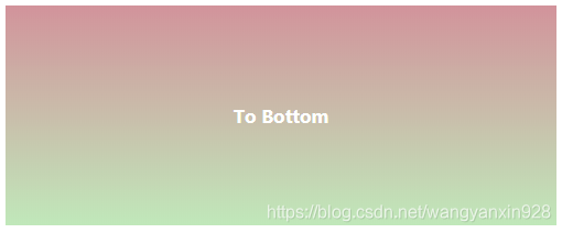
4、background: linear-gradient(to bottom,#d3959b,#bfe6ba);
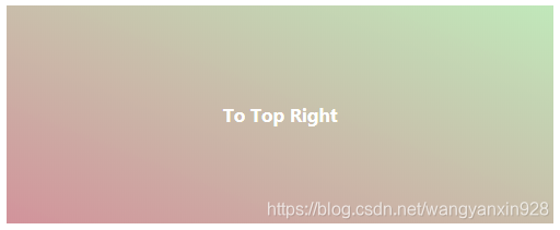
5、background: linear-gradient(to top right,#d3959b,#bfe6ba);
to right top = to top right :从左下角到右上角,对角线角度
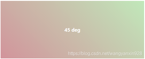
6、background: linear-gradient(45deg,#d3959b,#bfe6ba);
和to top right 有细微差别(背景为正方形的时候无差别)
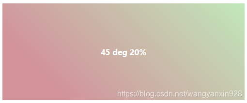
7、background: linear-gradient(45deg,#d3959b 20%,#bfe6ba);
用百分比指定起始颜色的位置,默认值为0%;
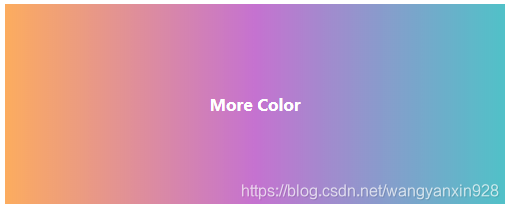
8、background: linear-gradient(to right,#feac5e,#c779d0,#4bc0c8);
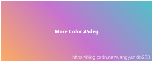
9、background: linear-gradient(45deg,#feac5e,#c779d0,#4bc0c8);
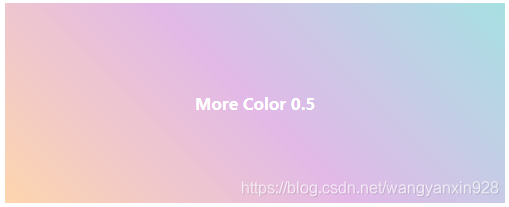
10、background: linear-gradient(45deg,rgba(254,172,94,0.5),rgba(199,121,208,0.5),rgba(75,192,200,0.5));
rgba使用了0.5的透明度