1.使用函数绘制matplotlib的图表组成元素
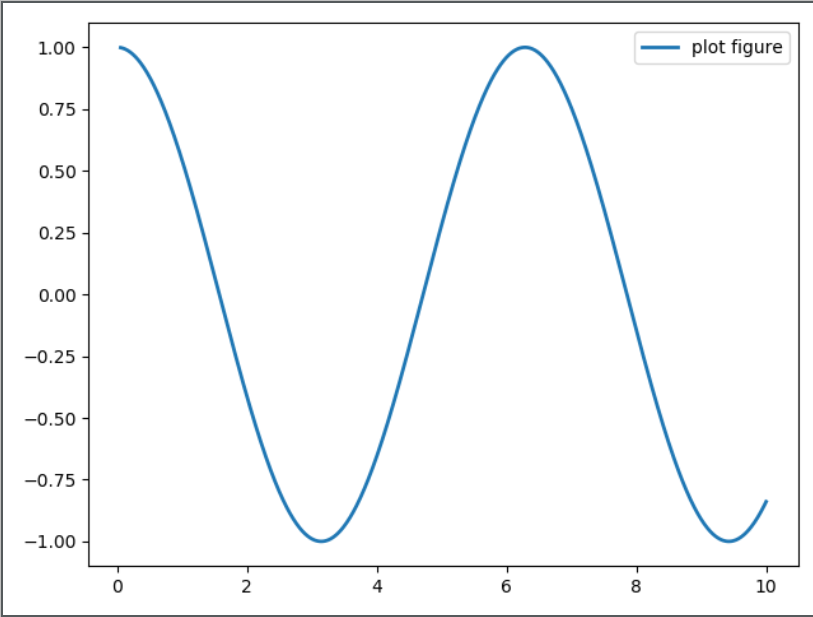
(1)函数plot---变量的变化趋势
import matplotlib.pyplot as plt
import numpy as np
x = np.linespace(0.05, 10, 1000) #在x轴均匀取1000个点
y = np.cos(x) #对应的y值
plt.plot(x,y,ls="-", lw=2, label="plot figure")
'''
ls-------->线条的风格
lw--------->线条的宽度
label-------->标记图形内容的标签文本
'''
(2)函数scatter------寻找变量间的关系
import matplotlib.pyplot as plt
import numpy as np
x = np.linspace(0.05, 10, 1000)
y = np.random.rand(1000)
plt.scatter(x, y, label="scatter figure")
plt.legend()
plt.show()

(三) 函数xlim()----------设置x轴的数值显示范围
import matplotlib.pyplot as plt
import numpy as np
x = np.linspace(0.05,10,1000)
y = np.random.rand(1000)
plt.scatter(x, y, label="scatter figure")
plt.legend()
plt.xlim(2, 10)  #x轴的显示范围
plt.ylim(0,1)

plt.show()

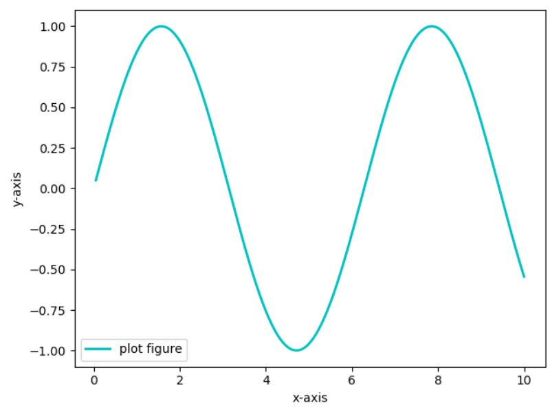
(四)函数xlabel()--------设置x轴的标签文本
import matplotlib.pyplot as plt
import numpy as np

x = np.linspace(0.05,10,1000)
y = np.sin(x)

plt.plot(x, y, ls="-", lw=2, c="c", label="plot figure") #c为颜色设置

plt.legend()

plt.xlabel("x-axis")  #x轴的标签
plt.ylabel("y-axis")

plt.show()
(五)函数grid---------绘制刻度线的网格线
import matplotlib.pyplot as plt
import numpy as np

x = p.linspace(0.05,10,1000)
y = np.sin(x)

plt.plot(x, y, ls="-", lw=2, c="c", label="plot figure") #c为颜色设置

plt.legend()

plt.grid(linestyle="-", color="r")#linestyle------>线型=ls color------->颜色=c


plt.show()

(六)函数axhline()------绘制平行于x轴的水平参考线
import matplotlib.pyplot as plt
import numpy as np

x = p.linspace(0.05,10,1000)
y = np.sin(x)

plt.plot(x, y, ls="-", lw=2, c="c", label="plot figure") #c为颜色设置

plt.legend()

plt.axhline(y = 0.0, c="c", ls="--", lw=2)  #axh轴代表水平
plt.axvline(x = 4.0, c="c", ls="--", lw=2)  #axv代表竖直

plt.show()