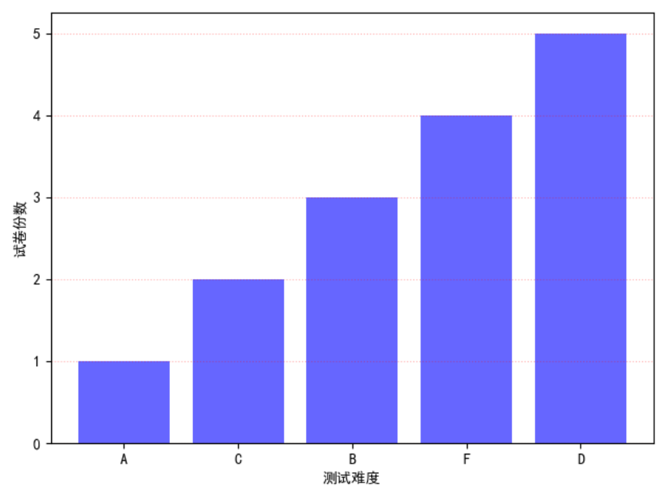
(一)柱状图-应用在定性数据的可视化场景或者离散型数据,条形图和柱状图相似,只不过是函数barh
import matplotlib as mpl
import matplotlib.pyplot as plt
mpl.rcParams["font.sans-serif"] = ["SimHei"]
mpl.rcParams["axes.unicode_minus"] = False
x = [1, 2, 3, 4, 5]
y = [1, 2, 3, 4, 5]
plt.bar(x, y, align="center", color="b", tick_label = ["A", "C", "B", "F", "D"], alpha=.6)
'''
x---->柱状图中的柱体标签值
y---->柱状图的柱体高度
align------>柱体对齐方式
tick_label------>刻度标签值
alpha--------->柱体的透明度
'''
plt.xlabel("测试难度")
plt.ylabel("试卷份数")
plt.grid(True, axis="y", ls=":", color="r", alpha=.3)
plt.show()
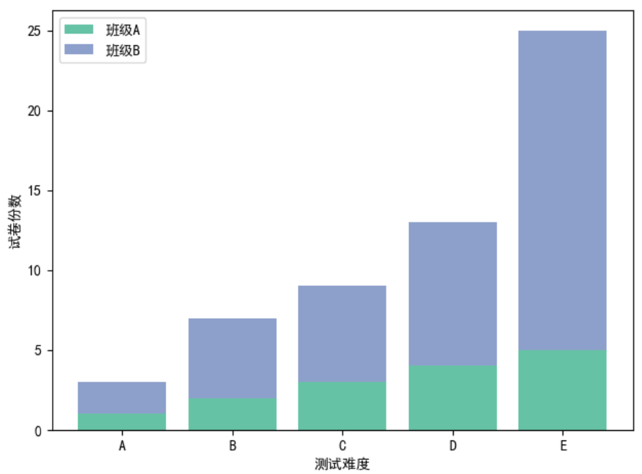
(二)堆积图
import matplotlib as mpl
import matplotlib.pyplot as plt
mpl.rcParams["font.sans-serif"] = ["SimHei"]
mpl.rcParams["axes.unicode_minus"] = False
x = [1, 2, 3, 4, 5]
y = [1, 2, 3, 4, 5]
y1 = [2, 5,  6, 9, 20]
plt.bar(x, y, align="center", color="#66c2a5", tick_label = ["A", "B", "C", "D", "E"], label="班级A")
plt.bar(x, y1, align="center",bottom=y, color="#8da0cb", label="班级B")
'''
x---->柱状图中的柱体标签值
y---->柱状图的柱体高度
align------>柱体对齐方式
tick_label------>刻度标签值
bottom--------->底部是什么
'''
plt.xlabel("测试难度")
plt.ylabel("试卷份数")
plt.legend()
plt.show()
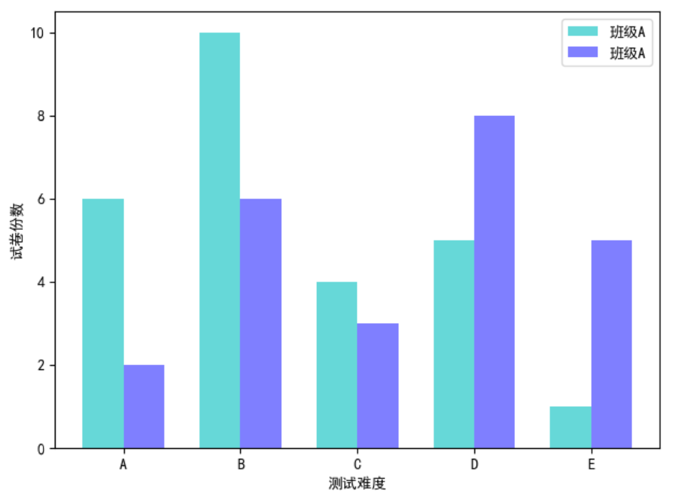
(三)分块图--------多数据的分布差异
import matplotlib as mpl
import matplotlib.pyplot as plt
import numpy as np
mpl.rcParams["font.sans-serif"] = ["SimHei"]
mpl.rcParams["axes.unicode_minus"] = False

x = np.arange(5)
y = [6, 10, 4, 5, 1]
y1 = [2, 6,  3, 8, 5]

bar_width = 0.35
tick_label = ["A", "B", "C", "D", "E"]

plt.bar(x, y, bar_width, align="center", color="c", label="班级A", alpha = .6)
plt.bar(x+bar_width, y1, bar_width, align="center", color="b", label="班级A", alpha=.5)
'''
注意起始位置的关系
bar_width------->柱状图宽度
'''
plt.xlabel("测试难度")
plt.ylabel("试卷份数")

plt.xticks(x+bar_width/2, tick_label)
plt.legend()
plt.show()
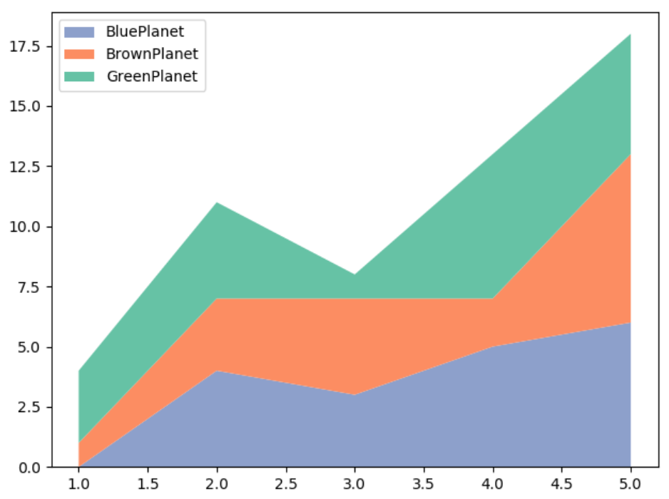
(四)函数stackplot()----------堆积折线图,即将多个折线放在同一坐标,互相堆积但不会覆盖
import matplotlib.pyplot as plt
import numpy as np

x = np.arange(1, 6, 1)
y = [0, 4, 3, 5, 6]
y1 = [1, 3, 4, 2, 7]
y2 = [3, 4, 1, 6, 5]
labels = ["BluePlanet", "BrownPlanet", "GreenPlanet"]
colors = ["#8da0cb", "#fc8d62", "66c2a5"]
plt.stackplot(x, y, y1, y2, labels=labels, colors=colors)
plt.legend(loc = "upper left")
plt.show()
(五)函数broken_barh()-------绘制间断条形图,在条形图的基础上绘制而成的,可视化定性数据的相同指标在时间维度上的指标值变化
扫描二维码关注公众号,回复:
6571499 查看本文章

import matplotlib as mpl
import matplotlib.pyplot as plt
import numpy as np
mpl.rcParams["font.sans-serif"] = ["LiSu"]
mpl.rcParams["axes.unicode_minus"] = False
plt.broken_barh([(30, 100), (180, 50), (260, 70)], (20, 8), facecolors="#1f78b4")
plt.broken_barh([(60, 90), (190, 20), (230, 30), (280, 60)], (10, 8), facecolors=("#7fc97f", "#beaed4", "#fdc086", "#ffff99"))
'''
(30, 100)------->以30为起点,移动100个单位
(20, 8)--------->Y轴以20为起点,移动8单位
facecolor--------->指柱体的颜色
'''
plt.xlim(0, 360)
plt.ylim(5, 35)
plt.xlabel("演出时间")

plt.xticks(np.arange(0, 361, 60))
plt.yticks([15, 25], ["歌剧院A", "歌剧院B"])
#显示tick的位置
plt.grid(ls = "-", lw = 1, color = "r")
#网格线
plt.title("不同地区的歌剧院的演出时间比较")

plt.show()
(六)函数step()----------绘制阶梯图,使用在时间序列数据的可视化任务中
import matplotlib.pyplot as plt
import numpy as np

x = np.linspace(1, 10, 10)
y = np.sin(x)
#where------>pre--->左开右闭区间,post---->左闭右开区间
plt.step(x, y, color="#8dd3c7", where="pre", lw = 2)

plt.xlim(0, 11)
plt.xticks(np.arange(1, 11, 1))
plt.ylim(-1.2, 1.2)
plt.show()
(七)函数hist()---------直方图,定量数据或者连续数据的可视化展示
import matplotlib as mpl
import matplotlib.pyplot as plt
import numpy as np
mpl.rcParams["font.sans-serif"] = ["LiSu"]
mpl.rcParams["axes.unicode_minus"] = False
scoresT = np.random.randint(0, 100, 100)
x = scoresT

bins = range(0, 101, 10)

plt.hist(x, bins=bins, color="#377eb8", histtype="bar", rwidth=1.0)
'''
bins------->用于确定柱体的个数或者柱体边缘范围
histtype----->柱体类型
'''

plt.xlabel("测试成绩")
plt.ylabel("学生人数")
plt.show()
(八)堆积直方图
import matplotlib as mpl
import matplotlib.pyplot as plt
import numpy as np
mpl.rcParams["font.sans-serif"] = ["LiSu"]
mpl.rcParams["axes.unicode_minus"] = False
scoresT1 = np.random.randint(0, 100, 100)
scoresT2 = np.random.randint(0, 100, 100)
x = [scoresT1, scoresT2]
colors = ["#8dd3c7", "#bebada"]
labels = ["班级A", "班级B"]
bins = range(0, 101, 10)

plt.hist(x, bins=bins, color=colors, histtype="bar", rwidth=1.0, stacked=True, label=labels)
# stacked决定着是否堆积,True为堆积,False不堆积
plt.xlabel("测试成绩")
plt.ylabel("学生人数")

plt.title("不同班级的测试成绩直方图")
plt.legend(loc = "upper left")
plt.show()
(九)直方图的不同形状-----------改变hist的histtype参数
import matplotlib as mpl
import matplotlib.pyplot as plt
import numpy as np
mpl.rcParams["font.sans-serif"] = ["LiSu"]
mpl.rcParams["axes.unicode_minus"] = False
scoresT1 = np.random.randint(0, 100, 100)
scoresT2 = np.random.randint(0, 100, 100)
x = [scoresT1, scoresT2]
colors = ["#8dd3c7", "#bebada"]
labels = ["班级A", "班级B"]
bins = range(0, 101, 10)

plt.hist(x, bins=bins, color=colors, histtype="stepfilled", rwidth=1.0, stacked=True, label=labels)
# stacked决定着是否堆积,True为堆积,False不堆积
plt.xlabel("测试成绩")
plt.ylabel("学生人数")

plt.title("不同班级的测试成绩直方图")
plt.legend(loc = "upper left")
plt.show()
