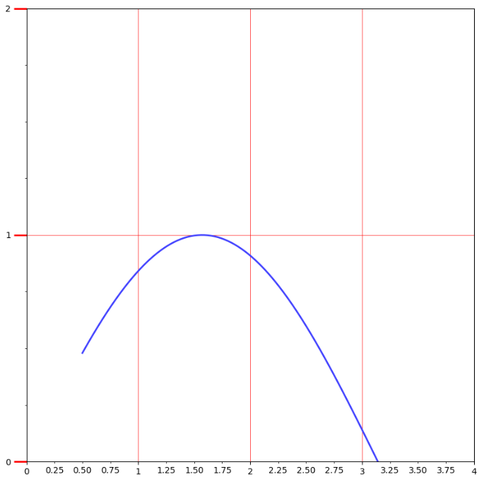
(一)刻度线定位器和刻度格式器的使用方法
import matplotlib.pyplot as plt
import numpy as np
from matplotlib.ticker import AutoMinorLocator, MultipleLocator, FuncFormatter

x = np.linspace(0.5, 3.5, 100)
y = np.sin(x)

fig = plt.figure(figsize=(8, 8)) #生成8x8的画布
ax = fig.add_subplot(111)  #向画布添加1行1列的子区,并且生成Axes实例ax

ax.xaxis.set_major_locator(MultipleLocator(1.0))
'''ax.xaxis是ax的x轴实例,语句会在x轴的1倍处
分别设置主刻度线,其中参数MultipleLocator(1.0)
就是设置主刻度线的显示位置
'''
ax.yaxis.set_major_locator(MultipleLocator(1.0))
'''
次刻度线的显示位置,MultipleLocator(1.0)表示
将每一份主刻度线区间等分4份
'''
ax.xaxis.set_minor_locator(AutoMinorLocator(4))

ax.yaxis.set_minor_locator(AutoMinorLocator(4))


#函数是控制次要刻度线显示精度的
def minor_tick(x, pos):
    if not x %1.0:
        return ""
    return "%.2f" % x

ax.xaxis.set_minor_formatter(FuncFormatter(minor_tick))
#set_minor_formatter设置次刻度线精度,FuncFormatter(minor_tick)控制位置精度

ax.tick_params("y", which="major", length = 15, width=2.0, color="r")#刻度线样式的设置
ax.tick_params(which="manor", length = 5, width=1.0, labelsize=10, labelcolor="0.25")

ax.set_xlim(0, 4)
ax.set_ylim(0, 2)

ax.plot(x, y, c=(0.25, 0.25, 1.00), lw=2, zorder=10)

ax.grid(linestyle="-", linewidth=0.5, color="r", zorder=0)

plt.show()
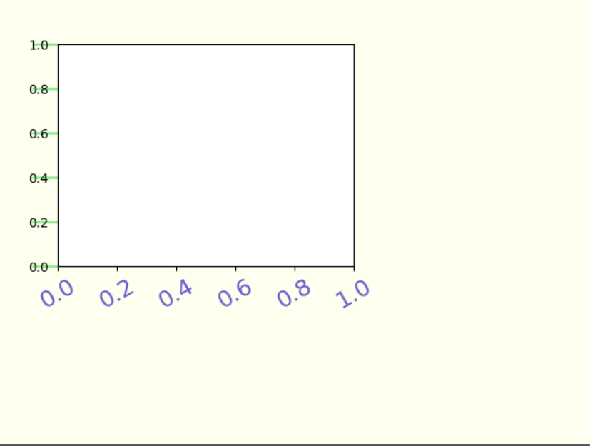
(二)刻度标签和刻度线样式的定制化
import matplotlib.pyplot as plt
import numpy as np

fig = plt.figure(facecolor=(1.0, 1.0, 0.9412))
ax = fig.add_axes([0.1, 0.4, 0.5, 0.5])

for ticklabel in ax.xaxis.get_ticklabels():
#ax.xaxis.get_ticklabels()是使用get_ticklabels()方法获得Text实例列表,用for循环遍历设置
    ticklabel.set_color("slateblue")
    ticklabel.set_fontsize(18)
    ticklabel.set_rotation(30)

for tickline in ax.yaxis.get_ticklines():
    tickline.set_color("lightgreen")
    tickline.set_markersize(20)
    tickline.set_markeredgewidth(2)
plt.show()
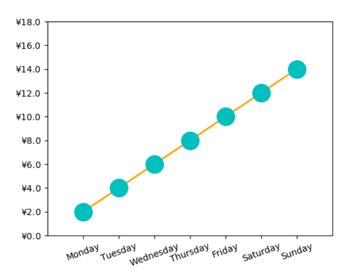
(三)货币和时间序列样式的刻度标签
import matplotlib.pyplot as plt
import numpy as np
from calendar import month_name, day_name
#日期标签通过导入标准库calender中的day_name实现日期的刻度标签
from matplotlib.ticker import FormatStrFormatter
'''货币标签是通过FormatStrFormatter(r"$\yen%1.1f$")
作为参数值代入实例方法Axes.set_major_formmatter()中
实现格式化坐标轴标签,r"$\yen%1.1f$"是用来生成保留两位有效数字的人民币计量的刻度标签'''
fig = plt.figure()
ax = fig.add_axes([0.2, 0.2, 0.7, 0.7])

x = np.arange(1, 8, 1)
y = 2*x
ax.plot(x, y, ls="-", lw=2, color="orange", marker="o", ms=20, mfc="c",mec="c")

ax.yaxis.set_major_formatter(FormatStrFormatter(r"$\yen%1.1f$"))

plt.xticks(x, day_name[0:7], rotation =20)

ax.set_xlim(0, 8)
ax.set_ylim(0, 18)

plt.show()
(四)有指示注释与无指示注解(annotate)
import matplotlib.pyplot as plt
import numpy as np

x = np.linspace(0.5, 3.5, 100)
y = np.sin(x)

fig = plt.figure(figsize=(8, 8))
ax = fig.add_subplot(111)

ax.plot(x, y, c="b", ls="--", lw=2)

ax.annotate("maximum", xy=(np.pi/2, 1.0), xycoords="data",
            xytext=((np.pi/2)+0.15, 0.8), textcoords="data",
            weight="bold", color="r", arrowprops=dict(arrowstyle="->", connectionstyle="arc3",color="r"))
'''
有指示注释使用annotate函数,ax.annotate(str, xy, xycoords, xytext, textcoords, weight, color, arrowprops)
s------>注释内容
xy------>被解释内容的位置
xycoords------>xy的坐标系统,参数值“data”表示与折线图使用相同坐标系统
xytext-------->注释内容所在位置,如果是矩形,左下角所在位置
textcoords----->xytext的坐标系统
weight--------->注释内容的显示风格
color--------->注释内容的颜色
arrowprops---->指示箭头的属性,箭头风格,颜色等等
'''
ax.text(2.8, 0.4, "$y=\sin(x)$", fontsize=20, color="b",
        bbox=dict(facecolor="y", alpha=.5))
#无指示注释
plt.show()

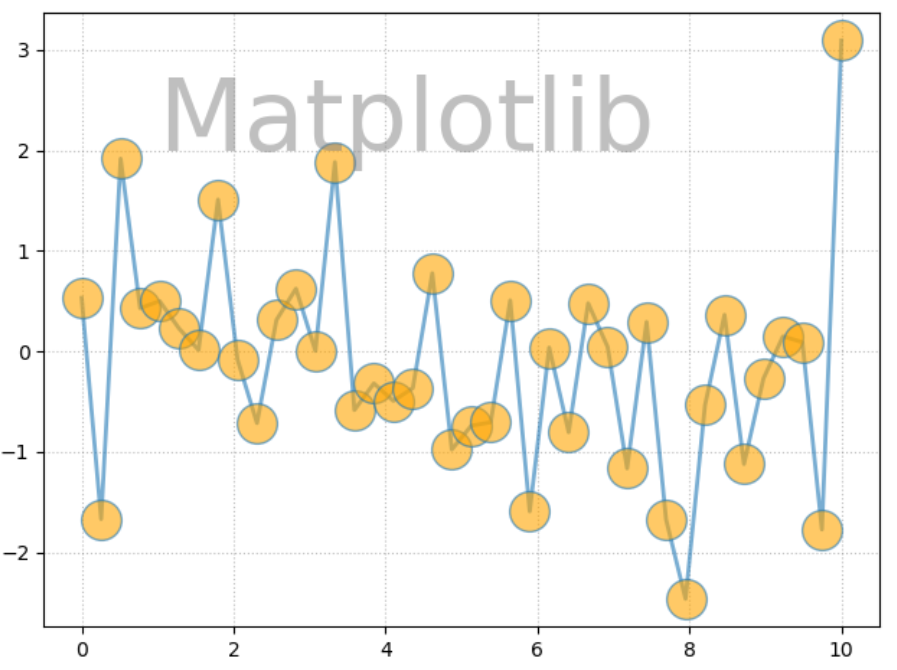
(五)圆角文本框的设置
import matplotlib.pyplot as plt
import numpy as np

x = np.linspace(0.0, 10, 40)
y = np.random.randn(40)

plt.plot(x, y, ls="-", lw=2, marker="o", ms=20, mfc="orange", alpha=.6)

plt.grid(ls=":", color="gray", alpha=.5)

plt.text(6, 0, "Matplotlib", size=30, rotation=30,
         bbox=dict(boxstyle="round", ec="#8968CD", fc="#FFE1FF"))
#boxstyle="round"控制着圆角,还可改成square,circle等
plt.show()

(六)文本的水印效果
import matplotlib.pyplot as plt
import numpy as np

x = np.linspace(0.0, 10, 40)
y = np.random.randn(40)

plt.plot(x, y, ls="-", lw=2, marker="o", ms=20, mfc="orange", alpha=.6)

plt.grid(ls=":", color="gray", alpha=.5)

plt.text(1, 2, "Matplotlib", fontsize=50, color="gray",alpha=.5)
#水印通过alpha控制
plt.show
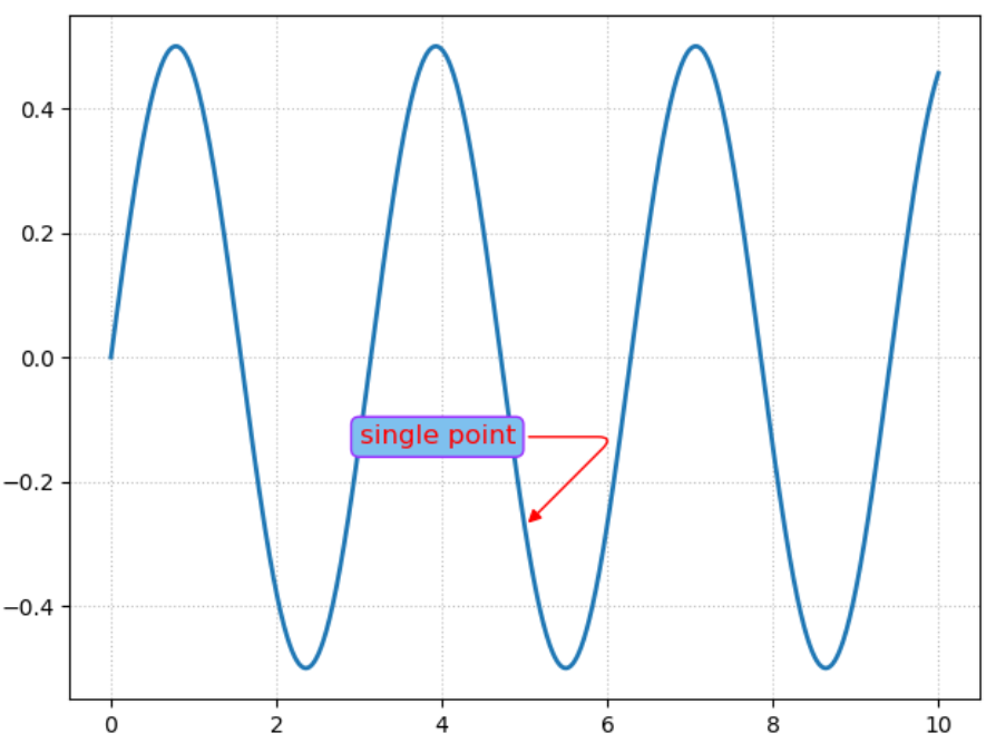
(七)圆角线框的有弧度指示注解
import matplotlib.pyplot as plt
import numpy as np

x = np.linspace(0, 10, 2000)
y = np.sin(x)*np.cos(x)

fig = plt.figure()
ax = fig.add_subplot(111)

ax.plot(x, y, ls="-", lw=2)

bbox = dict(boxstyle="round", fc="#7EC0EE", ec="#9B30FF")
arrowprops = dict(arrowstyle="-|>", connectionstyle="angle, angleA=0, angleB=45, rad=10", color="r")
#connectionstyle控制着箭头的走向
ax.annotate("single point", (5, np.sin(5)*np.cos(5)), xytext=(3, np.sin(3)*np.cos(3)),
            fontsize=12, color = "r", bbox=bbox, arrowprops=arrowprops)
ax.grid(ls=":", color="gray", alpha=.5)

plt.show()
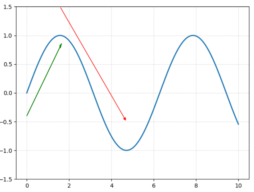
(八)有箭头指示的趋势线
import matplotlib.pyplot as plt
import numpy as np

x = np.linspace(0, 10, 2000)
y = np.sin(x)

fig = plt.figure()
ax = fig.add_subplot(111)

ax.plot(x, y, ls="-", lw=2)
ax.set_ylim(-1.5, 1.5)


arrowprops = dict(arrowstyle="-|>", color="r")
#connectionstyle控制着箭头的走向
ax.annotate("", (3*np.pi/2, np.sin(3*np.pi/2)+0.5), xytext=(np.pi/2, np.sin(np.pi/2)+0.5),
            color = "r", arrowprops=arrowprops)
ax.arrow(0.0, -0.4, np.pi/2, 1.2, head_width=0.05, head_length=0.1,
         fc="g", ec="g")
#arrow(起点,xy增量,样式)
ax.grid(ls=":", color="gray", alpha=.5)

plt.show()