版权声明:本文为博主原创文章,未经博主允许不得转载。 https://blog.csdn.net/funkstill/article/details/88744247
单侧投影
<!DOCTYPE html>
<html>
    <head>
        <meta charset="utf-8">
        <title></title>
        <style>
            .container {
                width: 20%;
                height: 320px;
                float: left;
            }
            #box_shadow {
                width: 80%;
                height: 80%;
                background: yellow;
                box-shadow: 2px 3px 4px rgba(0, 0, 0, .5);
                /*以该元素相同尺寸位置画一个rgba(0, 0, 0, .5)矩形
                将其向右移2px,向下移3px,使用高斯模糊算法将它进行4px
                的模糊处理。切除相交部分!!!*/
            }
            #box_shadow2 {
                width: 80%;
                height: 80%;
                background: yellow;
                box-shadow: 0 5px 4px -4px black;
            }
            #box_shadow3 {
                width: 80%;
                height: 80%;
                background: yellow;
                box-shadow: 3px 3px 6px -3px black;
            }
            #box_shadow4 {
                width: 80%;
                height: 80%;
                background: yellow;
                /*使用两块投影达到目的*/
                box-shadow: 5px 0 5px -5px black,
                            -5px 0 5px -5px black;
            }
        </style>
    </head>
    <body>
        <div class="container">单侧投影
            <div id="box_shadow"></div>
        </div>
        <div class="container">单侧投影2
            <div id="box_shadow2"></div>
        </div>
        <div class="container">邻边投影
            <div id="box_shadow3"></div>
        </div>
        <div class="container">双侧投影
            <div id="box_shadow4"></div>
        </div>
    </body>
</html>
染色效果
<!DOCTYPE html>
<html>
    <head>
        <meta charset="utf-8">
        <title></title>
        <style>
            .container {
                width: 20%;
                height: 320px;
                float: left;
            }

            #img2 {
                filter: sepia(1);
            }
            #img3 {
                filter: sepia(1) saturate(4);
            }
            #img4 {
                filter: sepia(1) saturate(4) hue-rotate(295deg);
            }
            #img5 {
                transition: .5s filter;
                filter: sepia(1) saturate(4) hue-rotate(295deg);
            }
            #img5:hover,
            #img5:focus {
                filter: none;
            }
        </style>
    </head>
    <body>
        <div class="container">原始图片
            <img id="img" src="../images/lion.jpg" alt="#">
        </div>
        <div class="container">降饱和度橙色染色效果<br>
            <img id="img2" src="../images/lion.jpg" alt="#">
        </div>
        <div class="container">饱和度提升<br>
            <img id="img3" src="../images/lion.jpg" alt="#">
        </div>
        <div class="container">色相偏移<br>
            <img id="img4" src="../images/lion.jpg" alt="#">
        </div>
        <div class="container">过度动画<br>
            <img id="img5" src="../images/lion.jpg" alt="#">
        </div>
    </body>
</html>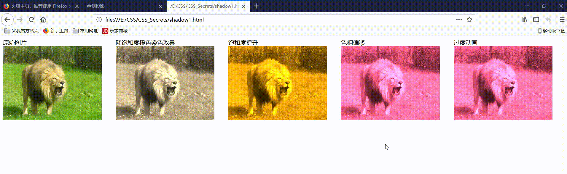
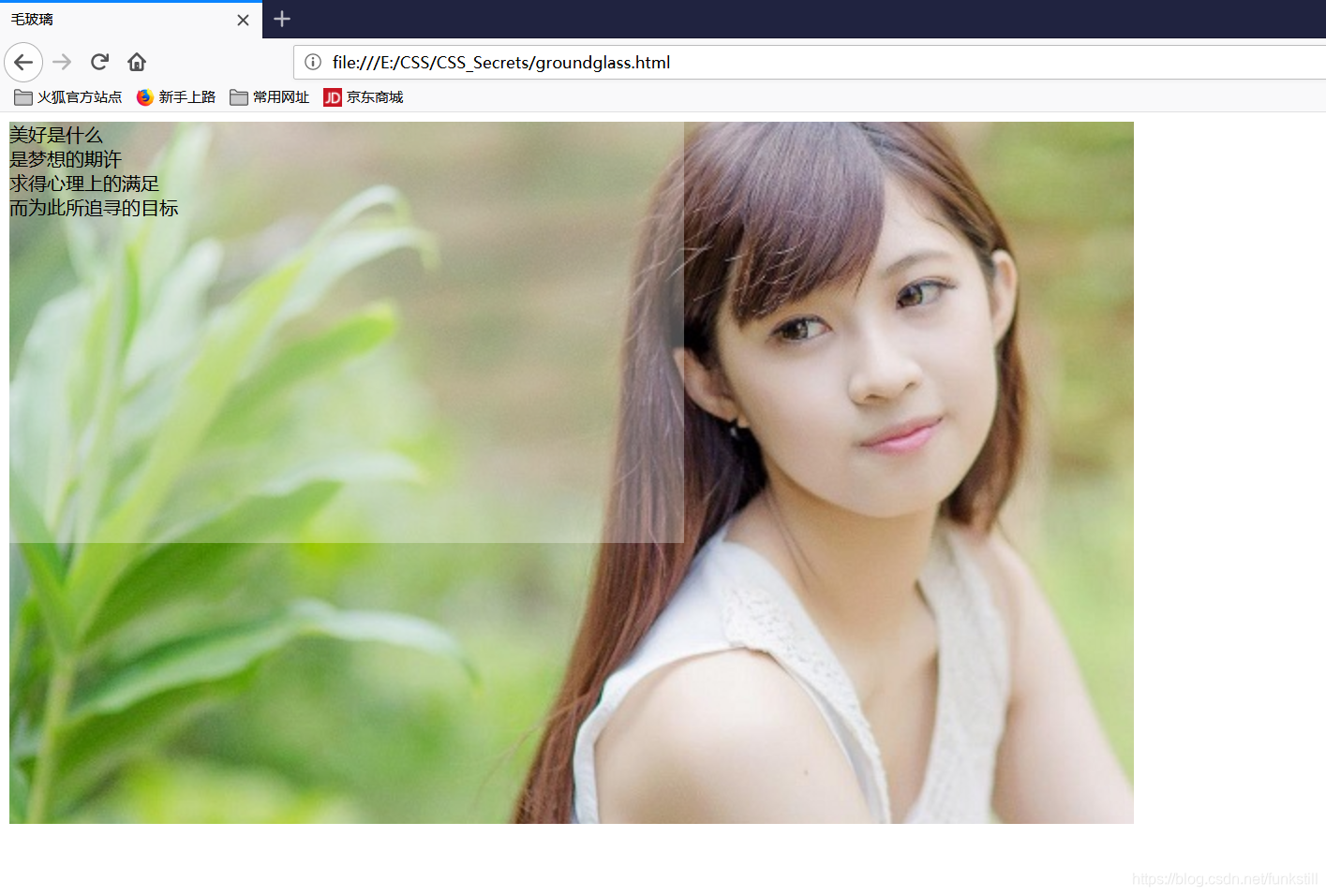
毛玻璃效果
<!DOCTYPE html>
<html>
    <head>
        <meta charset="utf-8">
        <title>毛玻璃</title>
        <style>
            .container {
                width: 960px;
                height: 600px;
                background: url(../images/192.jpg) 0 / cover fixed;
            }
            #main {
                width: 60%;
                height: 60%;
                position: relative;
                background: hsla(0, 0%,100%,.3);
                overflow: hidden;
            }
            #main::before{
                content: '';
                position: absolute;
                top:0;right: 0;bottom: 0;left: 0;
                filter: blur(20px);
                margin: -30px;
            }
        </style>
    </head>
    <body>
        <div class="container">
            <div class="test" id="main">美好是什么<br>
                    是梦想的期许<br>
                    求得心理上的满足<br>
                    而为此所追寻的目标</div>
        </div>
    </body>
</html>