透明度:
1、opacity 背景颜色和字体同时透明
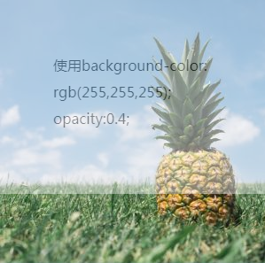
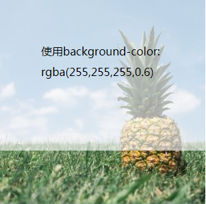
2.background:rgba(255,255,255,0.2); 只是背景颜色透明,字体不透明
代码:
.info{
    background-image: url(pineapple.jpg);
    width:300px;
    height:300px;
}
p{

    background-color: rgba(255,255,255,0.8);
    opacity:0.2;
    height:100px;
}
毛玻璃效果:CSS filter
- 模糊背景部分, 应用了filter:blur(size)的元素的所有子孙元素都会被模糊处理(不是因为继承),即使子孙元素脱离了该元素的文档流也不能避免。
- 只对login-box背后部分模糊处理。解决方案是在login-box下层加一个与之重叠的元素,对此元素应用filter:blur(<blur_size>);,可以选择用伪元素:

代码:
<div class="bg"><!--最外层包裹框,背景图片很鲜艳亮眼position:fixed-->
    <div class='blur-box'>
       <!--登录表单框部分position:fixed-->
    </div>
</div>
.bg{
    background:url(1.jpg) no-repeat center center fixed;/* 与下面的 blur_box:before 中的 background 设置一样 */
    width:100%;
    height:100%;
}

.blur_box{
    z-index: 0;/* 为不影响内容显示必须为最高层 */
    position: relative;
    overflow: hidden;
}

.blur-box::before{
    content:'';
    position:absolute;  /* 固定模糊层位置 */
    top:0;
    left:0;
    right:0;
    bottom:0;
    background:url(1.jpg) no-repeat center center fixed;/* 与上面的 bg 中的background设置一样 */
    filter:blur(10px) contrast(.8);  /* 值越大越模糊 */
    z-index:-1;  /* 模糊层在最下面 */
/* 还可以设置 width、height 来设置模糊曾的宽和高 */
}