文章内容来自CSS神书《CSS揭秘》。
献上膝盖就好
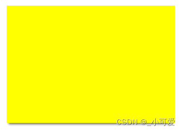
1、投影
单侧投影
因为模糊的效果会导致投影的面积增大,不过使用box-shadow的第四个参数就可以调控阴影的放大和缩小。
div {


  background-color: yellow;
  box-shadow: 0 7px 4px -4px rgba(0, 0, 0, .5);  /*这里将投影缩小4px*/
}
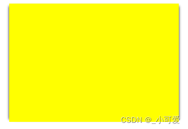
双侧投影
其实就是两个单侧投影的简单运用:
div {


  background-color: yellow;
  box-shadow: 5px 0 5px -5px black, -5px 0 5px -5px black;
}
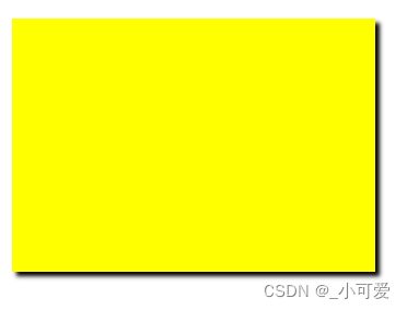
不规则投影
box-shadow对于规则的图形(矩形,border-radius产生的形状)有着完美的效果,但是对于很多加入了伪元素或者半透明装饰的元素就会显得力不从心。
解决这个难题的关键在于使用css滤镜。(但是也不能保证做到非常好的效果,甚至可能很糟糕。)
filter: drop-shadow(4px 4px 2px black);
drop-shadow()接收的参数基本和box-shadow完全一样,但是没有扩张的参数。
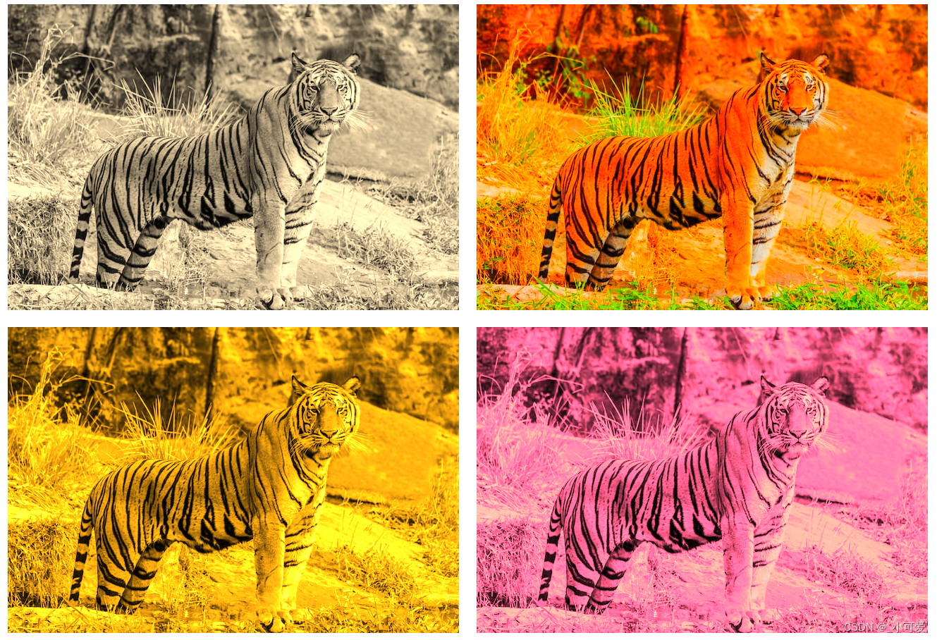
2、染色效果
为一张灰度图片增加染色效果是一种流行并且优雅的方式,可以给一系列风格不一的照片带来视觉上的一致性,通常的做法是使用图片处理软件来做出不同风格的图片,但是这样一来就会导致工作量的增加和文件体积增加。
javascript也可以做类似的处理,把元素放到canvas元素里面,确实可以得到真实的染色效果,但是会增加性能负担,而且限制很多。
实际上,使用css也可以很好地完成这样的染色效果。
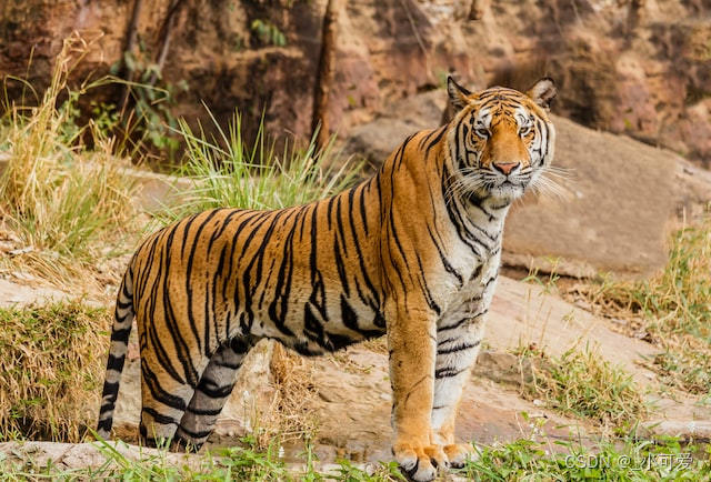
素材(来源于unsplash):
我们的目标在于改变主色调为粉红色色调。
使用CSS滤镜
img:nth-child(1) {


  filter: sepia(1);  /*降低饱和度的滤镜*/
}

img:nth-child(2) {


  filter: saturate(4);  /*增加饱和度*/
}

img:nth-child(3) {


  filter: sepia(1) saturate(4);  /*暖金色的染色效果*/
}

img:nth-child(4) {


  transition: 1s filter;  /*制作动画的效果*/
  filter: sepia(1) saturate(4) hue-rotate(295deg);  /*色相旋转*/
}

img:nth-child(4):hover {


  filter: none;
}
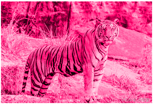
使用混合模式
使用滤镜获得的图片难免会有一些不自然的风格,那么另外一种方法就是使用混合模式的方法来获得染色图片。luminosity混合模式会保留上层元素的HSL亮度信息,并从下层吸取色相饱和度的信息。这样一来,我们需要做的就是把处理的图片放到上层,需要的主色调放在下层,并设置混合模式即可。
第一种写法,没有动画,基于容器和img元素。
<a href="#">
  <img src="https://unsplash.com/photos/YuQgNYku1M8/download?ixid=MnwxMjA3fDB8MXxhbGx8fHx8fHx8fHwxNjY1MTI2MDMy&force=true&w=640" />
</a>
a {


  background-color: hsl(335, 100%, 50%);
  display: inline-block;
  margin: 10px;
}

a > img {


  mix-blend-mode: luminosity;
}
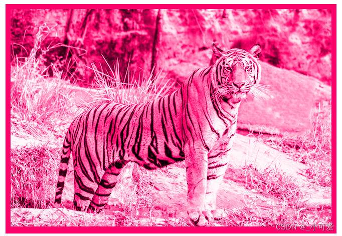
第二种,使用容器的背景图片和背景颜色,可以给背景颜色做一个改变就可以得到动画的效果。
<div class="tinted-image" style="background-image: url('https://unsplash.com/photos/YuQgNYku1M8/download?ixid=MnwxMjA3fDB8MXxhbGx8fHx8fHx8fHwxNjY1MTI2MDMy&force=true&w=640');"></div>
.tinted-image {


  width: 640px;
  height: 433px;
  background-size: cover;
  background-color: hsl(335, 100%, 50%);
  background-blend-mode: luminosity;
  transition: .5s background-color;
}
.tinted-image:hover {


  background-color: transparent;
}
个人觉得滤镜的效果比不上混合模式。
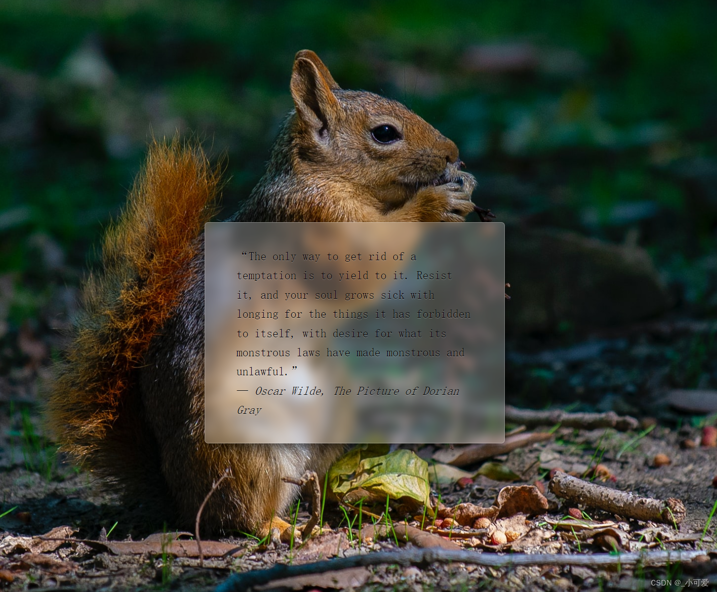
3、毛玻璃效果
在背景图片上面添加文字,可以通过透明度的方法来调节,可以带来视觉上的冲击,同时也可以添加毛玻璃效果让设计变得更加优雅。
总体的思路就是使用伪元素进行一层blur模糊滤镜。
<main>
<blockquote>“The only way to get rid of a temptation is to yield to it. Resist it, and your soul grows sick with longing for the things it has forbidden to itself, with desire for what its monstrous laws have made monstrous and unlawful.”</em>
<footer>— <cite>Oscar Wilde, The Picture of Dorian Gray</cite></footer>
</blockquote>
</main>
body {


  margin: 0;
  min-height: 100vh;
  box-sizing: border-box;
  padding-top: calc(50vh - 6em);
	font: 150%/1.6 Baskerville, Palatino, serif;
}

body, main::before {


  background: url("https://unsplash.com/photos/3smh0v6xTKg/download?ixid=MnwxMjA3fDB8MXxzZWFyY2h8MXx8YW5pbWFsbHxlbnwwfHx8fDE2NjUxMjkzMzU&force=true&w=1920") 0 / cover fixed;
}

main {


  position: relative;
  margin: 0 auto;
  padding: 1em;
  max-width: 23em;
  background: hsla(0,0%,100%,.25) border-box;
	overflow: hidden;
	border-radius: .3em;
	box-shadow: 0 0 0 1px hsla(0,0%,100%,.3) inset,
	            0 .5em 1em rgba(0, 0, 0, 0.6);
	text-shadow: 0 1px 1px hsla(0,0%,100%,.3)
}

main::before {


  z-index: -1;
  content: '';
  position: absolute;
  margin:-30px;
  top: 0; right: 0; bottom: 0; left: 0;
 filter: blur(10px);
}
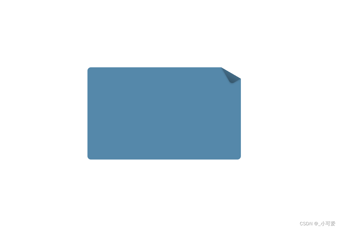
4、折角效果
使用伪元素的方法构造出折纸的效果,然后使用几何知识拼接到折痕上。
body {


  box-sizing: border-box;
  min-height: 100vh;
}

div {


  width: 500px;
  height: 300px;
  position: relative;
  background: linear-gradient(-150deg, transparent 2em, #58a 0);
  border-radius: .7em;
  margin: 0 auto;
  margin-top: calc(50vh - 10em);
}


div::before {


  content: '';
  position: absolute;
  top: 0; right: 0;
  width: 2.3em;
  height: 4em;
  background: linear-gradient(to bottom left, transparent 50%, rgba(0, 0, 0, .2) 0, rgba(0, 0, 0, .4));
  background-position: 100% 0;
  background-repeat: no-repeat;
  transform: translateY(-1.7em) rotate(-30deg);
  transform-origin: bottom right;
  border-bottom-left-radius: inherit;
  box-shadow: -.2em .2em .3em -.1em rgba(0, 0, 0, .15);
}