申明:本书使用 code 为 R。
本章主要总结一下几个内容:
- 对Data基本属性的挖掘,如:location,variability;
- 以图形方式,挖掘Data属性,如 data distribution,correlation;
一、对Data基本属性的挖掘
1、Estimate of location
评估Data location的几个 指标 汇总 如下:
| 指标 | 公式 | 优缺点 |
|---|---|---|
| Mean |  |
对异常值敏感 |
| Trimmed Mean |  |
trimmed mean可以去除异常值的影响 |
| Weighted mean |  |
weighted mean并不能排出异常值的影响,它主要用于如下情况:对于不同的sample由于某些原因,对其 value 的准确性有所质疑,通过对不同sample分配不同的权重,来表达对不同sample的信任程度 |
| Median | The middle number on a sorted list of the data | 相比Mean来说,其对“异常值”的鲁棒性更强 |
| Weighted Median | 将各个sample_value * weight,sort,the weighted median is a value such that the sum of weights is equal for the lower and upper halves of the sorted list | weighted median is robust to outliers |
在上述几个指标中,Trimmed mean 和 median 均对 outliers 具有较强的 鲁棒性!
2、Estimate of variability
评估Ddata variability 的指标 汇总如下:
| 指标 | 公式 | 优缺点 |
|---|---|---|
| Mean absolution deviation |  |
sensitive to outliers |
| Variance | 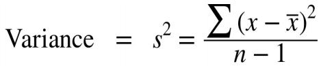 |
sensitive to outliers |
| Standard deviation |  |
sensitive to outliers |
| Median absolute deviation |  |
robust to outliers;Sometimes, the median absolute deviation is multiplied by a constant scaling factor (it happens to work out to 1.4826) to put MAD on the same scale as the standard deviation in the case of a normal distribution. |
| Trimmed standard deviation | like trimmed mean | robust to outliers |
| range | the largest - the smallest | sensitive to outliers, not useful as a measure of dispersion in the data |
| percentile | the common measurement of variability is the difference between the 25th percentile and the 75th percentile, called the interquartile range (or IQR). | robust to outliers |
二、以图形方式挖掘Data属性
1、Exploring data distribution
data distribution 可以从如下几个角度去分析:
- location;
- variability;
- skewness(Skewness refers to whether the data is skewed to larger or
smaller values); - kurtosis(kurtosis indicates the propensity of the data to have extreme values).
下面给出可以用来分析 data distribution的几种 plot:
- Percentile
quantile(state[["Murder.Rate"]], p=c(.05, .25, .5, .75, .95))
5% 25% 50% 75% 95%
1.600 2.425 4.000 5.550 6.510

- Boxplot
boxplot(state[["Population"]]/1000000, ylab="Population (millions)")
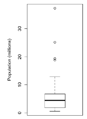
对 Boxplot 的解释如下:

- violin plot
violin plot 在 y轴 上的意义 与 Boxplot 相同,在 x轴上,表示特定数值(y)的concentration:
ggplot(data=airline_stats, aes(airline, pct_carrier_delay)) +
ylim(0, 50) +
geom_violin() +
labs(x="", y="Daily % of Delayed Flights")

- Frequency table
breaks <- seq(from=min(state[["Population"]]),
to=max(state[["Population"]]), length=11)
pop_freq <- cut(state[["Population"]], breaks=breaks,
right=TRUE, include.lowest = TRUE)
table(pop_freq)

- Histogram
hist(state[["Population"]], breaks=breaks)

- Density estimate
hist(state[["Murder.Rate"]], freq=FALSE)
lines(density(state[["Murder.Rate"]]), lwd=3, col="blue")

2、Exploring Binary and Categorical Data
- Bar plot

- pie chart

Note that:可以用mode(最长出现的category) 或 expected value(针对 numerical category 而言) 来描述 category data。
3、Correlation
可以用 correlation matrix 或 scatterplot 来描述 变量之间的相关关系:
- correlation matrix
etfs <- sp500_px[row.names(sp500_px)>"2012-07-01",
sp500_sym[sp500_sym$sector=="etf", 'symbol']]
library(corrplot)
corrplot(cor(etfs), method = "ellipse")

- scatterplot
plot(telecom$T, telecom$VZ, xlab="T", ylab="VZ")

Note that:我们可以利用 Pearson correlation coefficience 来描述 变量之间的 “线性”相关关系,Pearson correlation coefficience 公式如下:
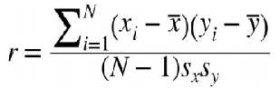
Sx,Sy 为 x,y 的 标准差。N为sample个数。
4、利用plot挖掘 two variable or more variable 之间的关系
- Hexagonal Binning plot
scatterplot是将所有的sample以point的形式绘制于二维平面,这种绘制方式仅适用于 small data_set(hundreds of data),但是对于large data_set(Hundreds of thousands of data),以scatterplot绘制图形,point密度会很大,从而只能得到一团黑云。为了改善scatterplot的这种缺陷,我们引进了“Hexagonal Binning plot”,其核心思想是:we grouped the records into hexagonal bins and plotted the hexagons with a color indicating the number of records in that bin.
下面利用R绘制 Hexagonal Binning plot:
ggplot(kc_tax0, (aes(x=SqFtTotLiving, y=TaxAssessedValue))) +
stat_binhex(colour="white") +
theme_bw() +
scale_fill_gradient(low="white", high="black") +
labs(x="Finished Square Feet", y="Tax Assessed Value")

- Contour plot
Contour plot 中每一个 “线圈” 都是一个等密度线,等密度线之间的 差值 相等。contour plot中等密度线越密集,说明这部分point密度越大,否则,越稀疏。
ggplot(kc_tax0, aes(SqFtTotLiving, TaxAssessedValue)) +
theme_bw() +
geom_point( alpha=0.1) +
geom_density2d(colour="white") +
labs(x="Finished Square Feet", y="Tax Assessed Value")

- Contingency table
Contingency table 用于 总结 两个 “Categorical variable” :
library(descr)
x_tab <- CrossTable(lc_loans$grade, lc_loans$status,
prop.c=FALSE, prop.chisq=FALSE, prop.t=FALSE)
#两个categorical variable:
# variable1:Grade :A ,B ,C ,D ,E
#variable2:      :Fully paid, Current Late, Charged off

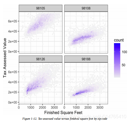
- visualize multiple variables
ggplot(subset(kc_tax0, ZipCode %in% c(98188, 98105, 98108, 98126)),
aes(x=SqFtTotLiving, y=TaxAssessedValue)) +
stat_binhex(colour="white") +
theme_bw() +
scale_fill_gradient( low="white", high="blue") +
labs(x="Finished Square Feet", y="Tax Assessed Value") +
facet_wrap("ZipCode")
#除x,y轴外,还有一个conditioning:ZipCode={98105,98108,98126,98188}