前言
这几天又有点松懈,分析主要原因是对自己目前的把握不是很准确,对很多方面都一知 半解。所以决定搞好基础,目前零零散散学习了css,js,vue,webpack,sass,决定分类对每部分都写博客深入研究一下。为了激发学习兴趣,同时开始学习React。
虚线边框渐变
本次的内容是虚线边框的颜色渐变,主要是借鉴了张鑫旭大神的博客。记录一下自己不会的点。
方法
大神主要提出了2种解决方法,下面贴出HTML和CSS
- 把边框实线的部分设为透明,虚线露出渐变色。
  .box{
    width: 150px;
    border: 2px dashed #ffffff;
    background: linear-gradient(to bottom, #34538b, #cd0000);
    background-origin: border-box;
  }
  .content{
    background-color: #ffffff;
    height: 100px;
  }
效果如图:
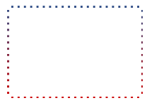
可以看到,此处是有一点瑕疵,那就是边角无法形成直角。这个技术点主要是设置border 和content 的背景色一致,然后通过设置box的渐变形成渐变色。
- 借助CSS遮罩实现精致的渐变虚框
.box {
    width: 200px;
    height: 150px;
    border: 2px dashed #cd0000;
    box-sizing: border-box;
}
@supports (-webkit-mask: none) or (mask: none) {
.box {
    border: none;
    background: linear-gradient(to bottom, #34538b, #cd0000) no-repeat;
    -webkit-mask-image: linear-gradient(to right, #000 6px, transparent 6px), linear-gradient(to bottom, #000 6px, transparent 6px),  linear-gradient(to right, #000 6px, transparent 6px), linear-gradient(to bottom, #000 6px, transparent 6px);
    -webkit-mask-repeat: repeat-x, repeat-y, repeat-x, repeat-y;
    -webkit-mask-position: 0 0, 0 0, 0 100%, 100% 0;
    -webkit-mask-size: 8px 2px, 2px 8px, 8px 2px, 2px 8px;

}
}
效果如下图:
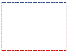
此技术主要是CSS的 mask属性。mask的linear-gradient设置4个方向的虚线,position设置起始位置,repeat设置方向,size设置大小。
虚线边框滚动动画
在这里插入图片描述主要原理是一个animation动画,代码如下:
.box {
    width: 200px;
    background: repeating-linear-gradient(135deg, transparent, transparent 3px, #000 3px, #000 8px);
    animation: shine 1s infinite linear;
    overflow: hidden;
}
.content {
    height: 128px;
    margin: 1px; padding: 10px;
    background-color: #fff;
}
@keyframes shine {
    0% { background-position: -1px -1px;}
    100% { background-position: -12px -12px;}
}
效果如图:
最后
由于这一次是第一次写博客,一些常识性的格式可能不规范,相信后面会越来越好。如果有什么问题可以私信或评论我。
引用自:
https://www.zhangxinxu.com/wordpress/2018/08/css-gradient-dashed-border/