matplotlib
学习莫烦python,非常感谢~记录自己在学习python过程中的点滴。
matplotlib 安装
- Anaconda安装
- pip安装
matplotlib 基本使用
- 基本用法
- figure 图像
- 设置坐标轴1
- 设置坐标轴2
- Legend 图例
- Annotation 标注
- tick 能见度
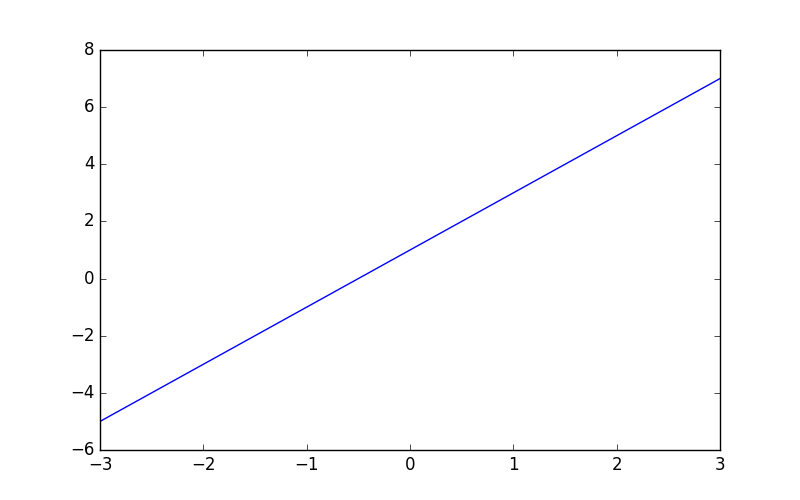
基本用法
figure():定义图像窗口plot():画曲线show():显示图像
参考代码:
import matplotlib.pyplot as plt
import numpy as np

# 使用np.linspace定义x:范围是(-1,1);个数是50. 仿真一维数据组(x ,y)表示曲线1.
x = np.linspace(-1, 1, 50)
y = 2*x + 1

# 使用plt.figure定义一个图像窗口. 使用plt.plot画(x ,y)曲线. 使用plt.show显示图像
plt.figure()
plt.plot(x, y)
plt.show()
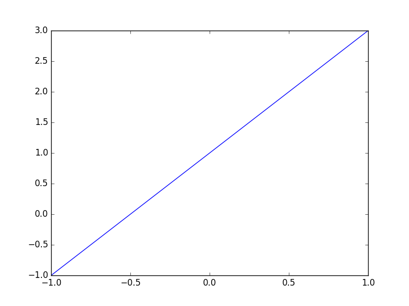
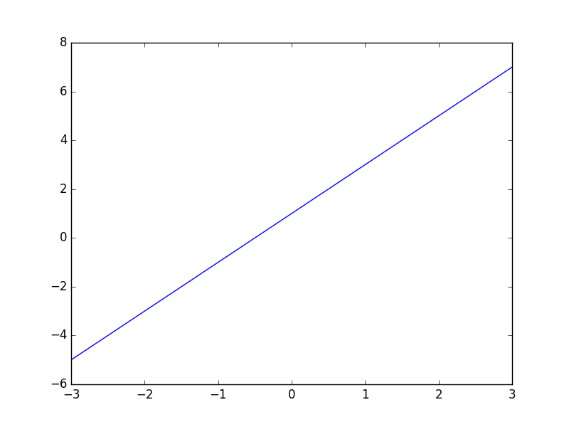
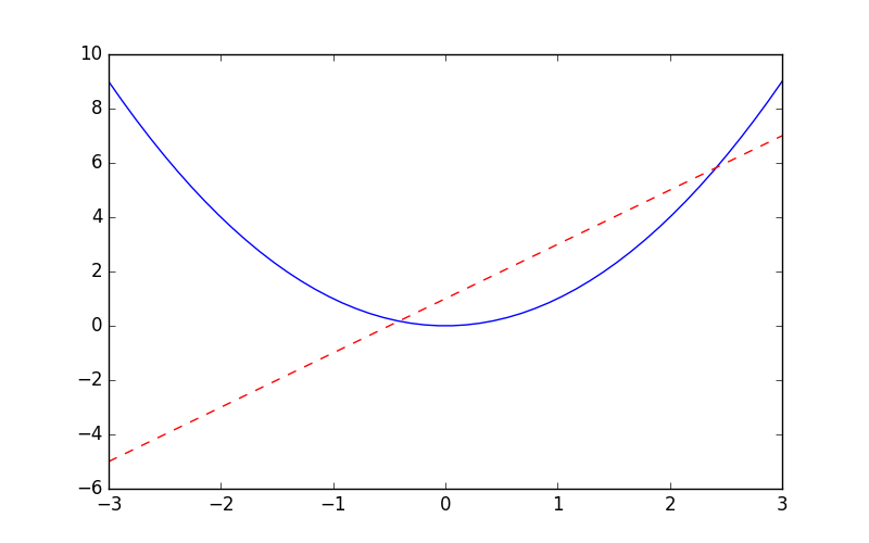
figure 图像
- 简单显示图像
参考代码:
import matplotlib.pyplot as plt
import numpy as np

x = np.linspace(-3, 3, 50)
y1 = 2*x + 1
y2 = x**2

plt.figure()
plt.plot(x, y1)
plt.show()
# 使用plt.figure定义一个图像窗口:编号为3;大小为(8, 5).
plt.figure(num=3, figsize=(8, 5),)
plt.plot(x, y2)
# 使用plt.plot画(x ,y1)曲线,曲线的颜色属性(color)为红色;曲线的宽度(linewidth)为1.0;
plt.plot(x, y1, color='red', linewidth=1.0, linestyle='--')
# 曲线的类型(linestyle)为虚线. 使用plt.show显示图像.
plt.show()
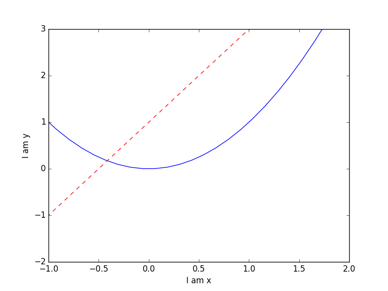
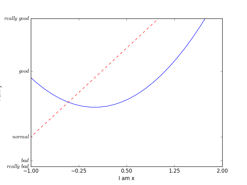
设置坐标轴1
xlim():设置x坐标轴范围ylim():设置y坐标轴范围xlabel():设置x坐标轴名称ylabel():设置y坐标轴名称xticks():设置x轴刻度yticks():设置y轴刻度
参考代码:
import matplotlib.pyplot as plt
import numpy as np

x = np.linspace(-3, 3, 50)
y1 = 2*x + 1
y2 = x**2

plt.figure()
plt.plot(x, y2)
plt.plot(x, y1, color='red', linewidth=1.0, linestyle='--')

plt.xlim((-1, 2))
plt.ylim((-2, 3))
plt.xlabel('I am x')
plt.ylabel('I am y')
plt.show()
new_ticks = np.linspace(-1, 2, 5)
print(new_ticks)
plt.xticks(new_ticks)

plt.yticks([-2, -1.8, -1, 1.22, 3],[r'$really\ bad$', r'$bad$', r'$normal$', r'$good$', r'$really\ good$'])
plt.show()
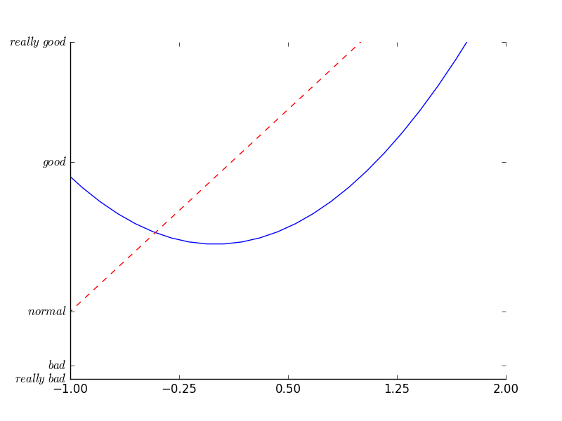
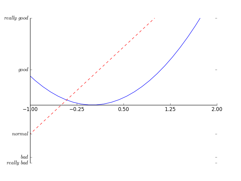
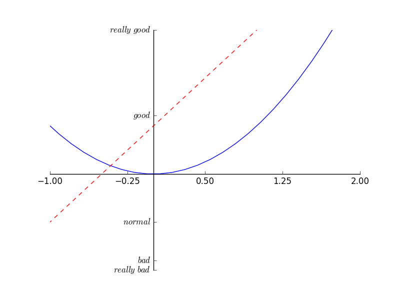
设置坐标轴2
gca():获取当前坐标轴信息.spines:设置边框.set_color:设置边框颜色:默认白色.spines:设置边框.xaxis.set_ticks_position:设置x坐标刻度数字或名称的位置.yaxis.set_ticks_position:设置y坐标刻度数字或名称的位置.set_position:设置边框位置
设置不同名字和位置:
import matplotlib.pyplot as plt
import numpy as np

x = np.linspace(-3, 3, 50)
y1 = 2*x + 1
y2 = x**2

plt.figure()
plt.plot(x, y2)
plt.plot(x, y1, color='red', linewidth=1.0, linestyle='--')
plt.xlim((-1, 2))
plt.ylim((-2, 3))

new_ticks = np.linspace(-1, 2, 5)
plt.xticks(new_ticks)
plt.yticks([-2, -1.8, -1, 1.22, 3],['$really\ bad$', '$bad$', '$normal$', '$good$', '$really\ good$'])

ax = plt.gca()
ax.spines['right'].set_color('none')
ax.spines['top'].set_color('none')
plt.show()
调整坐标轴:
ax.xaxis.set_ticks_position('bottom')
ax.spines['bottom'].set_position(('data', 0))
plt.show()
ax.yaxis.set_ticks_position('left')
ax.spines['left'].set_position(('data',0))
plt.show()
Legend 图例
- 添加图例
- 调整位置和名称
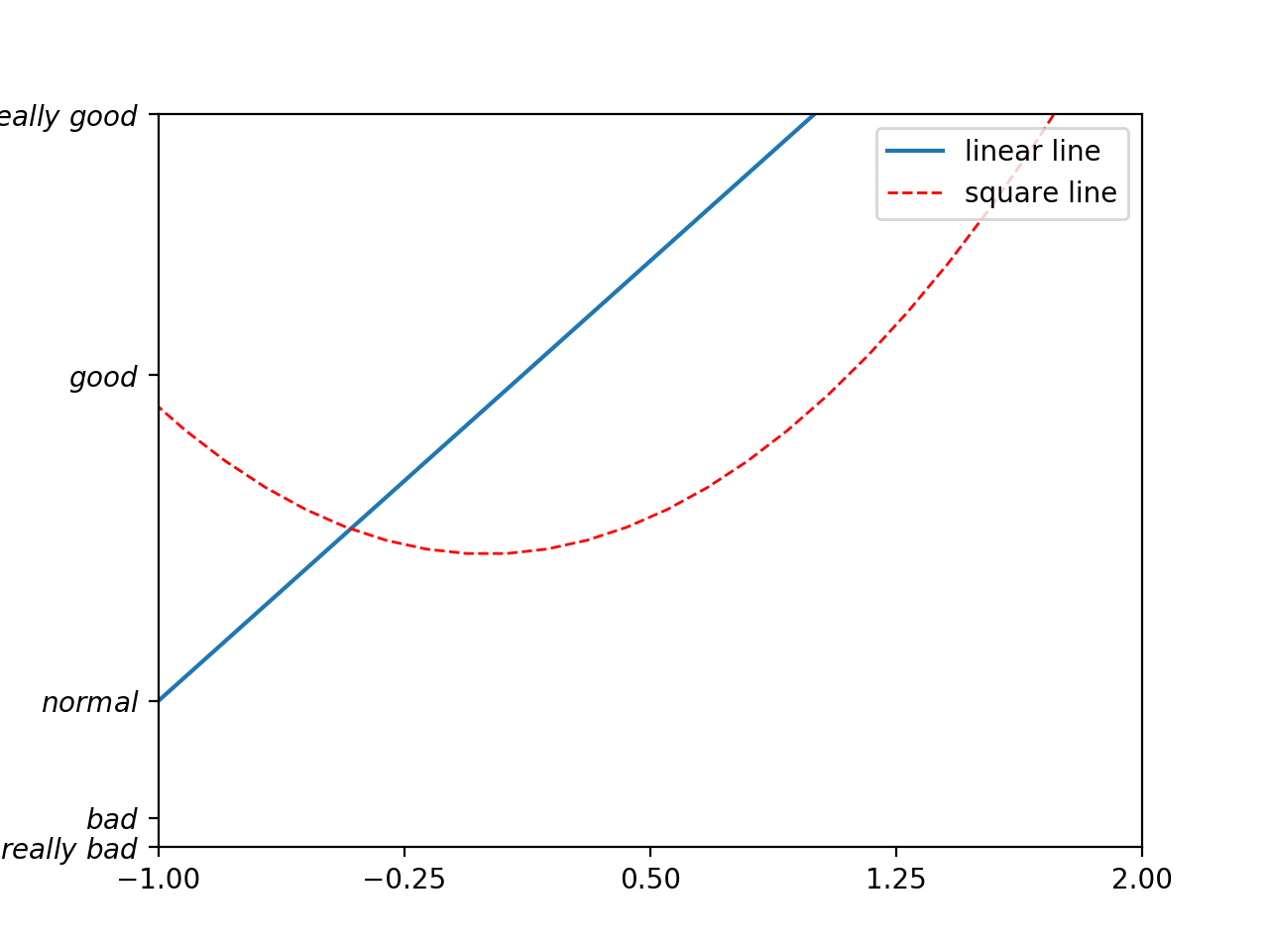
添加图例:
import matplotlib.pyplot as plt
import numpy as np

x = np.linspace(-3, 3, 50)
y1 = 2*x + 1
y2 = x**2

plt.figure()
#set x limits
plt.xlim((-1, 2))
plt.ylim((-2, 3))

# set new sticks
new_sticks = np.linspace(-1, 2, 5)
plt.xticks(new_sticks)
# set tick labels
plt.yticks([-2, -1.8, -1, 1.22, 3],
           [r'$really\ bad$', r'$bad$', r'$normal$', r'$good$', r'$really\ good$'])

# set line syles
l1, = plt.plot(x, y1, label='linear line')
l2, = plt.plot(x, y2, color='red', linewidth=1.0, linestyle='--', label='square line')

plt.legend(loc='upper right')
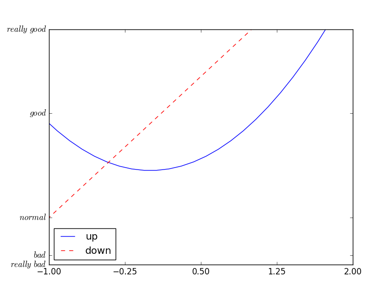
调整位置和名称:
plt.legend(handles=[l1, l2], labels=['up', 'down'], loc='best')
Annotation 标注
annotate:添加注释text:添加注释
参考代码:
import matplotlib.pyplot as plt
import numpy as np

x = np.linspace(-3, 3, 50)
y = 2*x + 1

plt.figure(num=1, figsize=(8, 5),)
plt.plot(x, y,)
# 移动坐标
ax = plt.gca()
ax.spines['right'].set_color('none')
ax.spines['top'].set_color('none')
ax.spines['top'].set_color('none')
ax.xaxis.set_ticks_position('bottom')
ax.spines['bottom'].set_position(('data', 0))
ax.yaxis.set_ticks_position('left')
ax.spines['left'].set_position(('data', 0))
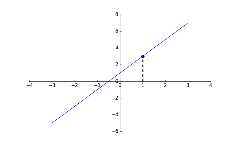
x0 = 1
y0 = 2*x0 + 1
plt.plot([x0, x0,], [0, y0,], 'k--', linewidth=2.5)
# set dot styles
plt.scatter([x0, ], [y0, ], s=50, color='b')
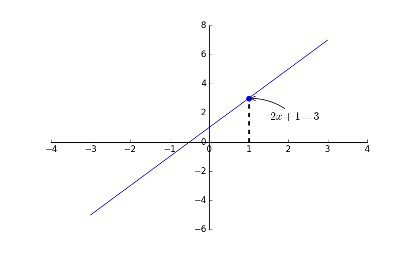
# 添加注释 annotate
plt.annotate(r'$2x+1=%s$' % y0, xy=(x0, y0), xycoords='data', xytext=(+30, -30),
             textcoords='offset points', fontsize=16,
             arrowprops=dict(arrowstyle='->', connectionstyle="arc3,rad=.2"))
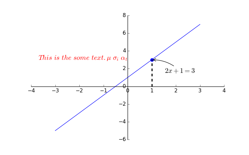
# 添加注释 text
plt.text(-3.7, 3, r'$This\ is\ the\ some\ text. \mu\ \sigma_i\ \alpha_t$',
         fontdict={'size': 16, 'color': 'r'})
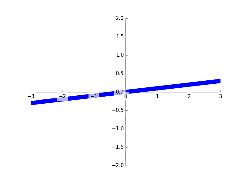
tick 能见度
- 调整坐标
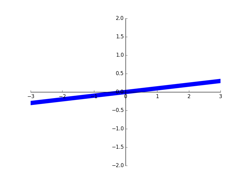
生成图形:
import matplotlib.pyplot as plt
import numpy as np

x = np.linspace(-3, 3, 50)
y = 0.1*x

plt.figure()
# 在 plt 2.0.2 或更高的版本中, 设置 zorder 给 plot 在 z 轴方向排序
plt.plot(x, y, linewidth=10, zorder=1)
plt.ylim(-2, 2)
ax = plt.gca()
ax.spines['right'].set_color('none')
ax.spines['top'].set_color('none')
ax.spines['top'].set_color('none')
ax.xaxis.set_ticks_position('bottom')
ax.spines['bottom'].set_position(('data', 0))
ax.yaxis.set_ticks_position('left')
ax.spines['left'].set_position(('data', 0))
调整坐标:
for label in ax.get_xticklabels() + ax.get_yticklabels():
    label.set_fontsize(12)
    # 在 plt 2.0.2 或更高的版本中, 设置 zorder 给 plot 在 z 轴方向排序
    label.set_bbox(dict(facecolor='white', edgecolor='None', alpha=0.7, zorder=2))
plt.show()
画图种类
- Scatter 散点图
- Bar 柱状图
- Contours 等高线图
- Image 图片
- 3D 数据
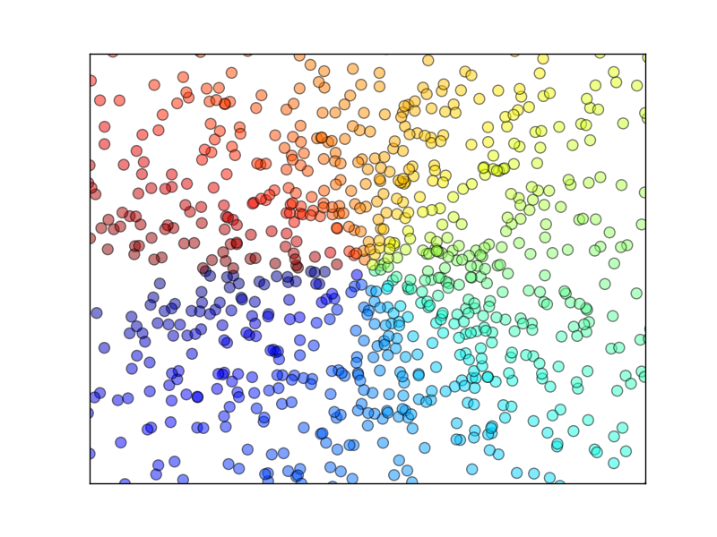
Scatter 散点图
scatter:绘制散点图
参考代码:
import matplotlib.pyplot as plt
import numpy as np

n = 1024    # data size
X = np.random.normal(0, 1, n) # 每一个点的X值
Y = np.random.normal(0, 1, n) # 每一个点的Y值
T = np.arctan2(Y,X) # for color value

plt.scatter(X, Y, s=75, c=T, alpha=.5)

plt.xlim(-1.5, 1.5)
plt.xticks(())  # ignore xticks
plt.ylim(-1.5, 1.5)
plt.yticks(())  # ignore yticks

plt.show()
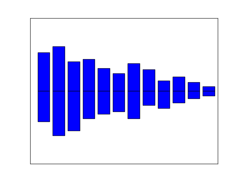
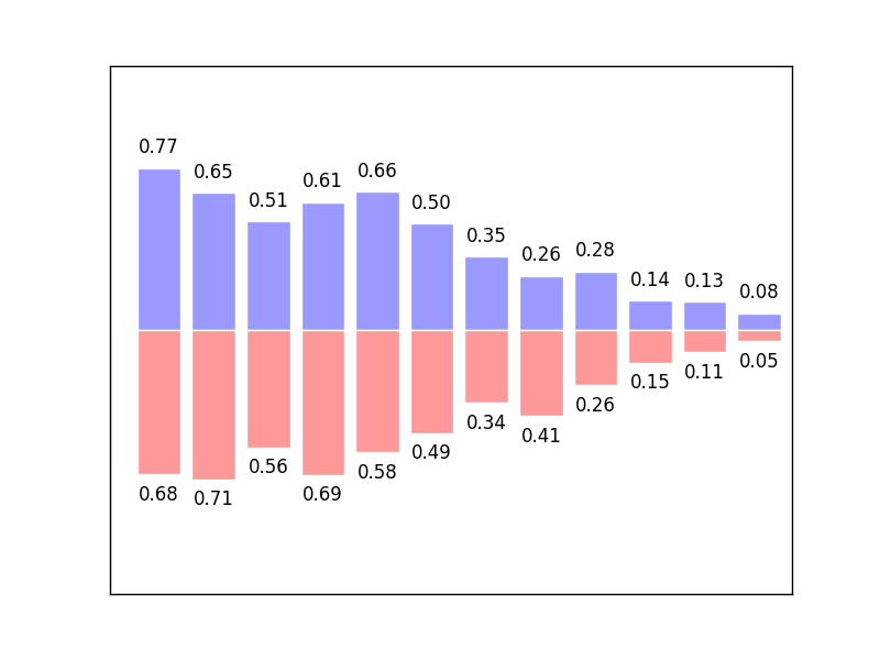
Bar 柱状图
bar():生成柱状图
生成基本图形:
import matplotlib.pyplot as plt
import numpy as np

n = 12
X = np.arange(n)
Y1 = (1 - X / float(n)) * np.random.uniform(0.5, 1.0, n)
Y2 = (1 - X / float(n)) * np.random.uniform(0.5, 1.0, n)

plt.bar(X, +Y1)
plt.bar(X, -Y2)

plt.xlim(-.5, n)
plt.xticks(())
plt.ylim(-1.25, 1.25)
plt.yticks(())

plt.show()
加颜色和数据:
plt.bar(X, +Y1, facecolor='#9999ff', edgecolor='white')
plt.bar(X, -Y2, facecolor='#ff9999', edgecolor='white')
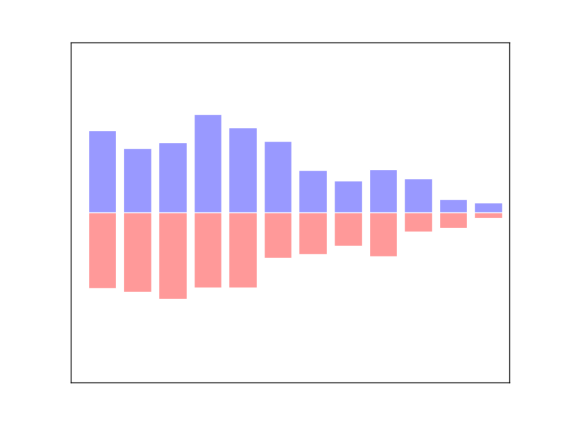
for x, y in zip(X, Y1):
    # ha: horizontal alignment
    # va: vertical alignment
    plt.text(x + 0.4, y + 0.05, '%.2f' % y, ha='center', va='bottom')

for x, y in zip(X, Y2):
    # ha: horizontal alignment
    # va: vertical alignment
    plt.text(x + 0.4, -y - 0.05, '%.2f' % y, ha='center', va='top')
Contours 等高线图
meshgrid:在二维平面中将每一个x和每一个y分别对应起来,编织成栅格contour:绘制等高线
画等高线:
import matplotlib.pyplot as plt
import numpy as np

def f(x,y):
    # the height function
    return (1 - x / 2 + x**5 + y**3) * np.exp(-x**2 -y**2)

n = 256
x = np.linspace(-3, 3, n)
y = np.linspace(-3, 3, n)
X,Y = np.meshgrid(x, y)

# use plt.contourf to filling contours
# X, Y and value for (X,Y) point
plt.contourf(X, Y, f(X, Y), 8, alpha=.75, cmap=plt.cm.hot)

# use plt.contour to add contour lines
C = plt.contour(X, Y, f(X, Y), 8, colors='black', linewidth=.5)
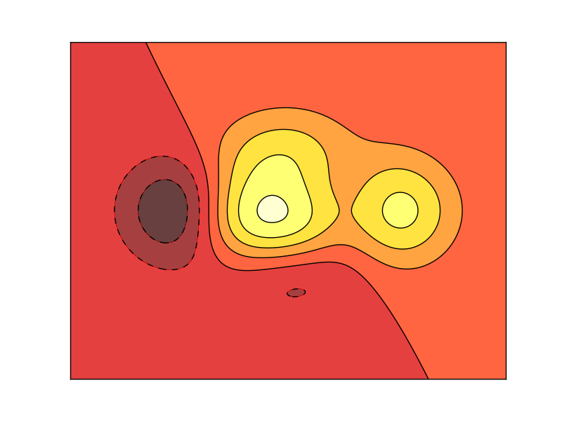
添加高度数字:
plt.clabel(C, inline=True, fontsize=10)
plt.xticks(())
plt.yticks(())
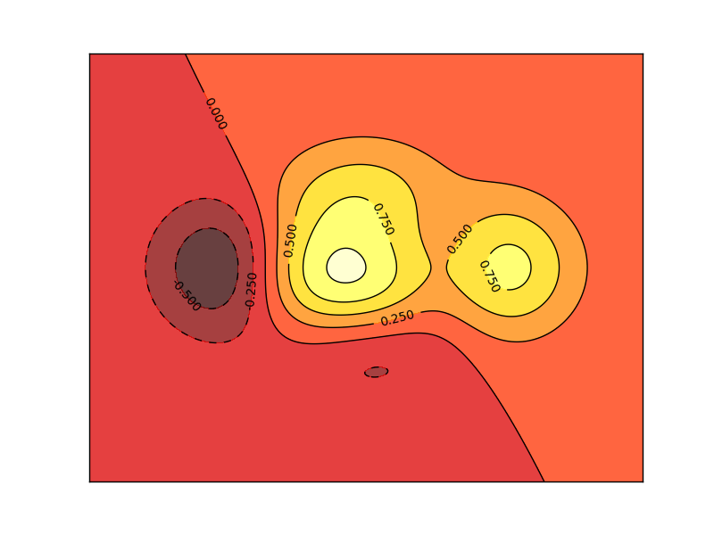
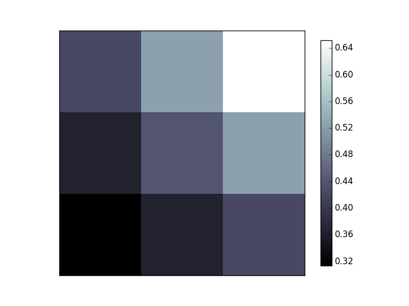
Image 图片
imshow:显示图片colorbar:添加颜色图例
参考代码:
import matplotlib.pyplot as plt
import numpy as np

a = np.array([0.313660827978, 0.365348418405, 0.423733120134,
              0.365348418405, 0.439599930621, 0.525083754405,
              0.423733120134, 0.525083754405, 0.651536351379]).reshape(3,3)
plt.imshow(a, interpolation='nearest', cmap='bone', origin='lower')
plt.colorbar(shrink=.92)

plt.xticks(())
plt.yticks(())
plt.show()
3D 数据
- 3D 图
- 投影
3D 图:
import numpy as np
import matplotlib.pyplot as plt
from mpl_toolkits.mplot3d import Axes3D

fig = plt.figure()
ax = Axes3D(fig)
# X, Y value
X = np.arange(-4, 4, 0.25)
Y = np.arange(-4, 4, 0.25)
X, Y = np.meshgrid(X, Y)    # x-y 平面的网格
R = np.sqrt(X ** 2 + Y ** 2)
# height value
Z = np.sin(R)
ax.plot_surface(X, Y, Z, rstride=1, cstride=1, cmap=plt.get_cmap('rainbow'))
跨度1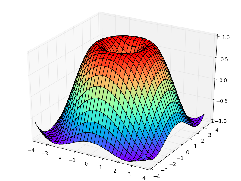
跨度5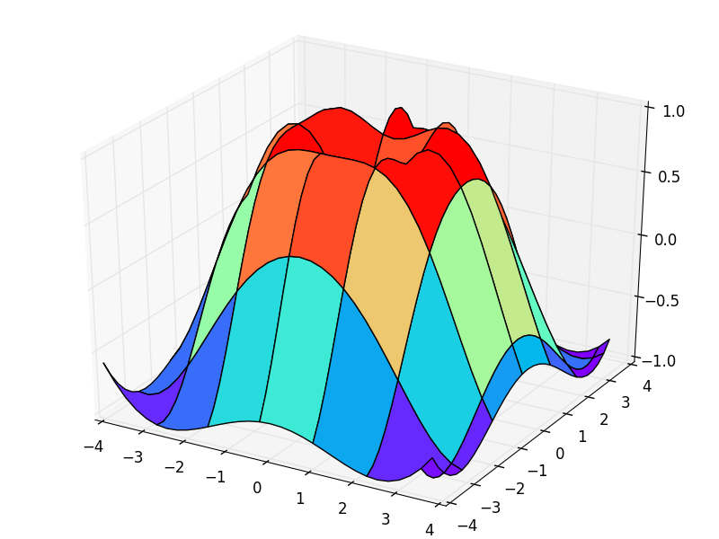
投影:
ax.contourf(X, Y, Z, zdir='z', offset=-2, cmap=plt.get_cmap('rainbow'))
xz平面投影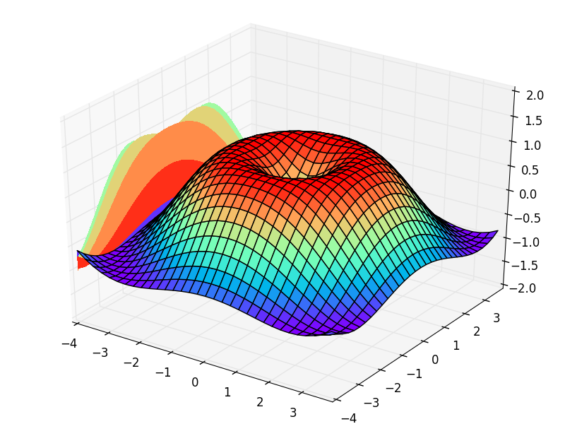
xy平面投影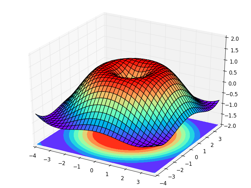
多图合并显示
- Subplot 多合一显示
- Subplot 分格显示
- 图中图
- 次坐标轴
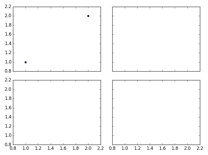
Subplot 多合一显示
- 均匀图中图
- 不均匀图中图
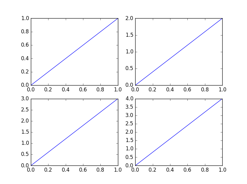
均匀图中图:
import matplotlib.pyplot as plt

plt.figure()
plt.subplot(2,2,1)
plt.plot([0,1],[0,1])

plt.subplot(2,2,2)
plt.plot([0,1],[0,2])

plt.subplot(223)
plt.plot([0,1],[0,3])

plt.subplot(224)
plt.plot([0,1],[0,4])

plt.show()  # 展示
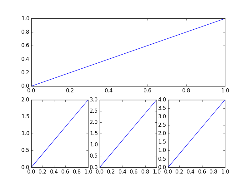
不均匀图中图:
plt.subplot(2,1,1)
plt.plot([0,1],[0,1])

plt.subplot(2,3,4)
plt.plot([0,1],[0,2])

plt.subplot(235)
plt.plot([0,1],[0,3])

plt.subplot(236)
plt.plot([0,1],[0,4])

plt.show()  # 展示
Subplot 分格显示
- subplot2grid
- gridspec
- subplots
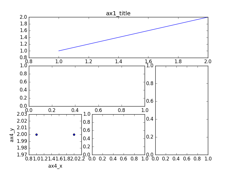
subplot2grid:
import matplotlib.pyplot as plt

plt.figure()

ax1 = plt.subplot2grid((3, 3), (0, 0), colspan=3)
ax1.plot([1, 2], [1, 2])    # 画小图
ax1.set_title('ax1_title')  # 设置小图的标题

ax2 = plt.subplot2grid((3, 3), (1, 0), colspan=2)
ax3 = plt.subplot2grid((3, 3), (1, 2), rowspan=2)
ax4 = plt.subplot2grid((3, 3), (2, 0))
ax5 = plt.subplot2grid((3, 3), (2, 1))

ax4.scatter([1, 2], [2, 2])
ax4.set_xlabel('ax4_x')
ax4.set_ylabel('ax4_y')
gridspec:
import matplotlib.pyplot as plt
import matplotlib.gridspec as gridspec

plt.figure()
gs = gridspec.GridSpec(3, 3)

ax6 = plt.subplot(gs[0, :])
ax7 = plt.subplot(gs[1, :2])
ax8 = plt.subplot(gs[1:, 2])
ax9 = plt.subplot(gs[-1, 0])
ax10 = plt.subplot(gs[-1, -2])
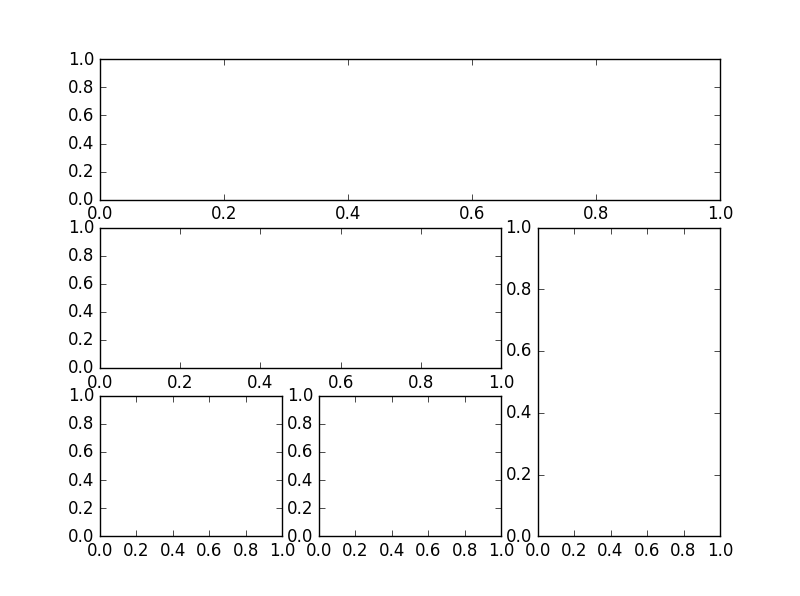
subplots:
f, ((ax11, ax12), (ax13, ax14)) = plt.subplots(2, 2, sharex=True, sharey=True)
ax11.scatter([1,2], [1,2])
plt.tight_layout()
plt.show()
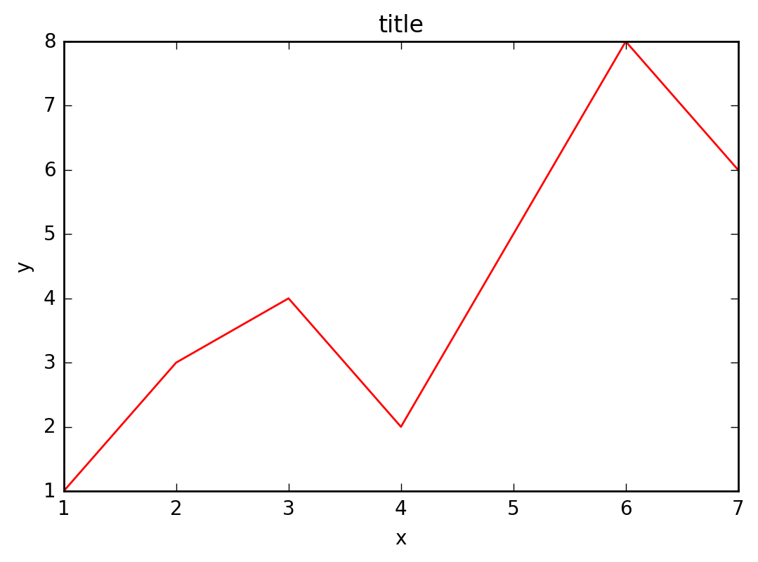
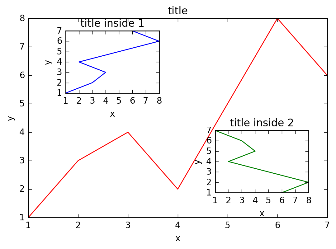
图中图
- 大图
- 小图
大图:
# 导入pyplot模块
import matplotlib.pyplot as plt

# 初始化figure
fig = plt.figure()

# 创建数据
x = [1, 2, 3, 4, 5, 6, 7]
y = [1, 3, 4, 2, 5, 8, 6]

left, bottom, width, height = 0.1, 0.1, 0.8, 0.8

ax1 = fig.add_axes([left, bottom, width, height])
ax1.plot(x, y, 'r')
ax1.set_xlabel('x')
ax1.set_ylabel('y')
ax1.set_title('title')
小图:
left, bottom, width, height = 0.2, 0.6, 0.25, 0.25
ax2 = fig.add_axes([left, bottom, width, height])
ax2.plot(y, x, 'b')
ax2.set_xlabel('x')
ax2.set_ylabel('y')
ax2.set_title('title inside 1')
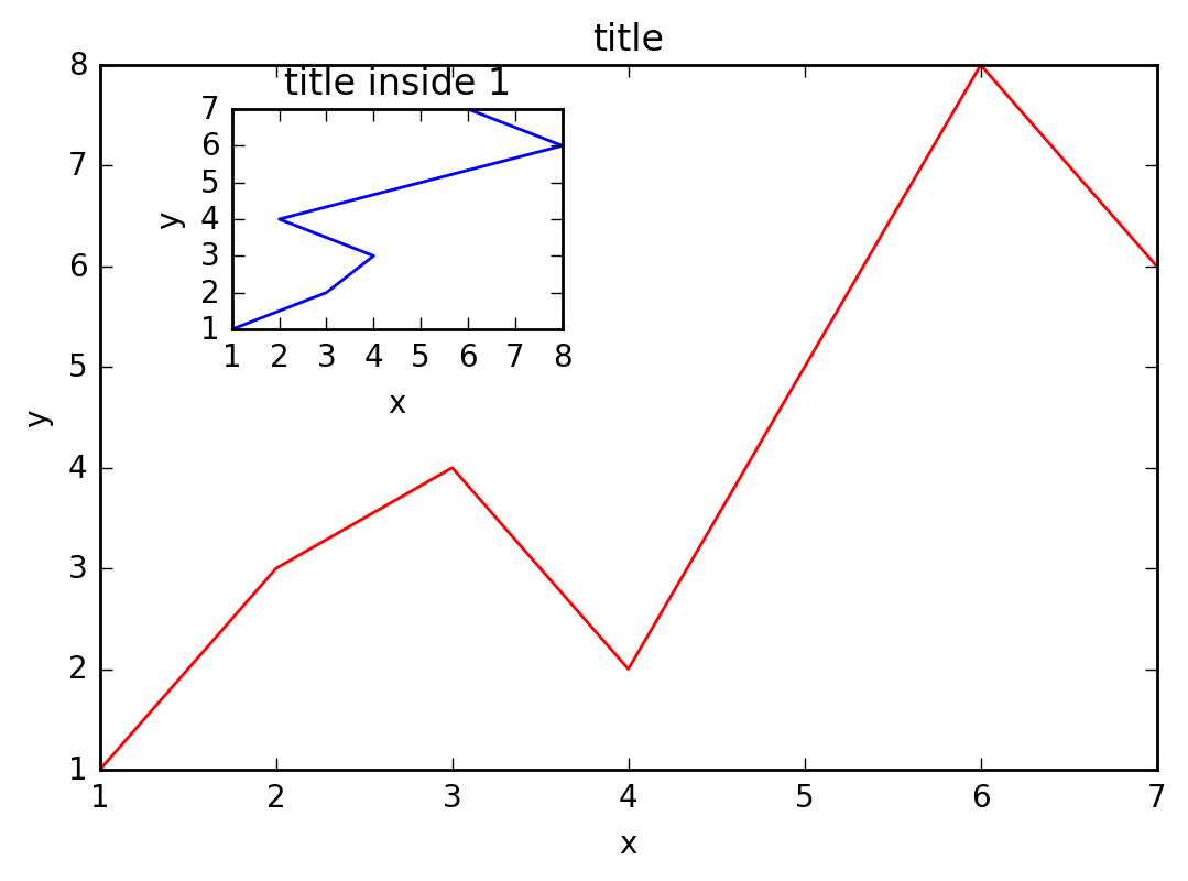
plt.axes([0.6, 0.2, 0.25, 0.25])
plt.plot(y[::-1], x, 'g') # 注意对y进行了逆序处理
plt.xlabel('x')
plt.ylabel('y')
plt.title('title inside 2')
plt.show()
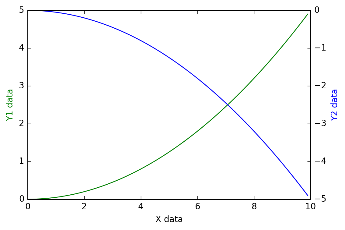
主次坐标轴
- 第一个y坐标
- 第二个y坐标
第一个y坐标:
import matplotlib.pyplot as plt
import numpy as np

x = np.arange(0, 10, 0.1)

y1 = 0.05 * x**2

y2 = -1 * y1

fig, ax1 = plt.subplots()
第二个y坐标:
ax2 = ax1.twinx()

ax1.plot(x, y1, 'g-')   # green, solid line

ax1.set_xlabel('X data')

ax1.set_ylabel('Y1 data', color='g')

ax2.plot(x, y2, 'b-') # blue

ax2.set_ylabel('Y2 data', color='b')

plt.show()
Animation 动画
- 定义方程
- 参数设置
定义方程:
from matplotlib import pyplot as plt
from matplotlib import animation
import numpy as np
fig, ax = plt.subplots()

x = np.arange(0, 2*np.pi, 0.01)
line, = ax.plot(x, np.sin(x))
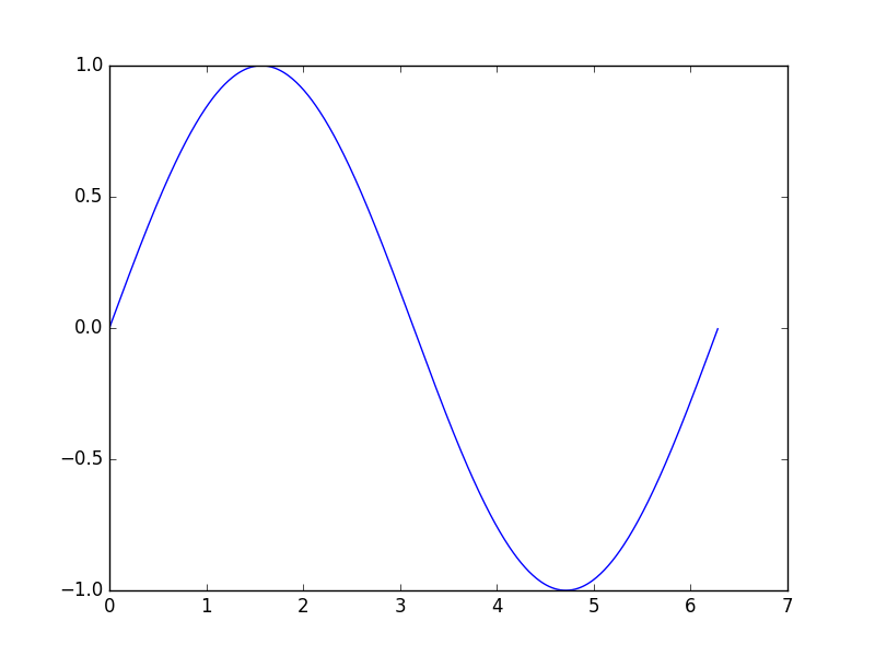
def animate(i):
    line.set_ydata(np.sin(x + i/10.0))
    return line,

def init():
    line.set_ydata(np.sin(x))
    return line,
参数设置:
ani = animation.FuncAnimation(fig=fig,
                              func=animate,
                              frames=100,
                              init_func=init,
                              interval=20,
                              blit=False)

plt.show()

ani.save('basic_animation.mp4', fps=30, extra_args=['-vcodec', 'libx264'])
再次感谢莫烦python