文章目录
一、seaborn概述
Seaborn是在matplotlib的基础上进行了更高级的API封装,从而使得作图更加容易,在大多数情况下使用seaborn就能做出很具有吸引力的图。详情请查阅官网:seaborn
二、数据整理
import seaborn as sns
import numpy as np
import matplotlib as mpl
from matplotlib import pyplot as plt
import pandas as pd
from datetime import datetime,timedelta
%matplotlib inline
plt.rcParams['font.sans-serif']=['SimHei'] # 用来正常显示中文标签
plt.rcParams['axes.unicode_minus']=False # 用来正常显示负号
from datetime import datetime
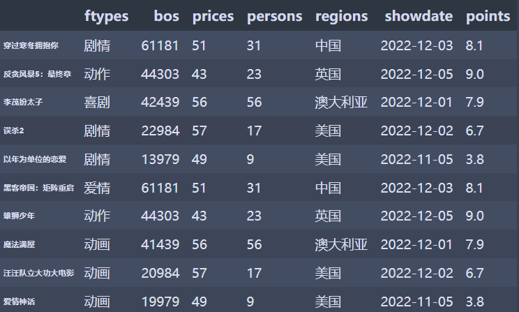
films=['穿过寒冬拥抱你','反贪风暴5:最终章','李茂扮太子','误杀2','以年为单位的恋爱','黑客帝国:矩阵重启','雄狮少年','魔法满屋','汪汪队立大功大电影','爱情神话']
regions=['中国','英国','澳大利亚','美国','美国','中国','英国','澳大利亚','美国','美国']
bos=['61,181','44,303','42,439','22,984','13,979','61,181','44,303','41,439','20,984','19,979']
persons=['31','23','56','17','9','31','23','56','17','9']
prices=['51','43','56','57','49','51','43','56','57','49']
showdate=['2022-12-03','2022-12-05','2022-12-01','2022-12-02','2022-11-05','2022-12-03','2022-12-05','2022-12-01','2022-12-02','2022-11-05']
ftypes=['剧情','动作','喜剧','剧情','剧情','爱情','动作','动画','动画','动画']
points=['8.1','9.0','7.9','6.7','3.8','8.1','9.0','7.9','6.7','3.8']
filmdescript={


    'ftypes':ftypes,
    'bos':bos,
    'prices':prices,
    'persons':persons,
    'regions':regions,
    'showdate':showdate,
    'points':points
}
import numpy as np
import pandas as pd
cnbo2021top5=pd.DataFrame(filmdescript,index=films)
cnbo2021top5[['prices','persons']]=cnbo2021top5[['prices','persons']].astype(int)
cnbo2021top5['bos']=cnbo2021top5['bos'].str.replace(',','').astype(int)
cnbo2021top5['showdate']=cnbo2021top5['showdate'].astype('datetime64')
cnbo2021top5['points']=cnbo2021top5['points'].apply(lambda x:float(x) if x!='' else 0)
cnbo2021top5
# 常用调色盘
r_hex = '#dc2624'     # red,       RGB = 220,38,36
dt_hex = '#2b4750'    # dark teal, RGB = 43,71,80
tl_hex = '#45a0a2'    # teal,      RGB = 69,160,162
r1_hex = '#e87a59'    # red,       RGB = 232,122,89
tl1_hex = '#7dcaa9'   # teal,      RGB = 125,202,169
g_hex = '#649E7D'     # green,     RGB = 100,158,125
o_hex = '#dc8018'     # orange,    RGB = 220,128,24
tn_hex = '#C89F91'    # tan,       RGB = 200,159,145
g50_hex = '#6c6d6c'   # grey-50,   RGB = 108,109,108
bg_hex = '#4f6268'    # blue grey, RGB = 79,98,104
g25_hex = '#c7cccf'   # grey-25,   RGB = 199,204,207
color=['#dc2624' ,'#2b4750','#45a0a2','#e87a59','#7dcaa9','#649E7D','#dc8018','#C89F91','#6c6d6c','#4f6268','#c7cccf']
sns.set_palette(color)
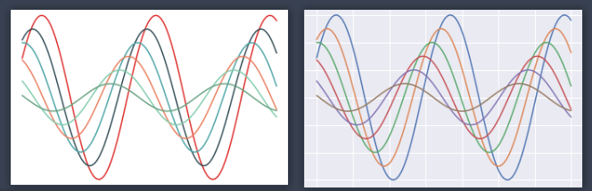
01 折线图
def sinplot(flip=1):
    x = np.linspace(0, 14, 100)
    for i in range(1, 7):
        plt.plot(x, np.sin(x + i * .5) * (7 - i) * flip)
sinplot()
# 对两种画图进行比较
fig = plt.figure()
sns.set()
sinplot()
plt.rcParams['font.sans-serif']=['SimHei'] # 用来正常显示中文标签
plt.rcParams['axes.unicode_minus']=False # 用来正常显示负号
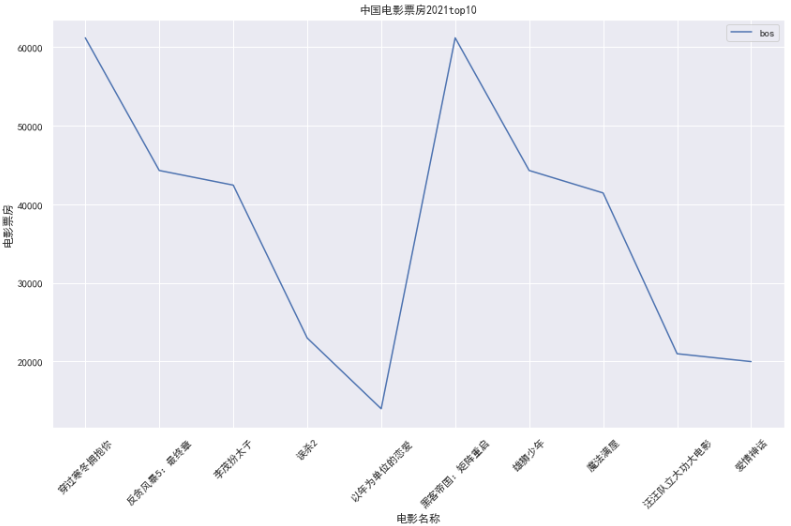
plt.figure(figsize=(14,8))
plt.title("中国电影票房2021top10")
plt.xlabel("电影名称")
plt.ylabel("电影票房")
sns.lineplot(data=cnbo2021top5[['bos']])
plt.xticks(rotation=45)
02 柱形图
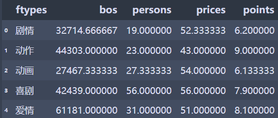
cnbo2021top5ftgb=cnbo2021top5.groupby(['ftypes'])['bos','persons','prices','points'].mean()
cnbo2021top5ftgb=cnbo2021top5ftgb.reset_index().replace()
cnbo2021top5ftgb
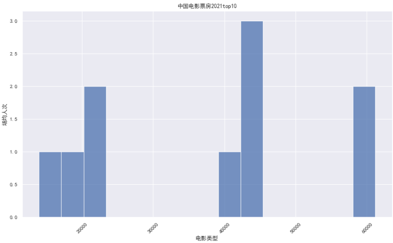
### 02 条形图
plt.figure(figsize=(14,8))
plt.title("中国电影票房2021top10")
sns.barplot(x=cnbo2021top5ftgb['ftypes'],y=cnbo2021top5ftgb['persons'])
plt.xlabel("电影类型")
plt.ylabel("场均人次")
plt.xticks(rotation=45)
plt.show()

03 直方图
### 03 直方图
plt.figure(figsize=(14,8))
plt.title("中国电影票房2021top10")
sns.histplot(x=cnbo2021top5['bos'],bins=15) # x=cnbo2021top5ftgb['ftypes'],y=cnbo2021top5ftgb['persons']
plt.xlabel("电影类型")
plt.ylabel("场均人次")
plt.xticks(rotation=45)
plt.show()
三、绘图
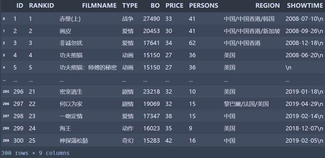
上面的数据只有十部电影,而下面的数据是我整理出来的电影数据:
扫描二维码关注公众号,回复:
13753831 查看本文章

import pandas as pd
cnboo=pd.read_excel("cnboNPPD1.xlsx")
cnboo
01 设定调色盘
# 设定调色盘
sns.set_palette(color)
sns.palplot(sns.color_palette(color,11)) # 表示11种颜色

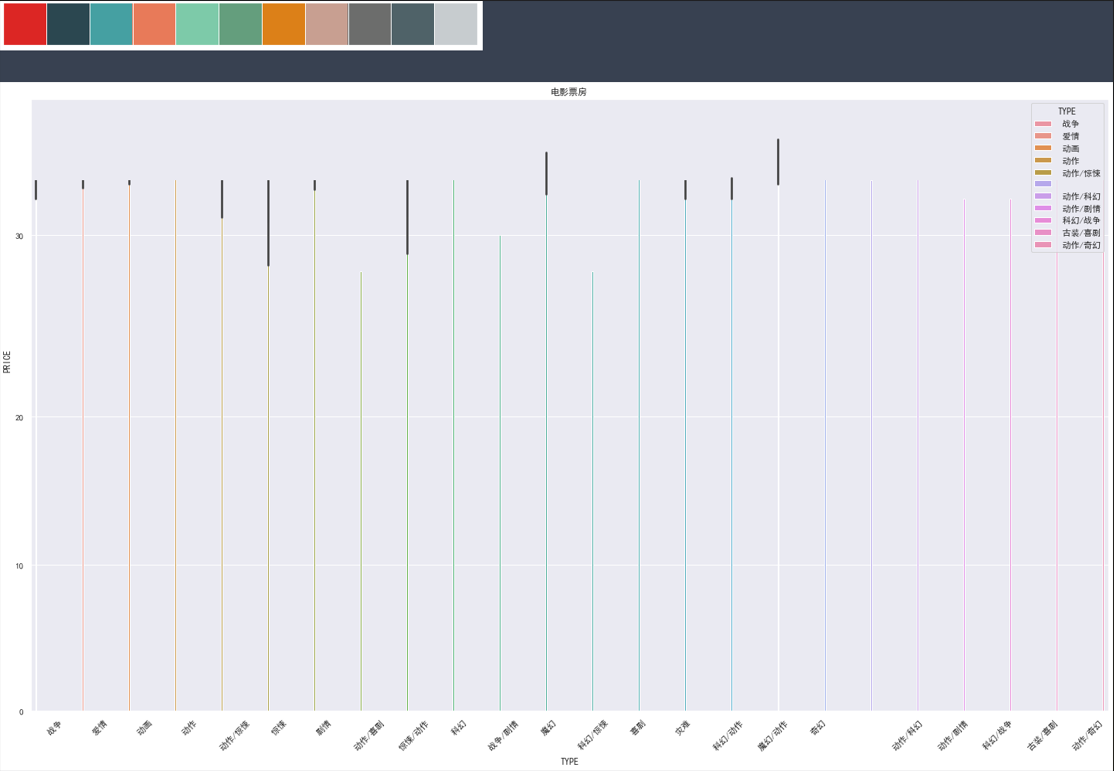
02 柱状图
sns.set_palette(color)
sns.palplot(sns.color_palette(color,11))
plt.figure(figsize=(25,20))
plt.title('电影票房')
plt.xticks(rotation=45)
sns.barplot(x='TYPE',
            y='PRICE',
            hue='TYPE',
            data=cnboo)
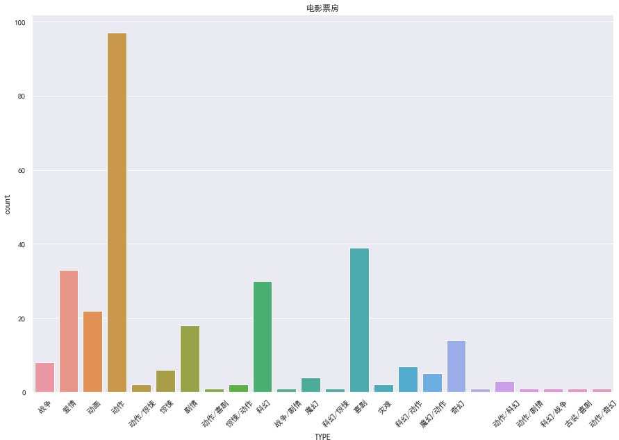
03 技术图
sns.set_palette(color)
sns.palplot(sns.color_palette(color,11))
plt.figure(figsize=(15,10))
plt.title('电影票房')
plt.xticks(rotation=45)
sns.countplot(x='TYPE',data=cnboo)
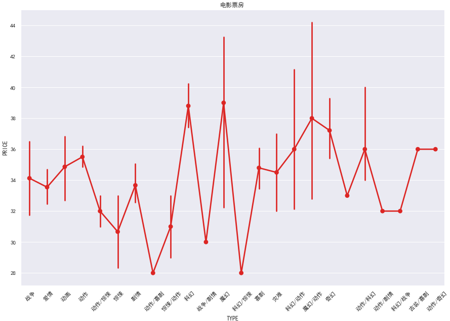
04 点图
sns.set_palette(color)
sns.palplot(sns.color_palette(color,11))
plt.figure(figsize=(15,10))
plt.title('电影票房')
plt.xticks(rotation=45)
sns.pointplot(x='TYPE',y='PRICE',data=cnboo)
plt.show()
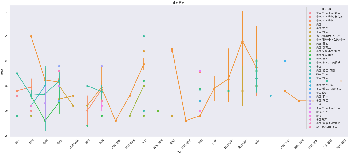
sns.set_palette(color)
sns.palplot(sns.color_palette(color,11))
plt.figure(figsize=(25,10))
plt.title('电影票房')
plt.xticks(rotation=45)
sns.pointplot(x='TYPE',y='PRICE',hue='REGION',data=cnboo)
plt.show()
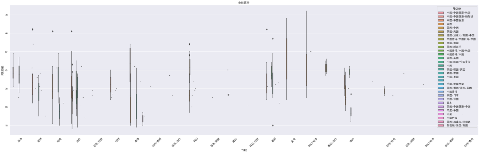
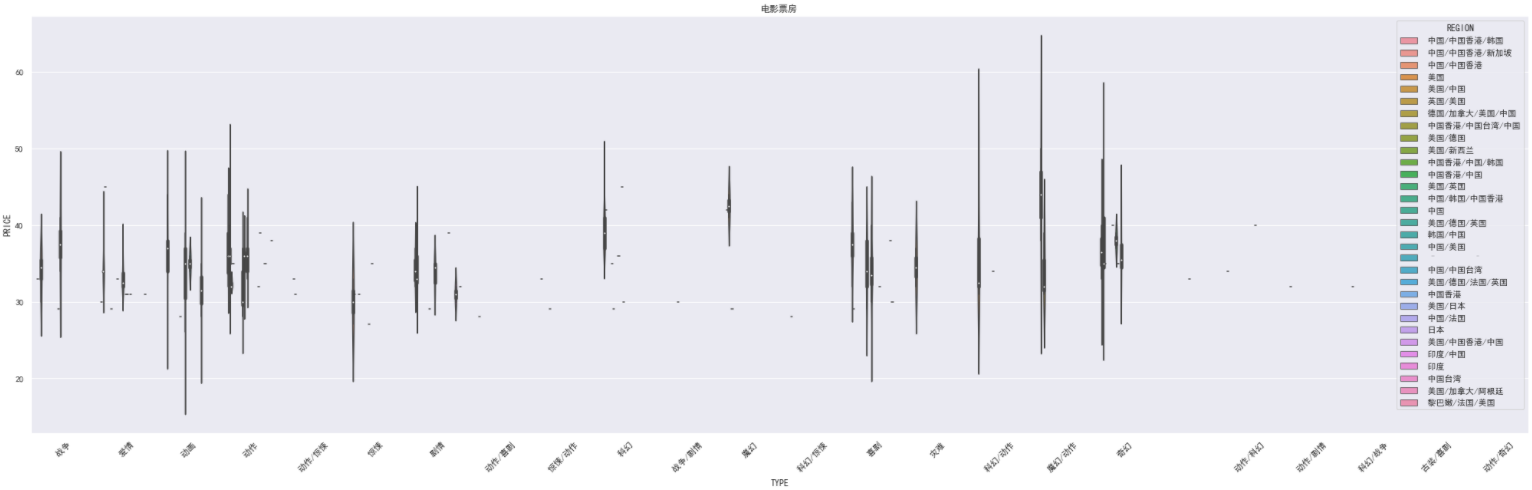
05 箱型图
### 05 箱型图
sns.set_palette(color)
sns.palplot(sns.color_palette(color,11))
plt.figure(figsize=(35,10))
plt.title('电影票房')
plt.xticks(rotation=45)
sns.boxplot(x='TYPE',y='PERSONS',hue='REGION',data=cnboo) # ,markers=['^','o'],linestyles=['-','--']
plt.show()
# 图中的单个点代表在此数据当中的异常值
06 小提琴图
### 06 小提琴图
sns.set_palette(color)
sns.palplot(sns.color_palette(color,11))
plt.figure(figsize=(35,10))
plt.title('电影票房')
plt.xticks(rotation=45)
sns.violinplot(x='TYPE',y='PRICE',hue='REGION',data=cnboo) # ,markers=['^','o'],linestyles=['-','--']
plt.show()
绘制横着的小提琴图:
sns.set_palette(color)
sns.palplot(sns.color_palette(color,11))
plt.figure(figsize=(35,10))
plt.title('电影票房')
plt.xticks(rotation=45)
sns.violinplot(x='PERSONS',y='PRICE',hue='REGION',data=cnboo,orient='h')
plt.show()

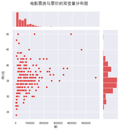
07 双变量分布图
sns.set_palette(color)
plt.figure(figsize=(15,7))
# plt.xticks(rotation=45)
sns.jointplot(x='BO',y='PRICE',data=cnboo).fig.suptitle("电影票房与票价的双变量分布图",va='top',y=1.05)
plt.show()
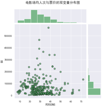
sns.set_palette(color)
plt.figure(figsize=(15,7))
# plt.xticks(rotation=45)
snsfig=sns.jointplot(x='PERSONS',y='BO',data=cnboo,color='g',s=50,edgecolor='black',linewidth=1,alpha=0.7,space=0.1,kind='scatter',height=6,ratio=5,marginal_kws=dict(bins=10,rug=True))
snsfig.fig.suptitle("电影场均人次与票价的双变量分布图",va='top',y=1.05)
plt.show()
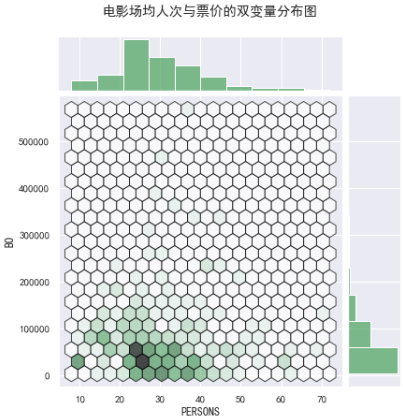
sns.set_palette(color)
plt.figure(figsize=(15,7))
# plt.xticks(rotation=45)
snsfig=sns.jointplot(x='PERSONS',y='BO',
data=cnboo,color='g',
edgecolor='black',linewidth=1,alpha=0.7,
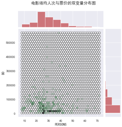
space=0.1,kind='hex',height=6,joint_kws=dict(gridsize=20), # gridsize越小,网格越大
ratio=5,marginal_kws=dict(bins=10,rug=True)) #bins=10:表示分成10个柱
snsfig.fig.suptitle("电影场均人次与票价的双变量分布图",va='top',y=1.05)
plt.show()

sns.set_palette(color)
plt.figure(figsize=(15,7))
snsfig=sns.jointplot(x='PERSONS',y='BO',
                     data=cnboo,color='g',
                     edgecolor='black',linewidth=1,alpha=0.7,
                     space=0.1,kind='hex',height=6,joint_kws=dict(gridsize=40), # gridsize越小,网格越大
                     ratio=5,marginal_kws=dict(bins=10,rug=True,color='r',hist_kws={

    'edgecolor':'b'})) #bins=10:表示分成10个柱 ,且这里的color控制柱形图的颜色
snsfig.fig.suptitle("电影场均人次与票价的双变量分布图",va='top',y=1.05)
plt.show()
sns.set_palette(color)
plt.figure(figsize=(15,7))
# plt.xticks(rotation=45)
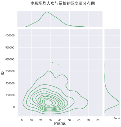
snsfig=sns.jointplot(x='PERSONS',y='BO',
data=cnboo,color='g',
# edgecolor='black',linewidth=1,alpha=0.7,
space=0.1,kind='kde', joint_kws=dict(gridsize=40), # gridsize越小,网格越大
ratio=5,) #bins=10:表示分成10个柱 ,且这里的color控制柱形图的颜色
snsfig.fig.suptitle("电影场均人次与票价的双变量分布图",va='top',y=1.05)
plt.show()
08 其余图形展示
sns.set_palette(color)
plt.figure(figsize=(15,7))
snsfig=sns.jointplot(x='PERSONS',y='BO',
                     data=cnboo,color='g',
                     space=0.1,kind='kde', joint_kws=dict(gridsize=40), # gridsize越小,网格越大
                     ratio=5,) #bins=10:表示分成10个柱 ,且这里的color控制柱形图的颜色
snsfig.fig.suptitle("电影场均人次与票价的双变量分布图",va='top',y=1.05)
snsfig.plot_joint(plt.scatter,c='r',s=20,linewidth=1,marker=".")
plt.show()

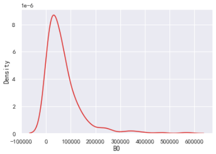
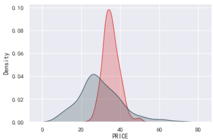
sns.kdeplot(cnboo['BO'])
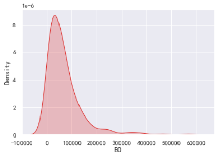
sns.kdeplot(cnboo['BO'],shade=True) # 填充阴影
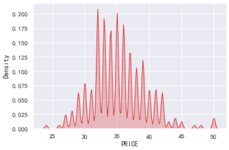
sns.kdeplot(cnboo['PRICE'],shade=True,bw=.05) # 核密度区间的设置
sns.kdeplot(cnboo['PRICE'],shade=True);
sns.kdeplot(cnboo['PERSONS'],shade=True);
sns.jointplot(x=cnboo['PERSONS'],y=cnboo['PRICE'],kind='kde',color="grey",space=0)
y1=cnboo['BO']
y2=cnboo['PRICE']
y3=cnboo['PERSONS']
from scipy.stats import gamma
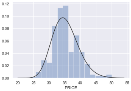
sns.distplot(y2,kde=False,fit=stats.gamma)
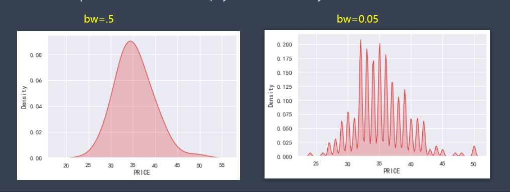
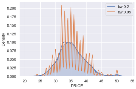
sns.kdeplot(y2,shade=True)
sns.kdeplot(y2,bw=0.2,label="bw:0.2");
sns.kdeplot(y2,bw=0.05,label="bw:0.05");
plt.legend()
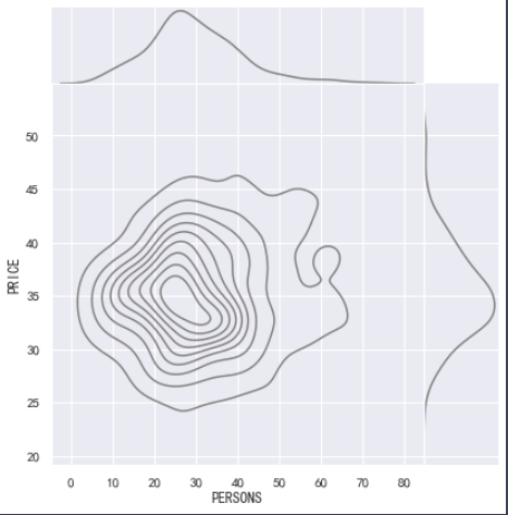
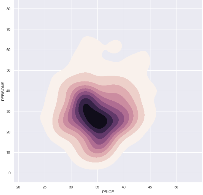
f,ax=plt.subplots(figsize=(10,10))
cmap=sns.cubehelix_palette(as_cmap=True,dark=0,light=1,reverse=False)
sns.kdeplot(y2,y3,cmap=cmap,n_level=20,shade=True)
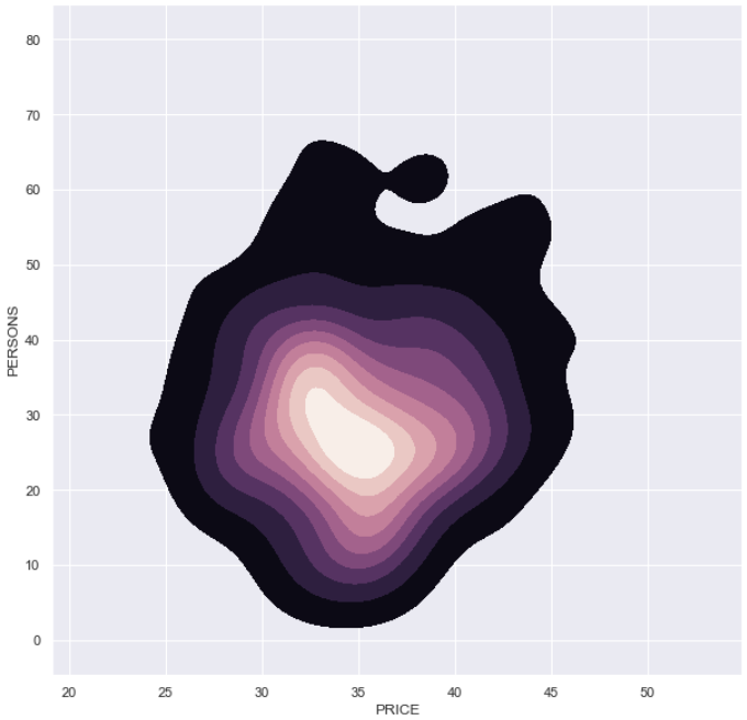
f,ax=plt.subplots(figsize=(10,10))
cmap=sns.cubehelix_palette(as_cmap=True,dark=0,light=1,reverse=True)
sns.kdeplot(y2,y3,cmap=cmap,n_level=20,shade=True)
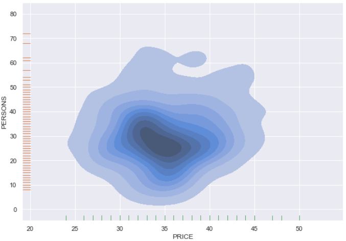
f,ax=plt.subplots(figsize=(10,7))
sns.kdeplot(y2,y3,shade=True,ax=ax)
sns.rugplot(y3,vertical=True,ax=ax)
sns.rugplot(y2,color='g',ax=ax)
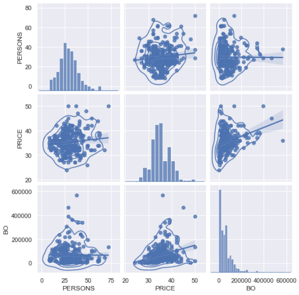
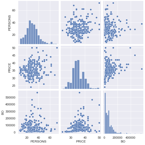
snspairdf=cnboo[['PERSONS','PRICE','BO']]
sns.pairplot(snspairdf)
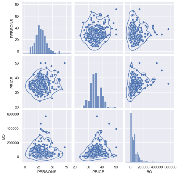
g=sns.pairplot(snspairdf)
g.map_diag(sns.kdeplot)
g.map_offdiag(sns.kdeplot,cmpap='Blues_d',n_levels=6)
g=sns.pairplot(snspairdf,kind='reg')
g.map_diag(sns.kdeplot)
g.map_offdiag(sns.kdeplot,cmpap='Blues_d',n_levels=6)