程序示例--多项式回归
下面,我们有一组温度(temperature)和实验产出量(yield)训练样本,该数据由博客 Polynomial Regression Examples 所提供:
| temperature | yield |
|---|---|
| 50 | 3.3 |
| 50 | 2.8 |
| 50 | 2.9 |
| 70 | 2.3 |
| 70 | 2.6 |
| 70 | 2.1 |
| 80 | 2.5 |
| 80 | 2.9 |
| 80 | 2.4 |
| 90 | 3.0 |
| 90 | 3.1 |
| 90 | 2.8 |
| 100 | 3.3 |
| 100 | 3.5 |
| 100 | 3.0 |
我们先通过如下预测函数进行训练:
![]()
# coding: utf-8
# linear_regression/test_temperature_normal.py
import regression
from matplotlib import cm
from mpl_toolkits.mplot3d import axes3d
import matplotlib.pyplot as plt
import matplotlib.ticker as mtick
import numpy as np

if __name__ == "__main__":
    X, y = regression.loadDataSet('data/temperature.txt');

    m,n = X.shape
    X = np.concatenate((np.ones((m,1)), X), axis=1)

    rate = 0.0001
    maxLoop = 1000
    epsilon =0.01

    result, timeConsumed = regression.bgd(rate, maxLoop, epsilon, X, y)

    theta, errors, thetas = result

    # 绘制拟合曲线
    fittingFig = plt.figure()
    title = 'bgd: rate=%.3f, maxLoop=%d, epsilon=%.3f \n time: %ds'%(rate,maxLoop,epsilon,timeConsumed)
    ax = fittingFig.add_subplot(111, title=title)
    trainingSet = ax.scatter(X[:, 1].flatten().A[0], y[:,0].flatten().A[0])

    xCopy = X.copy()
    xCopy.sort(0)
    yHat = xCopy*theta
    fittingLine, = ax.plot(xCopy[:,1], yHat, color='g')

    ax.set_xlabel('temperature')
    ax.set_ylabel('yield')

    plt.legend([trainingSet, fittingLine], ['Training Set', 'Linear Regression'])
    plt.show()

    # 绘制误差曲线
    errorsFig = plt.figure()
    ax = errorsFig.add_subplot(111)
    ax.yaxis.set_major_formatter(mtick.FormatStrFormatter('%.4f'))

    ax.plot(range(len(errors)), errors)
    ax.set_xlabel('Number of iterations')
    ax.set_ylabel('Cost J')

    plt.show()
得到的拟合图像为:

接下来,我们使用了多项式回归,添加了 2 阶项:
![]()
# coding: utf-8
# linear_regression/test_temperature_polynomial.py
import regression
import matplotlib.pyplot as plt
import matplotlib.ticker as mtick
import numpy as np
if __name__ == "__main__":
srcX, y = regression.loadDataSet('data/temperature.txt');
m,n = srcX.shape
srcX = np.concatenate((srcX[:, 0], np.power(srcX[:, 0],2)), axis=1)
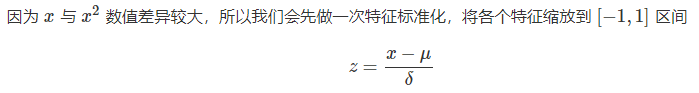
# 特征缩放
X = regression.standardize(srcX.copy())
X = np.concatenate((np.ones((m,1)), X), axis=1)
rate = 0.1
maxLoop = 1000
epsilon = 0.01
result, timeConsumed = regression.bgd(rate, maxLoop, epsilon, X, y)
theta, errors, thetas = result
# 打印特征点
fittingFig = plt.figure()
title = 'polynomial with bgd: rate=%.2f, maxLoop=%d, epsilon=%.3f \n time: %ds'%(rate,maxLoop,epsilon,timeConsumed)
ax = fittingFig.add_subplot(111, title=title)
trainingSet = ax.scatter(srcX[:, 1].flatten().A[0], y[:,0].flatten().A[0])
print theta
# 打印拟合曲线
xx = np.linspace(50,100,50)
xx2 = np.power(xx,2)
yHat = []
for i in range(50):
normalizedSize = (xx[i]-xx.mean())/xx.std(0)
normalizedSize2 = (xx2[i]-xx2.mean())/xx2.std(0)
x = np.matrix([[1,normalizedSize, normalizedSize2]])
yHat.append(regression.h(theta, x.T))
fittingLine, = ax.plot(xx, yHat, color='g')
ax.set_xlabel('Yield')
ax.set_ylabel('temperature')
plt.legend([trainingSet, fittingLine], ['Training Set', 'Polynomial Regression'])
plt.show()
# 打印误差曲线
errorsFig = plt.figure()
ax = errorsFig.add_subplot(111)
ax.yaxis.set_major_formatter(mtick.FormatStrFormatter('%.2e'))
ax.plot(range(len(errors)), errors)
ax.set_xlabel('Number of iterations')
ax.set_ylabel('Cost J')
plt.show()得到的拟合曲线更加准确:
