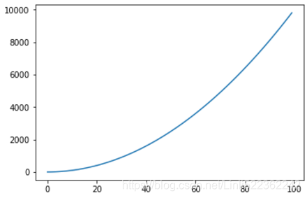
In [1]: import matplotlib.pyplot as plt
In [2]: X = range(100)
list(X)[:5]
Out[2]: [0, 1, 2, 3, 4]
In [3]: Y=[value **2 for value in X]
Y[:5]
Out[3]: [0, 1, 4, 9, 16]
In [15]: plt.plot(X,Y)
Out[15]: # if not plt.show()
[<matplotlib.lines.Line2D at 0x5219b00>]

In [13]: plt.plot(X,Y)
plt.show()
Out[13]:
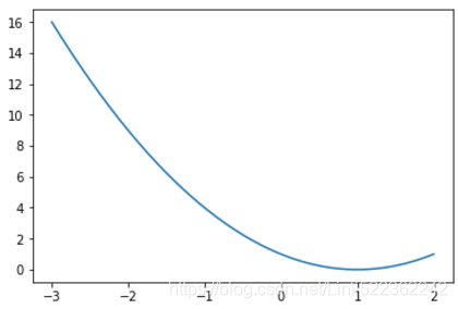
In [29]: import numpy as np
import matplotlib.pyplot as plt
In [30]: XList = np.linspace(-3,2,200)
YList = XList**2 - 2*XList +1 #ploting Y= X^2 - 2X -1
In [31]: plt.plot(XList, YList)
plt.show()
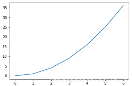
In [49]: import matplotlib.pyplot as plt
In [54]: XList, YList=[], []
for line in open('my_data.txt', 'r'):
values =[float(v) for v in line.split()]
XList.append(values[0]) #x-axis
YList.append(values[1]) #y-axis
In [55]: plt.plot(XList, YList)
plt.show()
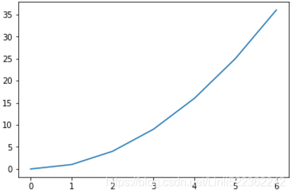
In [56]: import matplotlib.pyplot as plt
In [57]: with open('my_data.txt', 'r') as f:
X,Y= zip(*[
[ float(s) for s in line.split() ] for line in f
])#2D-list, each element is a list in this 2D-list
In [58]: plt.plot(X,Y)
plt.show()
In [59]: import matplotlib.pyplot as plt
import numpy as np
In [60]: data = np.loadtxt('my_data.txt') #return 2D array or called full-blown matrices
In [61]: plt.plot(data[:,0], data[:,1])
#0-->columnIndex-->X- axis, 1-->columnIndex --> Y-axis
plt.show()
##################################
'my_data.txt'
0 0 6
1 1 5
2 4 4
4 16 3
5 25 2
6 36 1
##################################
In [62]: import numpy as np
import matplotlib.pyplot as plt
In [63]: data = np.loadtxt('my_data.txt')
data.T
Out[63]: array([[ 0., 1., 2., 4., 5., 6.],
[ 0., 1., 4., 16., 25., 36.],
[ 6., 5., 4., 3., 2., 1.]])
In [67]: for columnList in data.T[1:]: #excluding data.T[0]
plt.plot(data[:,0], columnList) # the len(columnList) == the number of curves
plt.show()
In [68]: data
Out[68]: array([[ 0., 0., 6.], [ 1., 1., 5.], [ 2., 4., 4.], [ 4., 16., 3.], [ 5., 25., 2.], [ 6., 36., 1.]])
#######################################################################
cp2_customizing the Color and Styles
1 Alias Colors
- b Blue
- g Green
- r Red
- c Cyan m Magenta
- y Yellow
- k Black
- w White
1.0.1 Gray-level strings: matplotlib will interpret a string representation of a floating point- value as a shade of gray, such as 0.75 for a medium light gray.
In [1]: import numpy as np
import matplotlib.pyplot as plt
In [2]: #Gaussian Distribution
#Probability density function
def pdf(X, mu, sigma):
a = 1./(sigma*np.sqrt(2.*np.pi))
b =-1./(2* sigma**2)
return a * np.exp(b* (X-mu)**2 ) #f(x)
In [3]: X = np.linspace(-6,6,1000)
for i in range(5):
#generates five sets of 50 samples from a normal distribution
samples = np.random.standard_normal(50)
mu, sigma = np.mean(samples), np.std(samples)
#For each of the 5 sets, we plot the estimated probability density in light gray
plt.plot(X, pdf(X, mu, sigma), color='0.75')
plt.plot(X, pdf(X,0., 1.), color='k')# standard normal distribution(mean=0,stdev=1)
plt.show()

In [6]: samples=np.random.standard_normal(50)
samples.shape
Out[6]: (50L,)
In [7]: mu, sigma = np.mean(samples), np.std(samples)
mu,sigma
Out[7]: (-0.20688694794049467, 0.8455170647061793)
Controlling a line pattern and thickness
# In[20]:
import numpy as np
import matplotlib.pyplot as plt
# ### Normal Distribution~(mean,Variance)=(0,1)
# #### Gaussians Probability Density Functions~(mean,Variance)=(u,sigma**2 )
# In[21]:
#Gaussians PDF
def pdf(X, mu, sigma):
a=1./( sigma * np.sqrt(2. * np.pi))
b=-1./( 2. * sigma **2)
return a*np.exp(b*(X-mu)**2)
# In[22]:
X = np.linspace(-6,6,1024)
# In[23]:
plt.plot(X, pdf(X, 0., 1.), color='k', linestyle='solid')
plt.plot(X, pdf(X, 0., .5), color='k', linestyle='dashed')
plt.plot(X, pdf(X, 0., .25), color='k', linestyle='dashdot')
plt.show()
The line width
# In[62]:
import numpy as np
import matplotlib.pyplot as plt
# In[65]:
def pdf(X, mu, sigma):
a = 1./(sigma*np.sqrt(2. * np.pi))
b= -1./(2.* sigma**2)
return a*np.exp(b* (X-mu)**2)
# In[69]:
X = np.linspace(-6,6,1024)
for i in range(64):
samples = np.random.standard_normal(50)
mu, sigma = np.mean(samples), np.std(samples)
plt.plot(X, pdf(X, mu, sigma), color='.75', linewidth=0.5)
plt.plot(X, pdf(X,0,1), color='k', linewidth=3.) #u =0, std.dev=1 ~ standard normal distribution
plt.show()

markevery=32 will plot every 32th marker starting from the first data point
# In[104]:
import numpy as np
import matplotlib.pyplot as plt
# In[100]:
X = np.linspace(-6,6,1024)
Y1 = np.sinc(X) #The sinc function is sin(pi x)/(pi x).
Y2= np.sinc(X)+1
Y2
# In[103]:
plt.plot(X,Y1, marker='o', color='.75')
#markevery=32 will plot every 32th marker starting from the first data point
plt.plot(X,Y2, marker='o', color='k', markevery=32)
plt.show()

# In[117]:
import numpy as np
import matplotlib.pyplot as plt
# In[118]:
X = np.linspace(-6,6,1024)
Y = np.sinc(X)
# In[120]:
plt.plot(X,Y,
linewidth=3.,
color='k',
markersize=9,
markeredgewidth=3.5,
markerfacecolor='.75',
markeredgecolor='k',
marker='o',
markevery=32)
plt.show()

# In[121]:
import numpy as np
import matplotlib as mpl
from matplotlib import pyplot as plt
# In[173]:
mpl.rc('lines', linewidth=5)
mpl.rc('axes', facecolor='y', edgecolor='w')
mpl.rc('xtick', color='m')
mpl.rc('ytick', color='m')
mpl.rc('text', color='m')
mpl.rc('figure', facecolor='r', edgecolor='y')
#mpl.rc('axes', color_cycle = ('w', '.5', '.75'))
# In[172]:
X = np.linspace(0,7,1024)
# In[170]:
plt.plot(X, np.sin(X))
plt.plot(X, np.cos(X))
plt.show()

If a matplotlibrc file is found in your current directory (that is, the directory from where you launched your script from), it will override matplotlib's default settings. You can also save your matplotlibrc file in a specific location to make your own default settings. In the interactive Python shell, run the following command: import matplotlib mpl.get_configdir() This command will display the location where you can place your matplotlibrc file so that those settings will be your own default settings.