这个案例跟我上一次发布的文章案例——旋转木马相册比较像,但更简单一点,用不到translate,只需要用rotate,而且不分x轴,Y轴,z轴。案例效果图如下:
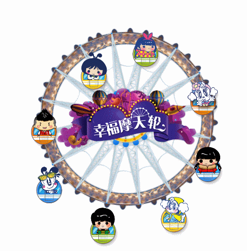
分析:摩天轮和中间的标题是两张导入的图片。它们都是定位到游览器的正中央,摩天轮图片我用的是固定定位,这样就可以避免产生竖向滚动条了。其它的用绝对定位就行。所有的娃娃是在同一个div里面,div的宽高跟摩天轮的图片一样。section的宽高也是一样。
html样式
<section>
    <img src="images/fsw.png" alt="">
    <img src="images/big-title.png" alt="">
</section>
<div>
    <img src="images/boy.png" alt="">
    <img src="images/girl.png" alt="">
    <img src="images/girls.png" alt="">
    <img src="images/hairboy.png" alt="">
    <img src="images/mimi.png" alt="">
    <img src="images/dog.png" alt="">
    <img src="images/mudog.png" alt="">
    <img src="images/shamegirl.png" alt="">
</div>
css样式
重置样式
        *{
            margin:0;padding:0;
        }
        body,html{
            height:100%;
        }
        img{
            display: block;
        }
难点:怎么让娃娃的头一直朝上转动?要做到两点,改变娃娃的旋转原点,和反方向转动。所有元素的转动要保持同频率
    section{
        width: 768px;
        height: 768px;
        background: url(images/fsw.png) no-repeat center;
        position:fixed;
        left: 0;right: 0;
        top: 0;bottom: 0;
        margin: auto;
        animation:rotate-circle 10s infinite linear;
    }
    section img:nth-child(2){
        position: absolute;
        left: 0;right: 0;
        top: 0;bottom: 0;
        margin: auto;
        animation:yuanxin 10s infinite linear;
    }
    div{
        width: 768px;
        height: 768px;
        position: fixed;
        left:0;right: 0;
        top: 0;bottom: 0;
        margin: auto;
        animation:rotate-circle 10s infinite linear;
    }
    div img{
        position: absolute;
        animation:divimg 10s infinite linear reverse;
        transform-origin:50% 0;
    }
    div img:nth-child(1){
        left:325px;top:9px;
    }
    div img:nth-child(2){
        left:-30px;top:350px;
    }
    div img:nth-child(3){
        left:325px;bottom:-150px;
    }
    div img:nth-child(4){
        right:-17px;top:350px;
    }
    div img:nth-child(5){
        left:54px;top:120px;
    }
    div img:nth-child(6){
        right:54px;top:120px;
    }
    div img:nth-child(7){
        left:54px;top:606px;
    }
    div img:nth-child(8){
        right:128px;top:620px;
    }
    @keyframes rotate-circle{
        0%{transform:rotate(0);}
        50%{transform: rotate(180deg);}
        100%{transform:rotate(360deg);}
    }
    @keyframes yuanxin{
        0%{transform:rotate(0);}
        50%{transform:rotate(-180deg);}
        100%{transform:rotate(-360deg);}
    }
    @keyframes divimg{
        0%{transform:rotate(0);}
        50%{transform: rotate(180deg);}
        100%{transform:rotate(360deg);}
    }
```