今天做项目,无意看到个摩天轮效果,甚是有意思,决定自己来做做。原效果是JS 写的,我懒得用JS,就用 CSS3 写一个。那么多美女围绕着转,开心的要死,所以放了个单纯的小男孩在中间代表我的心情~
效果动图如下:
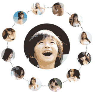
旋转的图片想做都少都无所谓,我这里做12个。
主要的原理就是利用了 CSS3 的 transform 的位移 和 旋转变形,以及帧动画。
HTML结构
12张图,就用一个 ul 结合 12 个 li 来做。注意,这里有 span 标签,后面有用~!
<div class="box">
    <ul>
        <li><span><img src="../images/3d/1.jpg" alt=""></span></li>
        <li><span><img src="../images/3d/2.jpg" alt=""></span></li>
        <li><span><img src="../images/3d/3.jpg" alt=""></span></li>
        <li><span><img src="../images/3d/4.jpg" alt=""></span></li>
        <li><span><img src="../images/3d/5.jpg" alt=""></span></li>
        <li><span><img src="../images/3d/6.jpg" alt=""></span></li>
        <li><span><img src="../images/3d/7.jpg" alt=""></span></li>
        <li><span><img src="../images/3d/8.jpg" alt=""></span></li>
        <li><span><img src="../images/3d/9.jpg" alt=""></span></li>
        <li><span><img src="../images/3d/10.jpg" alt=""></span></li>
        <li><span><img src="../images/3d/11.jpg" alt=""></span></li>
        <li><span><img src="../images/3d/12.jpg" alt=""></span></li>
    </ul>
</div>
样式分析
1、box 的大小任意,但是一定是一个正方形。
让它相对定位,是因为 li 的位置需要任意摆放,li 肯定是绝对定位的,那么 box 就必须相对定位。
.box{
  width: 400px;
  height: 400px;
  margin-left: auto;
  margin-right: auto;
  position: relative;
  margin-top: 10px;
}
ul 是一个宽高略小于 box 圆形,且在 box 的中心位置。
ul{
    border:1px #000 dashed;
    margin:auto;
    position: relative;
    width: 340px;
    height: 340px;
    border-radius: 100%;
    top: 30px;
  }
2、为了方便控制 li 的位置,先让 li 摆放到 box 的中心去,再调整位置,到 12 点方位。以12点方位为起点,调整每个 li 的位置。并且把li的旋转中心,也就是 transform-origin 属性,一定要图片下方 200px 的位置。为啥 200px?因为 box 的宽高一半就是 200px 。
li{
    width: 60px;
    height: 60px;
    overflow: hidden;
    position: absolute;
    border-radius: 100%;
    left:50%;
    margin-left: -30px;
    margin-top: -30px;
    top:50%;
    transform-origin: center 200px;   /* 调整旋转中心,水平居中,垂直坐标为图片下方200px */
}
这个时候,图片还是在中心上,还没放到各自的位置。
3、关键的来了,把 li 摆放到各自的位置上。li 要围绕 box 的中心,摆在12个方位上。每个位置到中心点的距离一样,只是旋转的度数不同。例如,第一个 0 度的话,第二个就旋转 30 度,第三个 60 度,依次类推。为啥 30 ? 因为 360 / 12 = 30 啊~!
这里可以看出来,每个方位的旋转度是 360 / 内容个数。
每个 li 添加样式:
transform: translateY(-170px) rotateZ( 索引*30 + deg);- translateY 是控制位移,往上放移动 170。为啥 170? 因为图片还有 60px 宽度,不能超出 box 范围,图片中心距离 box 边缘还有 30px。
- rotateZ 是围绕 z 轴,就是垂直于屏幕的坐标轴旋转。 每个 li 旋转 索引*30 度。控制每个 li 用 nth-child( 索引 )。注意,这里的索引是从 1 开始的。
.box li:nth-child(1) {
    transform: translateY(-170px) rotateZ(0deg);
}

.box li:nth-child(2) {
    transform: translateY(-170px) rotateZ(30deg);
}
依次类推。
但是,图片要始终是要摆正的。所以,图片要反向旋转对应的度数。
.box li:nth-child(1) img {
   transform: rotateZ(0deg);
}
.box li:nth-child(2) img {
   transform: rotateZ(-30deg);
}
按照这个思路写 12 个。有点多~~
4、最后动起来。让摩天轮旋转~!
 ul{
    animation:MoTianLun 50s infinite linear;
  }
@keyframes MoTianLun {
  0%{
     transform:rotateZ(0)
  }
  100%{
    transform:rotateZ(360deg)
  }
}
每个图片也会跟着旋转,会歪斜。要持续摆正,就做反向旋转动画。但是之前图片已经写了 transform 的旋转了,所以反向旋转的动画就写在 span 标签上。
 li>span{
    animation:MoTianLun 50s infinite linear reverse;
  }
考虑到每个 li 的位置写起太麻烦,其实我是用 SCSS 写的。完整 SCSS 代码如下:
@charset "utf-8";
*{
  margin: 0;
  padding: 0;
}
ul,li,ol{
  list-style: none;
}
img{
  border:none;
}

.boy{
  position: absolute;
  width: 200px;
  height: 200px;
  left: 50%;
  top:50%;
  margin-left: -100px;
  margin-top: -100px;
  z-index: 1;
  overflow: hidden;
  img{
    width: 200px;
    height: 200px;
    border-radius: 100%;
  }
}

.box{
  width: 400px;
  height: 400px;
  margin-left: auto;
  margin-right: auto;
  position: relative;
  margin-top: 10px;
  ul{
    border:1px #000 dashed;
    margin:auto;
    position: relative;
    width: 340px;
    height: 340px;
    border-radius: 100%;
    top: 30px;
  }
  li img{
    width: 60px;
    height: 60px;
  }
  li{
    width: 60px;
    height: 60px;
    overflow: hidden;
    position: absolute;
    border-radius: 100%;
    left:50%;
    margin-left: -30px;
    margin-top: -30px;
    top:50%;
    transform-origin: center 200px;
    span{
      display: block;
      width: 60px;
      height: 60px;
      overflow: hidden;
    }
  }
  @for $i from 1 through 12{
    $deg:$i*30-30;
    li:nth-child(#{$i}){
        transform: translateY(-170px)  rotateZ($deg+deg);
        img{
          transform:rotateZ(-$deg+deg);
        }
    }
  }
}
.box{
  ul{
    animation:MoTianLun 50s infinite linear;
  }
  li>span{
    animation:MoTianLun 50s infinite linear reverse;
  }
}
@keyframes MoTianLun {
  0%{
     transform:rotateZ(0)
  }
  100%{
    transform:rotateZ(360deg)
  }
}
没有SCSS环境的朋友,也可以使用完整 CSS, 代码如下:
* {
  margin: 0;
  padding: 0; }

ul, li, ol {
  list-style: none; }

img {
  border: none; }

.boy {
  position: absolute;
  width: 200px;
  height: 200px;
  left: 50%;
  top: 50%;
  margin-left: -100px;
  margin-top: -100px;
  z-index: 1;
  overflow: hidden; }
  .boy img {
    width: 200px;
    height: 200px;
    border-radius: 100%; }

.box, .box ul {
  width: 400px;
  height: 400px;
  margin-left: auto;
  margin-right: auto;
  position: relative;
  margin-top: 10px; }
  .box ul {
    border: 1px #000 dashed;
    margin: auto;
    position: relative;
    width: 340px;
    height: 340px;
    border-radius: 100%;
    top: 30px; }
  .box li img {
    width: 60px;
    height: 60px; }
  .box li {
    width: 60px;
    height: 60px;
    overflow: hidden;
    position: absolute;
    border-radius: 100%;
    left: 50%;
    margin-left: -30px;
    margin-top: -30px;
    top: 50%;
    transform-origin: center 200px; }
    .box li span {
      display: block;
      width: 60px;
      height: 60px;
      overflow: hidden; }
  .box li:nth-child(1) {
    transform: translateY(-170px) rotateZ(0deg); }
    .box li:nth-child(1) img {
      transform: rotateZ(0deg); }
  .box li:nth-child(2) {
    transform: translateY(-170px) rotateZ(30deg); }
    .box li:nth-child(2) img {
      transform: rotateZ(-30deg); }
  .box li:nth-child(3) {
    transform: translateY(-170px) rotateZ(60deg); }
    .box li:nth-child(3) img {
      transform: rotateZ(-60deg); }
  .box li:nth-child(4) {
    transform: translateY(-170px) rotateZ(90deg); }
    .box li:nth-child(4) img {
      transform: rotateZ(-90deg); }
  .box li:nth-child(5) {
    transform: translateY(-170px) rotateZ(120deg); }
    .box li:nth-child(5) img {
      transform: rotateZ(-120deg); }
  .box li:nth-child(6) {
    transform: translateY(-170px) rotateZ(150deg); }
    .box li:nth-child(6) img {
      transform: rotateZ(-150deg); }
  .box li:nth-child(7) {
    transform: translateY(-170px) rotateZ(180deg); }
    .box li:nth-child(7) img {
      transform: rotateZ(-180deg); }
  .box li:nth-child(8) {
    transform: translateY(-170px) rotateZ(210deg); }
    .box li:nth-child(8) img {
      transform: rotateZ(-210deg); }
  .box li:nth-child(9) {
    transform: translateY(-170px) rotateZ(240deg); }
    .box li:nth-child(9) img {
      transform: rotateZ(-240deg); }
  .box li:nth-child(10) {
    transform: translateY(-170px) rotateZ(270deg); }
    .box li:nth-child(10) img {
      transform: rotateZ(-270deg); }
  .box li:nth-child(11) {
    transform: translateY(-170px) rotateZ(300deg); }
    .box li:nth-child(11) img {
      transform: rotateZ(-300deg); }
  .box li:nth-child(12) {
    transform: translateY(-170px) rotateZ(330deg); }
    .box li:nth-child(12) img {
      transform: rotateZ(-330deg); }

.box ul {
  animation: MoTianLun 50s infinite linear; }
.box li > span, .box ul li > span {
  animation: MoTianLun 50s infinite linear reverse; }

@keyframes MoTianLun {
  0% {
    transform: rotateZ(0); }
  100% {
    transform: rotateZ(360deg); } }
网页上的应用
如某个培训机构的页面某一板块:

百度 CSS摩天轮效果,全是一个特效,一个模子。

今天开始,有第二个了~!!
