本篇文章向大家介绍利用CSS3动画制作摩天轮旋转特效,代码很简单,还不赶紧学起来,发给你的小朋友看看吧!
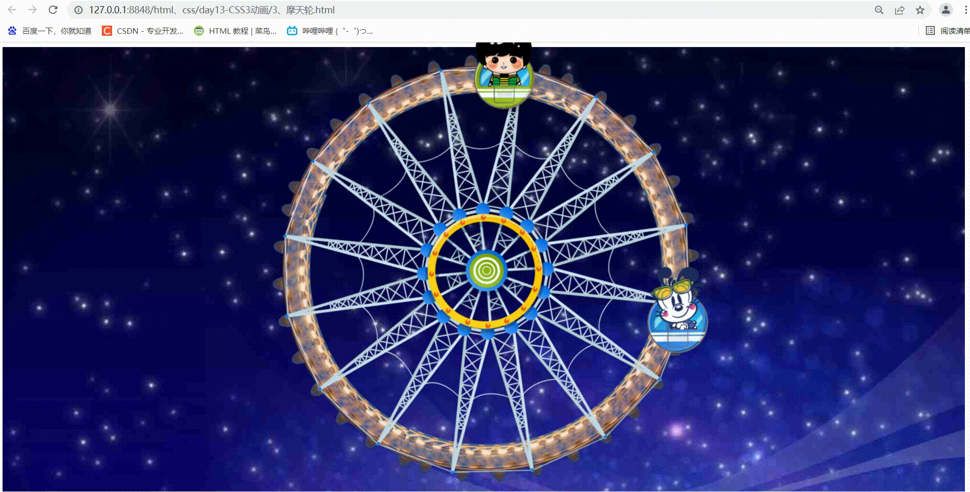
运行效果:
代码:
<!DOCTYPE html>
<html>
	<head>
		<meta charset="utf-8">
		<title></title>
		<style type="text/css">
			.wrapper{
				background: url(img/bg.jpg);
			}
			.box{
				width:768px ;
				margin: 0 auto;
				animation:name 20s linear infinite ;
				position: relative;
				transform-origin: center;
			}
			@keyframes name{
				from{
					transform: rotate(0);
				}
				to{
					transform: rotate(360deg);
				}
			}
			.box img:nth-of-type(2){
				position: absolute;
				top: 70px;
				left:60px;
				animation:name 20s linear infinite  reverse;
			}
			.box img:nth-of-type(3){
				position: absolute;
				top: 70px;
				right:60px;
				animation:name 20s linear infinite  reverse;
			}
		</style>
	</head>
	<body>
		<div class="wrapper">
			<div class="box">
				<img src="img/fsw.png" >
				<img src="img/1.png" >
				<img src="img/2.png" >
			</div>
		</div>
	</body>
</html>
图片素材:


超简单吧,赶紧保存下来试试吧!
如有疑惑请留言或私信!