css布局(flex)
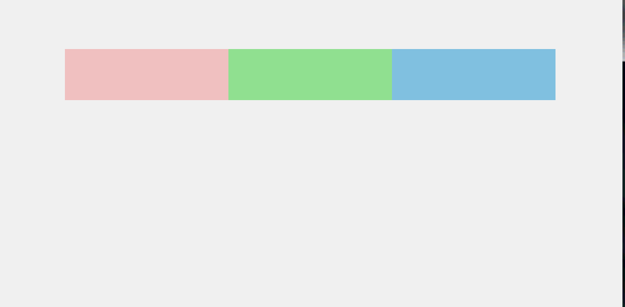
先来张效果图
<!DOCTYPE html>
<html lang="en">
<head>
    <meta charset="UTF-8">
    <title>display-flex</title>
    <style>
        *{
            margin: 0;
            padding: 0;
        }
        .flex-container{
            max-width: 960px;
            margin: 100px auto;
            display:flex;
            flex-wrap: wrap;
        }
        .one{ background: pink; }
        .two{ background: lightgreen; }
        .three{ background: skyblue; }
        .box{
            height: 100px;
            min-width: 300px;
            flex-grow: 1;
        }

    </style>
</head>
<body>
<div class="flex-container">
    <div class="box one"></div>
    <div class="box two"></div>
    <div class="box three"></div>
</div>
</body>
</html>