方法一: 用meta标签
<meta charset="UTF-8" name="viewport" content="width=device-width, initial-scale=1">
贴上完整代码:


<!DOCTYPE html>
<html lang="en">
<head>
    <meta charset="UTF-8" name="viewport" content="width=device-width, initial-scale=1">
    <title>Document</title>
    <style>
        body {
            background: #abcdef;
        }
    </style>
</head>
<body>

</body>
</html>
方法二: 用rem,配合媒体查询
贴上完整代码:
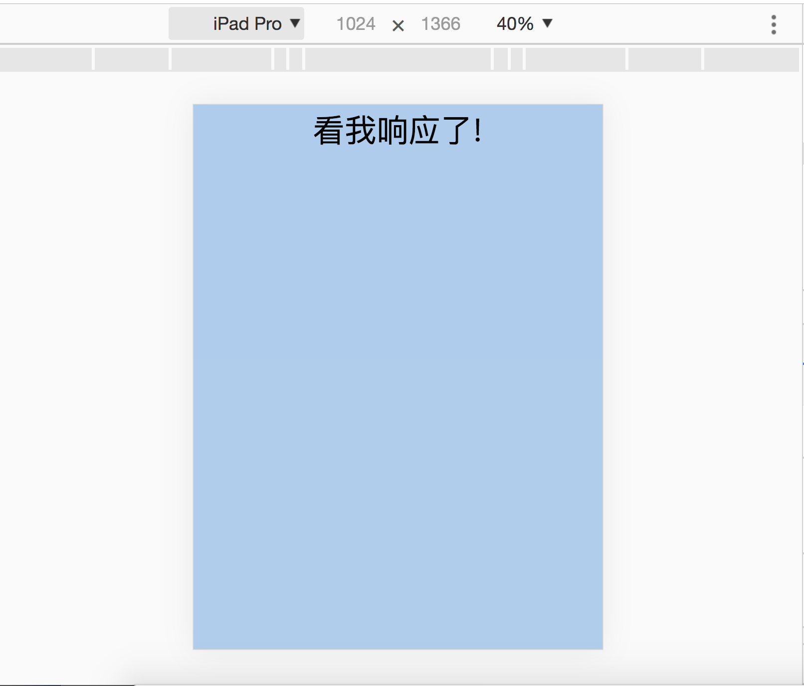
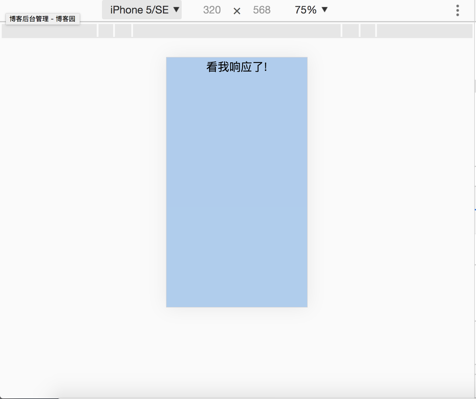
<!DOCTYPE html>
<html lang="en">
<head>
    <meta charset="UTF-8">
    <title>Document</title>
    <style>
        body {
            background: #abcdef;
        }
        @media screen and (max-width: 1024px) {
            html {
                font-size: 20px;
            }
        }
        @media screen and (max-width: 768px) {
            html {
                font-size: 16px;
            }
        }
        @media screen and (max-width: 375px) {
            html {
                font-size: 12px;
            }
        }
        @media screen and (max-width: 320px) {
            html {
                font-size: 10px;
            }
        }
        .main {
            font-size: 4rem;
            text-align: center;
        }
    </style>
</head>
<body>
    <div class="main">看我响应了!</div>
</body>
</html>
效果图: