概念
随着网页大小的改变,而改变布局的响应方式。
实现方式
- interger 设置触发宽度
网页小于<integer>设定宽度
@media only screen and (max-width: <integer>) {
    selector {

    }
}
网页宽度不位于<integer>设置宽度范围内
@media only screen and (min-width: <integer>) and (max-width: <integer>) {
    selector {

    }
}
网页大于<integer>设定宽度
@media only screen and (min-width: <integer>) {
    selector {

    }
}
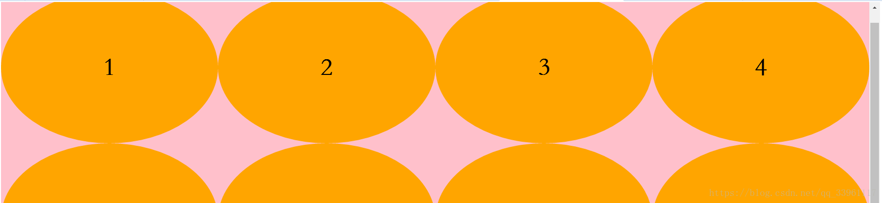
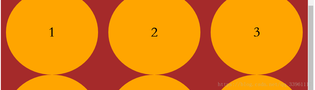
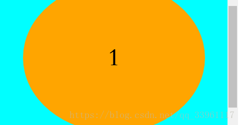
<!DOCTYPE html>
<html>
<head>
	<meta charset="UTF-8">
	<title>响应式布局</title>
	<style type="text/css">
		/*基本样式块*/
		/*.box {
			max-width: 1200px;
			width: 95%;
			margin: 0 auto;
			background-color: red!important;
		}
		.it {
			width: 300px;
			height: 300px;
			font: 900 50px/300px 'STSong';
			text-align: center;
			float: left;
			border-radius: 50%;
			background-color: orange;
		}
		.box:after {
			content: "";
			display: block;
			clear: both;
		}*/

		html, body {
			margin: 0;
		}
		.it {
			height: 300px;
			background-color: orange;
			font: 900 50px/300px 'STSong';
			text-align: center;
			border-radius: 50%;
			float: left;
		}
		.box:after {
			content: "";
			display: block;
			clear: both;
		}
		/*屏幕宽度超出1200px*/
		@media only screen and (min-width: 1200px) {
			/*1.在响应式布局内,css语法同正常样式表语法*/
			/*2.响应式布局之间存在不同屏幕尺寸的限制,使用样式相互不影响*/
			/*解释:满足当前屏幕尺寸时,该样式块起作用,不满足时,则样式块失效*/
			/*3.当响应式布局中样式块起作用时,会与正常样式块设置协同布局,遵循选择器的优先级规则*/
			.box {
				background-color: pink;
			}
			.it {
				width: 25%;
			}

			/*原则:*/
			/*1.采用响应式布局的页面,基本样式块只做共性样式设置
			需要根据页面尺寸进行适应变化的样式均有响应式布局处理*/
			/*2.要进行响应式布局的页面要处理所有屏幕尺寸下的样式块*/
		}
		/*屏幕宽度间于600至1200px*/
		@media only screen and (min-width: 600px) and (max-width: 1200px) {
			.box {
				background-color: brown;
			}
			.it {
				width: 30%;
				margin: 0 calc(10% / 6);
			}

		}
		/*屏幕宽度小于600px*/
		@media only screen and (max-width: 600px) {
			.box {
				background-color: cyan;
			}
			.it {
				width: 80%;
				margin-left: 10%;
				min-width: 300px;
			}
		}
	</style>
</head>
<body>
	<div class="box">
		<div class="it">1</div>
		<div class="it">2</div>
		<div class="it">3</div>
		<div class="it">4</div>
		<div class="it">5</div>
		<div class="it">6</div>
		<div class="it">7</div>
		<div class="it">8</div>
		<div class="it">9</div>
		<div class="it">10</div>
		<div class="it">11</div>
		<div class="it">12</div>
	</div>
</body>
</html>