 前期回顾
前期回顾 


目录
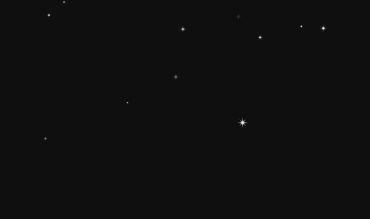
星空Vue3
<template>
  <div class="star-wrap"></div>
</template>
<script setup>
onMounted(() => {
  // 屏幕的尺寸
  var screenW = document.documentElement.clientWidth - 100;
  var screenH = document.documentElement.clientHeight - 100;

  // 2. 动态创建多个星星
  for (var i = 0; i < 20; i++) {
    var mySpan = document.createElement("span");
    // 为创建的span添加类名
    mySpan.className = "star";
    document.body.appendChild(mySpan);
    // 随机位置设置给元素
    mySpan.style.left = Math.random() * screenW + "px"; //水平方向随机距离
    mySpan.style.top = Math.random() * screenH + "px"; //垂直方向随机距离
    //大小随机
    var scale = Math.random() * 1.1;
    mySpan.style.transform = "scale(" + scale + ")";

    //频率随机
    var rate = Math.random() * 1.5;
    mySpan.style.animationDelay = rate + "s";
  }
});
</script>
<style>
.star-wrap {
  background-color: rgb(15, 16, 15);
  width: 100vw;
  height: 100vh;
  color: #fff;
  font-size: 20px;
}

.star {
  width: 30px;
  height: 30px;
  background: url("/image/home/star.png") no-repeat;
  position: absolute;
  background-size: 100% 100%;
  animation: flash 1s alternate infinite;
}

@keyframes flash {
  0% {
    opacity: 0;
  }

  100% {
    opacity: 1;
  }
}

span:hover {
  transform: scale(3, 3) rotate(180deg) !important;
  transition: all 1s;
}
</style>
<style lang="scss" scoped></style>
单文件html
<!DOCTYPE html>
<html lang="en">

<head>
    <meta charset="UTF-8">
    <title></title>
    <style>
        * {
            margin: 0;
            padding: 0;
            list-style: none;
        }

        body {
            background-color: rgb(15, 16, 15);
        }

        .star {
            width: 30px;
            height: 30px;
            background: url("images/star.png") no-repeat;
            position: absolute;
            background-size: 100% 100%;
            animation: flash 1s alternate infinite;
        }

        @keyframes flash {
            0% {
                opacity: 0;
            }

            100% {
                opacity: 1;
            }
        }

        span:hover {
            transform: scale(3, 3) rotate(180deg) !important;
            transition: all 1s;
        }
    </style>
</head>


<script>


    window.onload = function ()
    {
        // 屏幕的尺寸
        var screenW = document.documentElement.clientWidth - 200;
        var screenH = document.documentElement.clientHeight - 200;

        // 2. 动态创建多个星星
        for (var i = 0; i < 20; i++)
        {
            var mySpan = document.createElement('span');
            // 为创建的span添加类名
            mySpan.className = 'star';
            document.body.appendChild(mySpan);
            // 随机位置设置给元素
            mySpan.style.left = Math.random() * screenW + "px";//水平方向随机距离
            mySpan.style.top = Math.random() * screenH + "px";//垂直方向随机距离
            //大小随机
            var scale = Math.random() * 1.1;
            mySpan.style.transform = 'scale(' + scale + ')'

            //频率随机
            var rate = Math.random() * 1.5;
            mySpan.style.animationDelay = rate + 's';
        }
    }
</script>

</html>
地球代码
<!DOCTYPE html>
<html lang="en">

<head>
    <meta charset="UTF-8">
    <meta http-equiv="X-UA-Compatible" content="IE=edge">
    <meta name="viewport" content="width=device-width, initial-scale=1.0">
    <title>Document</title>
</head>
<style>
    * {
        margin: 0;
        padding: 0;
    }

    .map-wrap {
        position: relative;
        margin: 100px;
        width: 1000px;
        height: 800px;
        background: url('./bg.jpg') no-repeat center center;

    }

    img {
        position: absolute;
        transform: translate(-50%, -50%);
        left: 50%;
        top: 50%;
    }

    .map {
        animation: run1 40s infinite linear;
        width: 500px;
        height: 500px;
        box-shadow: 2px 2px 50px #a1003b(199, 13, 13);
        top: 129px;
        left: 263px;
    }

    .link {
        width: 600px;
        height: 600px;
        animation: run 35s infinite linear;
        transform-origin: center center;
        z-index: 5;
        top: 90px;
        left: 205px;
    }

    @keyframes run {
        from {
            transform: rotate(360deg);

        }

        to {
            transform: rotate(-360deg);


        }
    }

    @keyframes run1 {
        from {
            transform: rotate(-360deg);

        }

        to {
            transform: rotate(360deg);


        }
    }
</style>

<body>
    <div class="map-wrap">
        <img src="./map.png" class="map">
        <img src="./link.png" class="link">
    </div>
</body>

</html>
流行线图代码
<!DOCTYPE html>
<html lang="en">
<head>
<meta charset="UTF-8" />
<style type="text/css">
/*全局控制栏*/
body {
background-color: #020712;
margin: 0;
font-family: "Microsoft YaHei";
font-weight: lighter;
background-image: url("./img/Homebodybg.png");
background-repeat: no-repeat;
background-position: center;
background-position-y: -120px;
}
a {
text-decoration: none;
color: white;
}
.l_left {
float: left
}
.clear {
clear: both
}
img {
border: none
}
/*标题*/
.Hometitlebox {
width: 686px;
height: 69px;
margin: auto;
background-image: url("./img/Hometitlebg.png");
background-repeat: no-repeat;
background-position: center;
text-align: center;
font-weight: bold;
font-size: 18px;
line-height: 69px;
}
/*动效栏*/
.flasheffectoutbox {
width: 1000px;
height: 500px;
margin: auto;
margin-top: 100px;
background-image: url("./img/chain_bg.png");
background-repeat: no-repeat;
background-position: center;
position: relative
}
.circleeffectclass {
border-radius: 50%;
border: rgba(0, 168, 255, 0.6) 1px solid;
cursor: pointer;
position: absolute;
}
.effectposition {
position: absolute;
}
.acrossremindeffectout {
background-color: rgba(0, 126, 255, 0.05);
border-radius: 50%;
}
.acrossremindeffectoutho {
background-color: rgba(0, 126, 255, 0.15);
}
.acrossremindeffectin {
background-color: rgba(0, 126, 255, 0.3);
border-radius: 50%;
margin: auto;
}
.acrossremindeffectinho {
background-color: rgba(0, 126, 255, 0.45);
}
.stagetitle {
color: #00e4ff;
top: 104px;
font-size: 14px;
font-family: "Microsoft YaHei";
font-weight: lighter;
display: block;
width: 116px;
text-align: center;
position: absolute;
left: -10%;
}
.stagearoundtitle {
left: -25%;
top: 85px;
}
.line {
position: absolute;
transform-origin: left;
animation-iteration-count: infinite
}
.line2 {
z-index: 1;
left: 330px;
top: 183px;
width: 0;
height: 3px;
transform: rotate(21deg);
animation: mm2 4s;
animation-delay: 2s;
animation-iteration-count: infinite;
background-image: url("./img/linght_ef.png");
background-repeat: no-repeat;
background-position: 100%;
}
.line3 {
z-index: 1;
left: 262px;
top: 351px;
width: 0;
height: 3px;
transform: rotate(-25deg);
animation: mm 5s;
animation-delay: 4s;
animation-iteration-count: infinite;
background-image: url("./img/linght_ef.png");
background-repeat: no-repeat;
background-position: 100%;
}
.line4 {
z-index: 1;
left: 638px;
top: 141px;
width: 0;
height: 3px;
transform: rotate(-211deg);
animation: mm4 3s;
animation-delay: 3s;
animation-iteration-count: infinite;
background-image: url("./img/linght_ef.png");
background-repeat: no-repeat;
background-position: 100%;
}
.line5 {
z-index: 1;
left: 679px;
top: 289px;
width: 0;
height: 3px;
transform: rotate(-172deg);
animation: mm5 5s;
animation-delay: 1s;
animation-iteration-count: infinite;
background-image: url("./img/linght_ef.png");
background-repeat: no-repeat;
background-position: 100%;
}
.line6 {
z-index: 1;
left: 537px;
top: 373px;
width: 0;
height: 3px;
transform: rotate(-116deg);
animation: mm6 4s;
animation-delay: 0s;
animation-iteration-count: infinite;
background-image: url("./img/linght_ef.png");
background-repeat: no-repeat;
background-position: 100%;
}
@keyframes mm {
0% {
width: 0
}
100% {
width: 194px
}
}
@keyframes mm2 {
0% {
width: 0
}
100% {
width: 113px
}
}
@keyframes mm4 {
0% {
width: 0
}
100% {
width: 140px
}
}
@keyframes mm5 {
0% {
width: 0
}
100% {
width: 158px
}
}
@keyframes mm6 {
0% {
width: 0
}
100% {
width: 94px
}
}
/*主动效*/
.maineffectoutbox {
border: rgba(0, 168, 255, 0.6) 3px solid;
width: 94px;
height: 94px;
top: 194px;
left: 430px;
}
.maindataeffect {
animation: scrolleffect 6.5s infinite linear;
}
.maindataspecialeffectct {
animation: maindataspecialeffect 0.6s forwards;
}
@keyframes scrolleffect {
0% {
transfrom: rotate(0deg);
}
25% {
transform: rotate(90deg);
}
50% {
transform: rotate(180deg);
}
75% {
transform: rotate(270deg);
}
100% {
transform: rotate(360deg);
}
}
@keyframes maindataspecialeffect {
0% {
transform: rotate(0deg);
}
100% {
transform: rotate(360deg);
}
}
/*卫星动效*/
.aroundfunctioneffect {
width: 76px;
height: 76px;
}
.acrossremindeffectoutard {
width: 60px;
height: 60px;
margin: 8px;
}
.acrossremindeffectinard {
width: 54px;
height: 54px;
margin: 3px;
}
.arounddataeffect01 {
animation: scrolleffectarround01 linear infinite 4s forwards;
}
.arounddataeffect02 {
animation: scrolleffectarround01 linear infinite 3.8s forwards;
}
.arounddataeffect03 {
animation: scrolleffectarround01 linear infinite 4.2s forwards;
}
@keyframes scrolleffectarround01 {
0% {
transfrom: rotate(0deg);
}
25% {
transform: rotate(-90deg);
}
50% {
transform: rotate(-180deg);
}
75% {
transform: rotate(-270deg);
}
100% {
transform: rotate(-360deg);
}
}
/*修饰卫星*/
.decarround01 {
width: 37px;
height: 37px;
cursor: auto;
}
.decarroundin01 {
width: 33px;
height: 33px;
margin: 2px;
background-color: rgba(0, 126, 255, 0.8);
}
.decarroundin01:hover {
background-color: rgba(0, 126, 255, 0.9);
}
.decarround02 {
width: 27px;
height: 27px;
cursor: auto;
}
.decarroundin02 {
width: 23px;
height: 23px;
margin: 2px;
background-color: rgba(0, 126, 255, 0.7);
}
.decarroundin02:hover {
background-color: rgba(0, 126, 255, 0.8);
}
/*悬浮信息*/
.fltoutbox {
width: 282px;
position: absolute;
background-repeat: no-repeat;
background-position: center;
background-position-y: 0px;
}
.leftbox {
left: 2%;
top: 6%;
background-image: url("./img/fltleftbg.png");
}
.rightbox {
right: 2%;
top: 6%;
background-image: url("./img/fltrightbg.png");
}
.analyzedatashowtitle {
line-height: 44px;
color: #dfdede;
font-size: 14px;
margin-left: 16px;
display: block;
font-weight: bold
}
.analyzemsgbgbox {
background-color: rgba(0, 168, 255, 0.2);
width: 280px;
height: 260px;
position: relative;
}
.fltdecarround {
width: 8px;
height: 8px;
position: absolute;
}
.fltdecarroundtop {
top: -1px;
border-top: #00a8ff 3px solid;
}
.fltdecarroundright {
right: -1px;
border-right: #00a8ff 3px solid;
}
.fltdecarroundbottom {
bottom: -1px;
border-bottom: #00a8ff 3px solid;
}
.fltdecarroundleft {
left: -1px;
border-left: #00a8ff 3px solid;
}
/*弹出信息*/
.analyzepopupbox {
width: 1000px;
height: 680px;
background-color: rgba(0, 8, 12, 0.75);
position: fixed;
top: 100px;
overflow-y: scroll;
}
.popupboxtitlebox {
height: 30px;
width: 1000px;
background-color: #64a6d4;
position: fixed;
top: 100px;
z-index: 100;
}
.popupboxtitlemsg {
font-size: 16px;
color: white;
font-weight: bold;
line-height: 30px;
margin-left: 10px;
}
.popupboxclose {
width: 16px;
height: 16px;
background-image: url("./img/popupboxclosebtn01.png");
float: right;
margin-right: 9px;
margin-top: 6px;
cursor: pointer;
}
.popupboxclose:hover {
background-image: url("./img/popupboxclosebtn02.png");
}
.popupboxmsgoutbox {
height: 314px;
width: 980px;
margin: auto;
border-bottom: #00b6cc 2px solid;
}
.popupboxmsgboxhlf {
padding-top: 20px;
float: left;
width: 479px;
margin-left: 10px;
}
.popupboxmsgboxcrs {
padding-top: 20px;
}
.popupboxmsgtitle {
font-size: 14px;
font-weight: bold;
color: #00e4ff;
}
.popupboxdata {
color: #fffc00;
}
.popuofunxtionbox {
width: 1000px;
margin: auto;
position: relative;
display: none;
}
/*版权*/
.copyrigntoutbox {
position: absolute;
bottom: 10px;
left: 37%;
}
.copyrigntmsg {
display: block;
color: white;
font-size: 12px;
}
</style>
<title>“大数据分析”xxx市城xxxx局大数据综合分析平台</title>
</head>
<body>
<!--标题栏-->
<div class="Hometitlebox">
<a style=" color: #00e4ff;" href="Datacages_Homeindex.html">“大数据分析”xxx市城xxxx局大数据综合分析平台</a>
</div>
<!--动效显示-->
<div class="flasheffectoutbox">
<div style="width: 1000px; height: 500px; position: relative">
<div class="line2 line"></div>
<div class="line3 line"></div>
<div class="line4 line"></div>
<div class="line5 line"></div>
<div class="line6 line"></div>
<!--主动效-->
<div class="maineffectoutbox circleeffectclass">
<a href="http://www.txgis.com" target="_blank">
<img class="effectposition maindataeffect" src="./img/maindataeffect.png">
<div class="effectposition acrossremindeffectout" style=" width: 76px; height: 76px; margin: 9px;">
<div class="acrossremindeffectin" style="width: 68px; height: 68px; margin: 4px;"></div>
</div>
<img class="effectposition maindataspecialeffect" src="./img/maindataspecialeffect.png">
<img class="effectposition acrossremindeffecindex" src="./img/maindataicon.png">
<span class="stagetitle">xxxxxxx数据中心</span>
</a>
</div>
<!--卫星动效-->
<div class="circleeffectclass aroundfunctioneffect" style="left: 254px;top: 135px;">
<img class="effectposition arounddataeffect02" src="./img/aroundeffect.png">
<div class="effectposition acrossremindeffectout acrossremindeffectoutard">
<div class="acrossremindeffectin acrossremindeffectinard"></div>
</div>
<img class="effectposition acrossremindeffecindex" src="./img/xingzhengshenpi.png">
<span class="stagetitle stagearoundtitle">xxxxxx系统一</span>
</div>
<div class="circleeffectclass aroundfunctioneffect" style="left: 190px;bottom: 89px;">
<img class="effectposition arounddataeffect01" src="./img/aroundeffect.png">
<div class="effectposition acrossremindeffectout acrossremindeffectoutard">
<div class="acrossremindeffectin acrossremindeffectinard"></div>
</div>
<img class="effectposition acrossremindeffecindex" src="./img/baixingpaiAPP.png">
<span class="stagetitle stagearoundtitle">xxxxxx系统二</span>
</div>
<div class="circleeffectclass aroundfunctioneffect" style="right: 405px;bottom: 53px;">
<img class="effectposition arounddataeffect02" src="./img/aroundeffect.png">
<div class="effectposition acrossremindeffectout acrossremindeffectoutard">
<div class="acrossremindeffectin acrossremindeffectinard"></div>
</div>
<img class="effectposition acrossremindeffecindex" src="./img/zhatuyunshu.png">
<span class="stagetitle stagearoundtitle">xxxxxx系统三</span>
</div>
<div class="circleeffectclass aroundfunctioneffect" style="right: 243px;bottom: 165px;">
<img class="effectposition arounddataeffect01" src="./img/aroundeffect.png">
<div class="effectposition acrossremindeffectout acrossremindeffectoutard">
<div class="acrossremindeffectin acrossremindeffectinard"></div>
</div>
<img class="effectposition acrossremindeffecindex" src="./img/12319rexian.png">
<span class="stagetitle stagearoundtitle">xxxxxx系统四</span>
</div>
<div class="circleeffectclass aroundfunctioneffect" style="right: 294px;top: 79px;">
<img class="effectposition arounddataeffect03" src="./img/aroundeffect.png">
<div class="effectposition acrossremindeffectout acrossremindeffectoutard">
<div class="acrossremindeffectin acrossremindeffectinard"></div>
</div>
<img class="effectposition acrossremindeffecindex" src="./img/zonghezhifa.png">
<span class="stagetitle stagearoundtitle">xxxxxx系统五</span>
</div>
<div class="circleeffectclass decarround01" style="top: 218px;left: 92px;">
<div class="acrossremindeffectin decarroundin01"></div>
</div>
<div class="circleeffectclass decarround01" style="top: 197px;right: 163px;">
<div class="acrossremindeffectin decarroundin01"></div>
</div>
<div class="circleeffectclass decarround02" style="top: 99px;right: 93px;">
<div class="acrossremindeffectin decarroundin02"></div>
</div>
</div>
</div>
</script>
</html>loading代码
<!DOCTYPE html>
<html>
<head>

<meta http-equiv="Content-Type" content="text/html; charset=UTF-8">
<meta charset="utf-8">
<title>用CSS做一个好看的Loading加载特效</title>

</head>
<body>

<style>
body{ padding:100px;}
.loader{margin-bottom:50px;min-height:100px;}
@-webkit-keyframes rotate_pacman_half_up {
  0% {
    -webkit-transform: rotate(270deg);
            transform: rotate(270deg); }

  50% {
    -webkit-transform: rotate(360deg);
            transform: rotate(360deg); }

  100% {
    -webkit-transform: rotate(270deg);
            transform: rotate(270deg); } }

@keyframes rotate_pacman_half_up {
  0% {
    -webkit-transform: rotate(270deg);
            transform: rotate(270deg); }

  50% {
    -webkit-transform: rotate(360deg);
            transform: rotate(360deg); }

  100% {
    -webkit-transform: rotate(270deg);
            transform: rotate(270deg); } }

@-webkit-keyframes rotate_pacman_half_down {
  0% {
    -webkit-transform: rotate(90deg);
            transform: rotate(90deg); }

  50% {
    -webkit-transform: rotate(0deg);
            transform: rotate(0deg); }

  100% {
    -webkit-transform: rotate(90deg);
            transform: rotate(90deg); } }

@keyframes rotate_pacman_half_down {
  0% {
    -webkit-transform: rotate(90deg);
            transform: rotate(90deg); }

  50% {
    -webkit-transform: rotate(0deg);
            transform: rotate(0deg); }

  100% {
    -webkit-transform: rotate(90deg);
            transform: rotate(90deg); } }

@-webkit-keyframes pacman-balls {
  75% {
    opacity: 0.7; }

  100% {
    -webkit-transform: translate(-100px, -6.25px);
            transform: translate(-100px, -6.25px); } }

@keyframes pacman-balls {
  75% {
    opacity: 0.7; }

  100% {
    -webkit-transform: translate(-100px, -6.25px);
            transform: translate(-100px, -6.25px); } }

.pacman {
  position: relative; }
  .pacman > div:nth-child(2) {
    -webkit-animation: pacman-balls 1s 0s infinite linear;
            animation: pacman-balls 1s 0s infinite linear; }
  .pacman > div:nth-child(3) {
    -webkit-animation: pacman-balls 1s 0.33s infinite linear;
            animation: pacman-balls 1s 0.33s infinite linear; }
  .pacman > div:nth-child(4) {
    -webkit-animation: pacman-balls 1s 0.66s infinite linear;
            animation: pacman-balls 1s 0.66s infinite linear; }
  .pacman > div:nth-child(5) {
    -webkit-animation: pacman-balls 1s 0.99s infinite linear;
            animation: pacman-balls 1s 0.99s infinite linear; }
  .pacman > div:first-of-type {
    width: 0px;
    height: 0px;
    border-right: 25px solid transparent;
    border-top: 25px solid #279fcf;
    border-left: 25px solid #279fcf;
    border-bottom: 25px solid #279fcf;
    border-radius: 25px;
    -webkit-animation: rotate_pacman_half_up 0.75s 0s infinite;
            animation: rotate_pacman_half_up 0.75s 0s infinite; }
  .pacman > div:nth-child(2) {
    width: 0px;
    height: 0px;
    border-right: 25px solid transparent;
    border-top: 25px solid #279fcf;
    border-left: 25px solid #279fcf;
    border-bottom: 25px solid #279fcf;
    border-radius: 25px;
    -webkit-animation: rotate_pacman_half_down 0.75s 0s infinite;
            animation: rotate_pacman_half_down 0.75s 0s infinite;
    margin-top: -50px; }
  .pacman > div:nth-child(3), .pacman > div:nth-child(4), .pacman > div:nth-child(5) {
    background-color: #279fcf;
    width: 15px;
    height: 15px;
    border-radius: 100%;
    margin: 2px;
    width: 10px;
    height: 10px;
    position: absolute;
    -webkit-transform: translate(0, -6.25px);
        -ms-transform: translate(0, -6.25px);
            transform: translate(0, -6.25px);
    top: 25px;
    left: 100px; }
</style>

 <div class="loaders">
 	<div class="loader">
        <div class="loader-inner pacman">
          <div></div>
          <div></div>
          <div></div>
          <div></div>
          <div></div>
        </div>
      </div>
 	</div>

</body>
</html>
总结:
文件和所需图片已经上传主页资源,点击 获取css炫酷动画及文件图片-Javascript文档类资源-CSDN下载