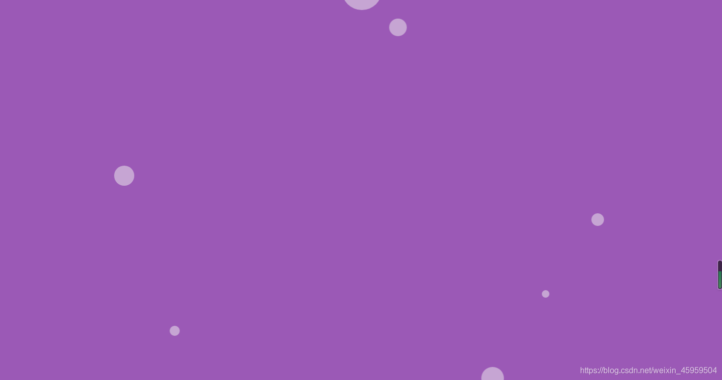
效果图(动态):
CSS
    <style>
        body,
        html {
            width: 100%;
            height: 100%;
        }

        body {
            margin: 0;
            padding: 0;
            background: #9b59b6;
        }

        .bubbles {
            position: absolute;
            width: 100%;
            height: 100%;
            z-index: 0;
            overflow: hidden;
            top: 0;
            left: 0;
        }

        .bubble {
            position: absolute;
            bottom: 0;

            background: #f1f1f1;
            border-radius: 50%;
            opacity: 0.5;
            animation: flying 10s infinite ease-in;
        }

        .bubble:nth-child(1) {
            width: 40px;
            height: 40px;
            left: 10%;
            animation-duration: 8s;
        }

        .bubble:nth-child(2) {
            width: 20px;
            height: 20px;
            left: 20%;
            animation-duration: 5s;
            animation-delay: 1s;
        }
         .bubble:nth-child(3) {
            width: 50px;
            height: 50px;
            left: 35%;
            animation-duration: 10s;
            animation-delay: 2s;
        }

        .bubble:nth-child(4) {
            width: 80px;
            height: 80px;
            left: 50%;
            animation-duration: 7s;
            animation-delay: 0s;
        }

        .bubble:nth-child(5) {
            width: 35px;
            height: 35px;
            left: 55%;
            animation-duration: 6s;
            animation-delay: 2s;
        }

         .bubble:nth-child(6) {
            width: 45px;
            height: 45px;
            left: 65%;
            animation-duration: 8s;
            animation-delay: 3s;
        }

         .bubble:nth-child(7) {
            width: 25px;
            height: 25px;
            left: 75%;
            animation-duration: 7s;
            animation-delay: 2s;
        }

        .bubble:nth-child(8) {
            width: 80px;
            height: 80px;
            left: 80%;
            animation-duration: 6s;
            animation-delay: 1s;
        }

         .bubble:nth-child(9) {
            width: 15px;
            height: 15px;
            left: 70%;
            animation-duration: 9s;
            animation-delay: 0s;
        }

        .bubble:nth-child(10) {
            width: 50px;
            height: 50px;
            left: 85%;
            animation-duration: 5s;
            animation-delay: 3s;
        }

        @keyframes flying {
            0% {
                bottom: -100px;
                transform: translateX(0);
            }

            50% {
                transform: translateX(100px);
            }

            100% {
                bottom: 1080px;
                transform: translateX(-200px);
            }
        }
    </style>
HTML
<body>
    <div class="bubbles">
        <div class="bubble"></div>
        <div class="bubble"></div>
        <div class="bubble"></div>
        <div class="bubble"></div>
        <div class="bubble"></div>
        <div class="bubble"></div>
        <div class="bubble"></div>
        <div class="bubble"></div>
        <div class="bubble"></div>
        <div class="bubble"></div>
    </div>
</body>