盒子模型(Box Model):
当对一个文档进行布局(laying out)的时候,浏览器渲染引擎会根据CSS-Box模型(CSS Basic Box model)将所有元素表示为一个矩形盒子(box)。
CSS决定这些盒子的大小,位置以及属性(颜色,背景,边框尺寸...)
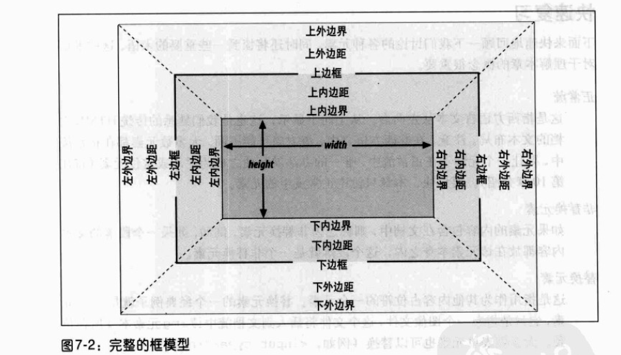
在CSS中,使用标准盒模型描述这些矩形盒子中的每一个。这个模型描述了元素所占空间的内容。每个盒子有四个边:外边距边, 边框边, 内填充边 与 内容边。
对应的属性名称分别如下:
水平格式化7大属性: margin-left、border-left、padding-left、width、padding-right、border-right、margin-right
垂直格式化7大属性: margin-top、border-top、padding-top、height、padding-bottom、border-bottom、margin-bottom
正常流中块级元素框的水平部分总和等于其包含块的 width
水平格式化7大属性,其中 width和 margin-left、margin-right这3个属性可以设置为 auto,其余属性必须设置特定值或默认为0
一、这3个属性都设置为非 auto值
此时格式化属性过分受限,这是总会把 margin-right强制为 auto
<div style="width:100px; margin-left: 100px; margin-right: 100px; height: 100px; background-color: aquamarine;"> </div>
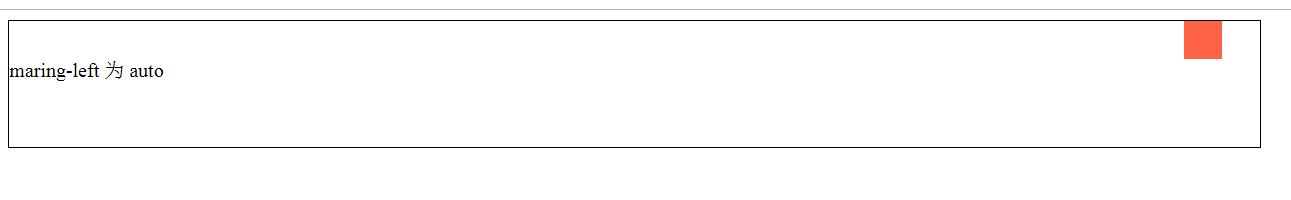
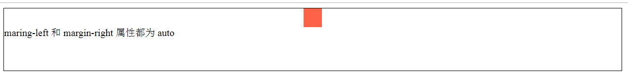
二、这3个属性中的某一个设置为 auto值
此时设置了 auto属性的元素会确定所需要的长度,从而使元素框的宽度等于父元素的 width
<div style="width:30px; margin-left: auto; margin-right: 30px; height: 30px; background-color: tomato;"> </div>
三、这3个属性中的其中两个都设置为 auto值
其一:设置两个 margin为 auto,则会使得左右 margin值相等,内容居中
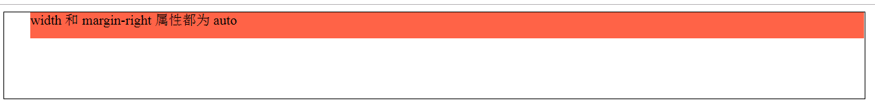
其二:设置 width和其中的某个 margin为 auto,则设为 auto的那个 margin会变成0,而 width会设置为所需要的值,使得元素完全填充其包含块
<div style="width:30px; margin-left: auto; margin-right: auto; height: 30px; background-color: tomato;"> </div>
<div style="width:auto; margin-left: 30px; margin-right: auto; height: 30px; background-color: tomato;"></div>
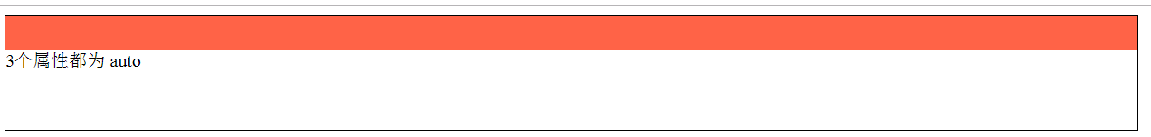
四、这3个属性都设置为 auto值
此时两个外边距都会变成0,width会尽可能宽(这与默认情况相同,即没有显示设置这3个属性,则外边距默认由 auto变为0,width默认为 auto)
<div style="width:auto; margin-left: auto; margin-right: auto; height: 30px; background-color: tomato;"> </div>
上述内容适用于非替换元素和替换元素(例外:替换元素中 width:auto时,元素宽度则为内容的固有宽度)
助记:
一:从左往右,即先考虑左外边距,再考虑右外边距,因此取左边距和 width设置的值,而把右外边距设置为 auto值
二: 先 width后 margin,即在有多个 auto需要确定宽度时,先考虑 width再考虑 margin,如设置外边距等长或为0
正常流中块级元素的垂直部分总和等于其包含块的 height()
垂直格式化7大属性,其中 height和 margin-top、margin-bottom这3个属性可以设置为 auto,其余属性必须设置特定值或默认为0
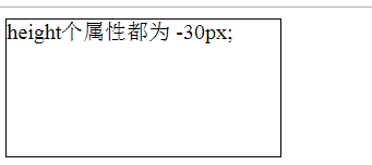
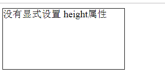
一、height必须设置为 auto或某种类型的非负值
<div style="                width: 30px; background-color: tomato;"></div>
<div style=" height: -30px; width: 30px;  background-color: tomato;"></div>
<div style=" height: 30px; width: 30px;  background-color: tomato;"></div>
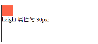
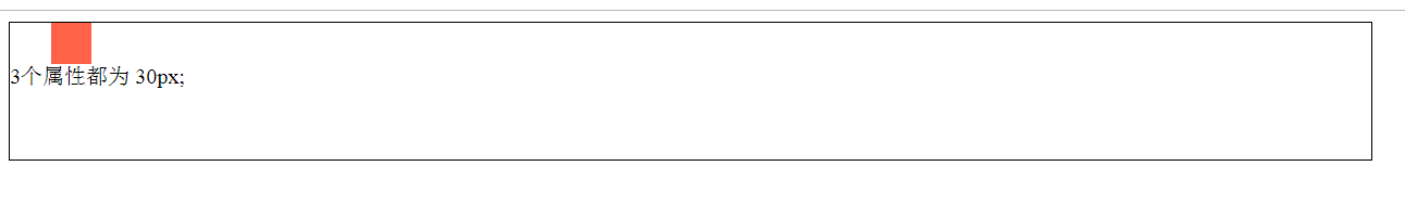
二、一个正常流中的块级元素中的 margin-top或者 margin-bottom设置为 auto,它会自动计算为0
<div style=" height: 30px; margin-top: auto; margin-bottom: auto; width: 30px; background-color: tomato;"></div>

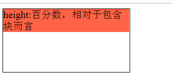
三、如果一个块级正常流元素中的 height设置为 百分数,则这个值是相对包含块而言的一个百分数,如果没有显式声明包含块的 height,百分数高度会重置为 auto
<div style="height: 100px; width: 200px;">
    <div style=" height: 30%; margin-top: auto; margin-bottom: auto; width: 30px;  background-color: tomato;"></div>
</div>
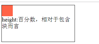
<div style="height: auto; width: 200px;">
    <p style=" height: 30%; background-color: tomato;">
        height:百分数,相对于包含块而言
    </p>
</div>
四、当 height:auto时
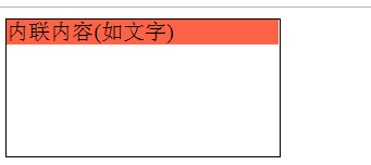
其一: 如果块级元素正常流的高度设置为 height:auto,子元素为内联内容(如文字),则该块级元素的高度将恰好包含足以包含其中的内联内容
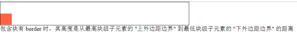
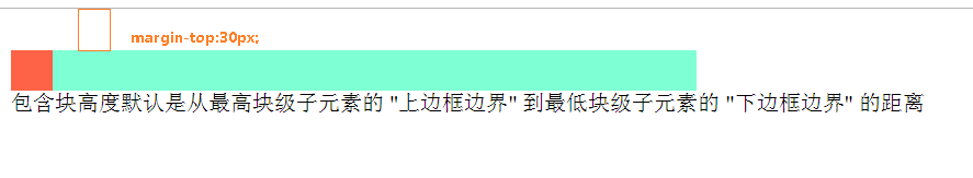
其二:如果块级元素正常流的高度设置为 height:auto,只有块级子元素,则该块级元素高度默认是从最高块级子元素的 "上边框边界" 到最低块级子元素的 "下边框边界" 的距离,
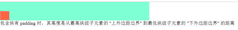
若该块级元素设置了 padding或border,则该块级元素高度是从最高块级子元素的 "上外边距边界" 到最低块级子元素的 "下外边距边界" 的距离
<div style=" height: auto; background-color: tomato;"> 内联内容(如文字) </div>
<div style="width: 500px; height: auto; background-color: aquamarine;">
    <div style=" height: 30px; width: 30px; margin-top: 30px; background-color: tomato;"></div>
</div>
<div style="width: 500px; height: auto; background-color: aquamarine; padding: 1px;">
    <div style=" height: 30px; width: 30px; margin-top: 30px; background-color: tomato;"></div>
</div>
<div style="width: 500px; height: auto; border: 1px solid black;">
    <div style=" height: 30px; width: 30px; margin-top: 30px; background-color: tomato;"></div>
</div>