<div class="parent">
<div class="child">
</div>
</div>
<style>
.parent {
width: 100px;
background-color: red;
}
.child {
width: 100%;
background-color: blue;
}
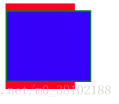
</style>上面代码中child的宽度设置为100%,意思是child的content的宽度等于parent的宽度100px,如下图所示:

.child {
width: 100%;
background-color: blue;
padding: 0 10px;
border: 2px solid green;
}
如果将child加上左右padding和border,则child的总宽度则会大于parent的宽度,表现为child的宽度撑出父元素了,如下图所示:
.child {
width: auto;
background: blue;
height: 100px;
padding: 0 10px;
border: 2px solid green;
margin: 0 10px;
}
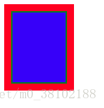
而如果设置child的宽度为auto,则表现为content+padding+border+margin值等于parent的宽度100px,如下图所示:
这里延伸一个知识点:CSS3的calc()函数,calc()函数可以计算不同单位的表达式的值,表达式可以是“+”、“-”、“*”、“/”,其中加减符号前后必须要有空格,乘除不必须,但是为了保持风格一致,可以都保留空格
.child {
width: calc(100% - 20px);
background: blue;
height: 100px;
padding: 0 10px;
}
显示如下图,可以看到通过计算可以实现与auto一致的效果
