版权声明:本文为博主原创文章,未经博主允许不得转载。 https://blog.csdn.net/qq_31126175/article/details/83819689
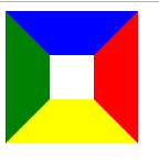
原理
<style>
    #triangle{
        width: 40px;
        height: 40px;
        border-width: 40px;
        border-style:  solid ;
        border-color:  blue red yellow green;
    }
</style>
<body>
    <div id="triangle"></div>
</body>
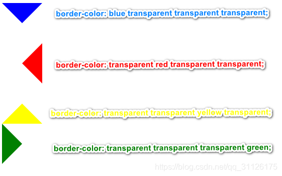
将宽高设置为0,

三角
#triangle{
        width: 0;
        height: 0;
        border-width: 40px;
        border-style:  solid ;
        border-color:  blue transparent transparent transparent;
    }

其他形状及原理
#triangle{
        width:0;
        height:0;
        border-style: solid;
        border-width: 40px 80px 100px 20px;
        border-color: blue red yellow green;
    }

将蓝色区域 设为 0;
将黄色左右两侧设为透明;
border-width: 0 80px 100px 20px;
border-color: transparent transparent yellow transparent;
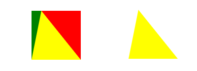
其他同理

直角三角形
	width:0;
	height:0;
	border-style: solid;
	border-width: 40px 80px 0 0;
	border-color: blue transparent ;
