大家看到许多网页的首页面都会有图片的轮播,图片轮播:既能通过图片增加整个页面的美观程度,又能让客户一眼看出网页想要表达的内容。那么,今天我们就通过swiper实现图片的轮播效果,简单又好看。
/**wxml**/
<swiper
indicator={{是否显示面板指示点}}
indicator-color={{指示点颜色}}
indicator-active-color={{当前选中的指示点颜色}}
autoplay={{是否自动切换}}
current={{当前所在滑块的 index}}
current-item-id={{当前所在滑块的 item-id ,不能与 current 被同时指定}}
interval={{自动切换时间间隔}}
duration={{滑动动画时长}}
circular={{是否采用衔接滑动}}
vertical={{滑动方向是否为纵向}}
previous-margin={{前边距,可用于露出前一项的一小部分,接受 px 和 rpx 值}}
next-margin={{后边距,可用于露出后一项的一小部分,接受 px 和 rpx 值}}
display-multiple-items={{同时显示的滑块数量}}
skip-hidden-item-layout={{是否跳过未显示的滑块布局,设为 true 可优化复杂情况下的滑动性能,但会丢失隐藏状态滑块的布局信息}}
bindchange={{current 改变时会触发 change 事件,event.detail = {current: current, source: source}}}
bindanimationfinish={{动画结束时会触发 animationfinish 事件,event.detail = {current: current, source: source}}}>
</swiper>
/**.js**/
page({
data:{//默认值
indicatordots:false,
indicatorcolor:rgba(0,0,0,.3),
indicatoractivecolor:#000000,
autoplay:false,
current:0,
currentitemid:"",
interval:5000,
duration:500,
circular:false,
vertical:false,
previousmargin:0px,
nextmargin:0px,
displaymultipleitems:1,
skiphiddenitemlayout:false
}
})
下面举一个小例子,只用了上面的部分属性。
})
效果图如下:
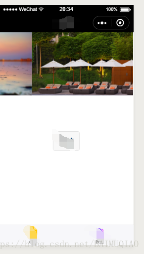
这是一个自动切换和衔接滑动的图片轮播,按照读者自己的需求,可以加上上述的其他属性。