目录
2.4 swarmplot(分簇散点图)+violinplot(小提琴图)+boxplot(盒形图)
  import pandas as pd
  import numpy as np
  import matplotlib.pyplot as plt
1. Pandas绘图
  # 可用的绘图样式
  plt.style.available
['bmh', 'classic', 'dark_background', 'fast', 'fivethirtyeight', 'ggplot', 'grayscale', 'seaborn-bright', 'seaborn-colorblind', 'seaborn-dark-palette', 'seaborn-dark', 'seaborn-darkgrid', 'seaborn-deep', 'seaborn-muted', 'seaborn-notebook', 'seaborn-paper', 'seaborn-pastel', 'seaborn-poster', 'seaborn-talk', 'seaborn-ticks', 'seaborn-white', 'seaborn-whitegrid', 'seaborn', 'Solarize_Light2', 'tableau-colorblind10', '_classic_test']
  # 设置绘图样式
  plt.style.use('seaborn-colorblind')
1.1DataFrame绘图
  np.random.seed(100)
  df = pd.DataFrame({'A': np.random.randn(365).cumsum(0),
                    'B': np.random.randn(365).cumsum(0) + 20,
                    'C': np.random.randn(365).cumsum(0) - 20},
                   index=pd.date_range('2017/1/1', periods=365))
  df.head()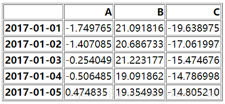
1.1.1 折线图
使用DataFrame自带的函数plot()就可以直接画出折线图,每条线代表一列的数据
df.plot()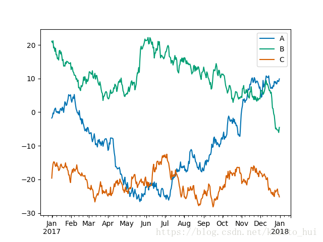
1.1.2 散点图
输入任意两列的数据作为x,y轴数据,把kind设置为scatter就可以画出散点图。
df.plot('A', 'B', kind='scatter')如果再设置参数c【小写】,就能设置颜色,如下例中的'B'指蓝色;如果再设置参数s【小写】,用于设置散点的大小;其中colormap参数设置的是下图中右边颜色条的样式。
  # 颜色(c)和大小(s)有'B'列的数据决定
  ax = df.plot('A', 'C', kind='scatter',
          c='B', s=df['B'], colormap='viridis')
1.1.3 箱形图【盒式图】
直接设置kind='box'就可以画出盒子图。箱形图可以表征数据的分散情况,其中,中间那条线表示中位数,构成盒子的上下两个边表示上四分位数和下四分位数。最后盒子的上下还有一个边界称为上限和下限。其中上限为上四分位数加上1.5倍的上下四分位数之差;同理,下限为下四分位数减去1.5倍的上下四分位数之差,其中上下四分位数之差称之为四分位间距。
  # 设置坐标为相同比例
  ax.set_aspect('equal')
df.plot(kind='box')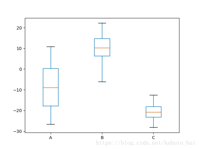
1.1.4 柱状图【直方图】
设置kind='hist'表示画直方图。
df.plot(kind='hist', alpha=0.7)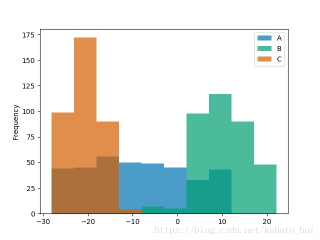
1.2 pandas.tools.plotting
  iris = pd.read_csv('iris.csv')
  iris.head()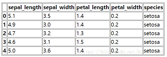
1.2.1 查看变量间的关系
  # 用于查看变量间的关系
  pd.plotting.scatter_matrix(iris);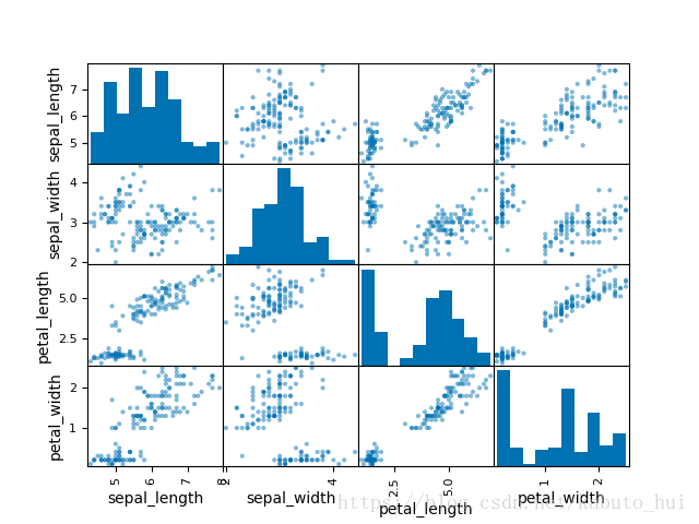
1.2.2 查看多变量分布
  # 用于查看多遍量分布
  plt.figure()
  pd.plotting.parallel_coordinates(iris, 'species')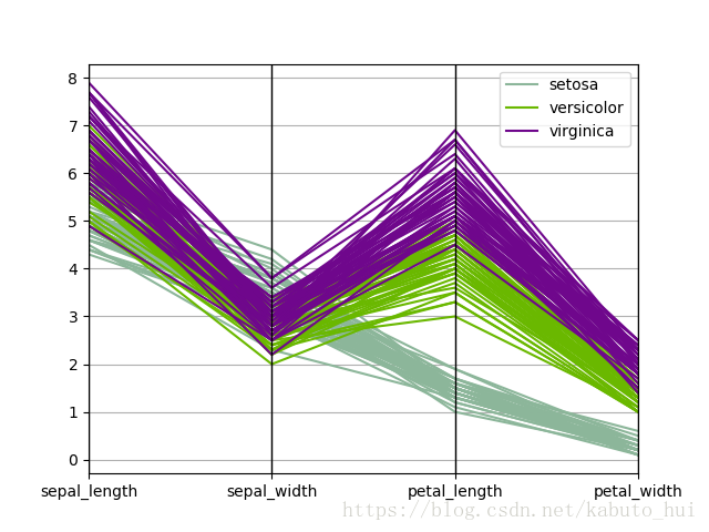
2. Seaborn绘图
import seaborn as sns np.random.seed(100)
v1 = pd.Series(np.random.normal(0, 10, 1000), name='v1')
v2 = pd.Series(2 * v1 + np.random.normal(60, 15, 1000), name='v2')2.1 Seaborn-直方图
  # 通过matplotlib绘图
  plt.figure()
  plt.hist(v1, alpha=0.7, bins=np.arange(-50, 150, 5), label='v1')
  plt.hist(v2, alpha=0.7, bins=np.arange(-50, 150, 5), label='v2')
  plt.legend()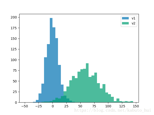
直方图与密度图同时画
  plt.figure()
  plt.hist([v1, v2], histtype='barstacked', normed=True)
  v3 = np.concatenate((v1, v2))
  sns.kdeplot(v3)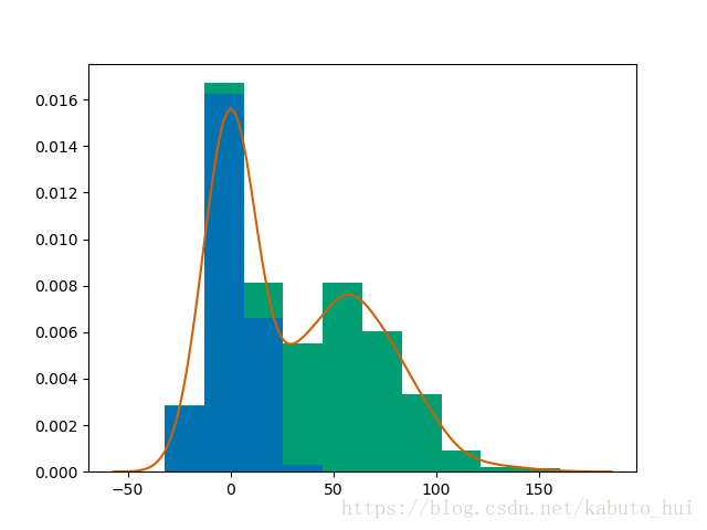
2.2 联合绘图jointplot()
直方图与散点图同时画
  # 使用seaborn绘图
  plt.figure()
  sns.jointplot(v1, v2, alpha=0.4)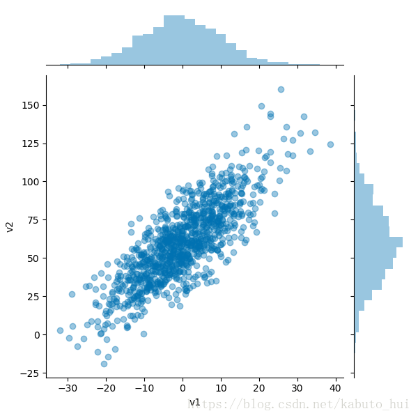
grid.ax_joint.set_aspect('equal')设置横纵坐标的尺度一样
  # 使用seaborn绘图
  plt.figure()
  grid = sns.jointplot(v1, v2, alpha=0.4)
  grid.ax_joint.set_aspect('equal')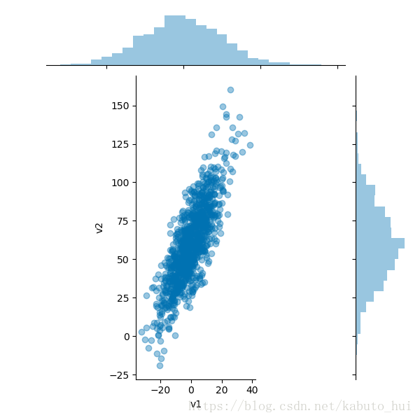
画密度图
  plt.figure()
  sns.jointplot(v1, v2, kind='kde')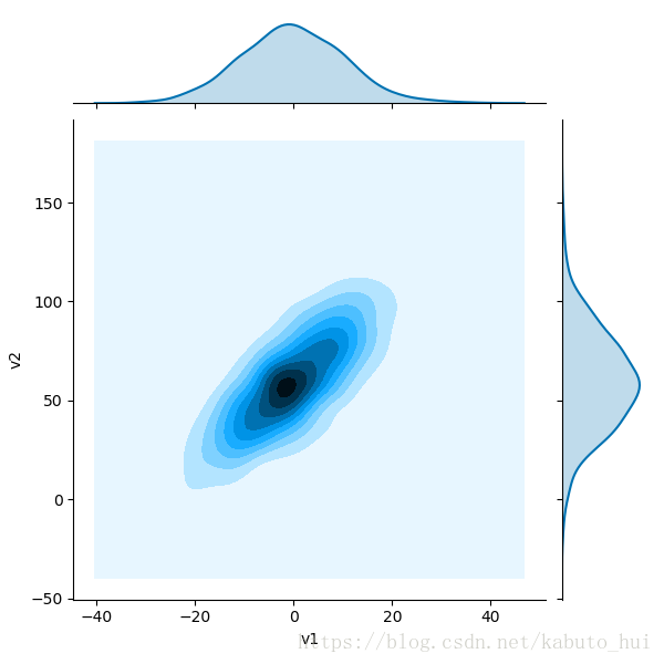
2.3 Seaborn-画变量间关系图pairplot()
  iris = pd.read_csv('iris.csv')
  iris.head()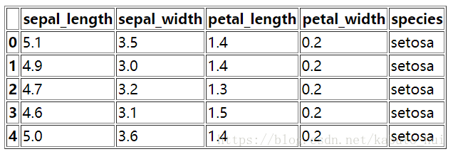
sns.pairplot(iris, hue='species', diag_kind='kde')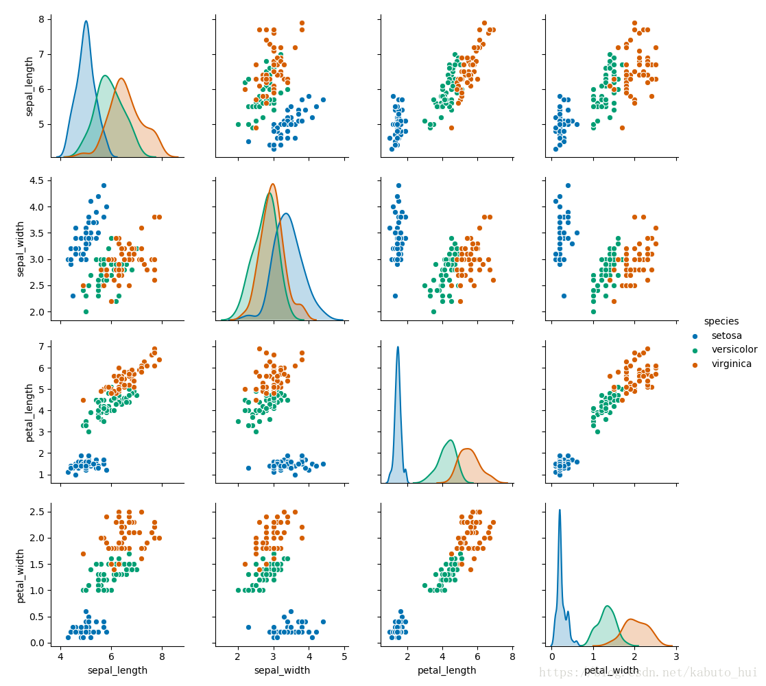
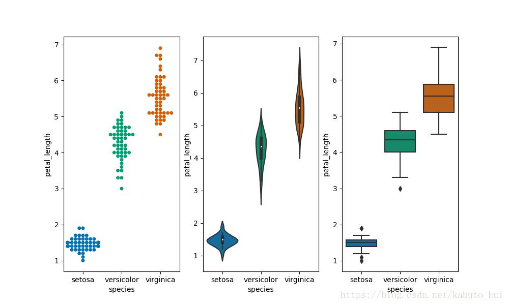
2.4 swarmplot(分簇散点图)+violinplot(小提琴图)+boxplot(盒形图)
  plt.figure(figsize=(10, 6))
  plt.subplot(131)
  sns.swarmplot('species', 'petal_length', data=iris)
  plt.subplot(132)
  sns.violinplot('species', 'petal_length', data=iris)
  plt.subplot(133)
  sns.boxplot('species', 'petal_length', data=iris)