版权声明:本文为博主原创文章,未经博主允许不得转载。 https://blog.csdn.net/weixin_38285131/article/details/82775044
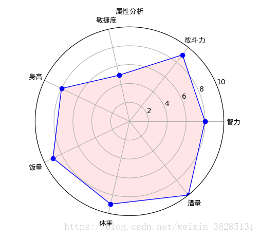
一丶雷达图
import numpy as np
import matplotlib.pyplot as plt

#标签
labels = np.array(['智力','战斗力','敏捷度','身高','饭量','体重','酒量'])
#数据个数
dataLenth = 7
#数据
data = np.array([8,9,5,8,9,9,10])

angles = np.linspace(0, 2*np.pi, dataLenth, endpoint=False)
data = np.concatenate((data, [data[0]])) # 闭合 # #将数据结合起来
angles = np.concatenate((angles, [angles[0]])) # 闭合

fig = plt.figure()
ax = fig.add_subplot(121, polar=True)# polar参数!!代表画圆形!!!!
#111代表总行数总列数位置
ax.plot(angles, data, 'bo-', linewidth=1)# 画线四个参数为x,y,标记和颜色,闲的宽度
ax.fill(angles, data, facecolor='r', alpha=0.1)# 填充颜色和透明度
ax.set_thetagrids(angles * 180/np.pi, labels, fontproperties="SimHei")
ax.set_title("老齐属性分析", va='baseline', fontproperties="SimHei")
ax.set_rlim(0,10)
ax.grid(True)
plt.show()
函数和参数说明:
‘bo-’:分别代表标记颜色,标记形状,和线型,,‘bo’代表blue和实心圆
set_rlim这是参数一个值域范围
set_thetagrids方法用于设置极坐标角度网格线显示
grid为是否画出圆形内部网格
fill为填充颜色和填充透明度
!!!在画图中如果不显示汉字,后面可以加上fontproperties=‘SimHei’
关于标记颜色形状和线性可参考:
https://blog.csdn.net/cjcrxzz/article/details/79627483
雷达图如下图所示:
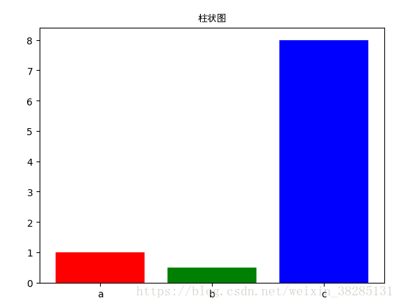
二丶柱状图
a=[1,0.5,8,]
ax=fig.add_subplot(111)
name=['a','b','c']
#参数:颜色和标签
ax.bar(range(len(a)),a,color='rgb',tick_label=name)
如下图所示:
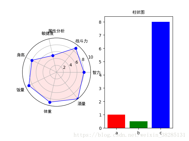
三丶在同一图中画雷达图和柱状图
'''
matplotlib雷达图
'''
import numpy as np
import matplotlib.pyplot as plt

#=======自己设置开始============
#标签
labels = np.array(['智力','战斗力','敏捷度','身高','饭量','体重','酒量'])
#数据个数
dataLenth = 7
#数据
data = np.array([8,9,5,8,9,9,10])
#========自己设置结束============

angles = np.linspace(0, 2*np.pi, dataLenth, endpoint=False)
data = np.concatenate((data, [data[0]])) # 闭合 # #将数据结合起来
angles = np.concatenate((angles, [angles[0]])) # 闭合

fig = plt.figure()
ax = fig.add_subplot(121, polar=True)# polar参数!!111代表总行数总列数位置
ax.plot(angles, data, 'bo-', linewidth=1)# 画线四个参数为x,y,标记和颜色,闲的宽度
ax.fill(angles, data, facecolor='r', alpha=0.1)# 填充颜色和透明度
ax.set_thetagrids(angles * 180/np.pi, labels, fontproperties="SimHei")
ax.set_title("属性分析", va='baseline', fontproperties="SimHei")
ax.set_rlim(0,10)
ax.grid(True)


a=[1,0.5,8,]
ax=fig.add_subplot(122)
name=['a','b','c']
ax.bar(range(len(a)),a,color='rgb',tick_label=name)
ax.set_title("柱状图",va='bottom', fontproperties="SimHei")
plt.show()
注:主要是add_subplot(122)设置,分别代表一幅图中子图像行数,列数,和位置
如下图: