-webkit- 是浏览器前缀, 表示特定浏览器对一个属性还在实验阶段, 在这里顺便写下各个浏览器的前缀:
chrome/ safari -webkit-
firefox -moz-
IE -ms-
opera -o-
文本渐变
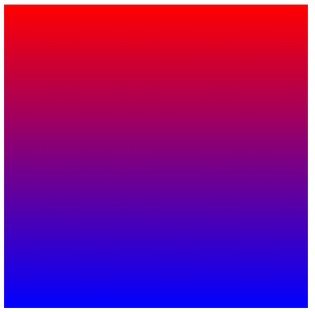
1.background-image: -webkit-linear-gradient(top, red, blue);
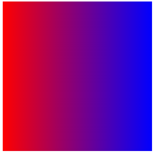
2.background-image: -webkit-linear-gradient(0deg, red, blue);
3.background-image: -webkit-radial-gradient(center center , red, blue)

文本描边-text-stroke
说明:复合属性。设置或检索对象中的文字的描边。
兼容:目前只有Chrome13.0、safari5.1能支持
语法:text-stroke:[ text-stroke-width ] || [ text-stroke-color ]
text-stroke-width 设置或检索对象中的文字的描边厚度
text-stroke-color 设置或检索对象中的文字的描边颜色
例:-webkit-text-stroke:1px #f00;text-stroke:1px #f00;