版权声明:本文为博主原创文章,转载务必注明出处,http://blog.csdn.net/michael_ouyang。 https://blog.csdn.net/michael_ouyang/article/details/76359357
Import
按需引入:
import { Navbar, TabItem } from 'mint-ui';
Vue.component(Navbar.name, Navbar);
Vue.component(TabItem.name, TabItem);
全局导入:全局导入后不用再导入
importMintfrom'mint-ui'
import'mint-ui/lib/style.css'
Vue.use(Mint);
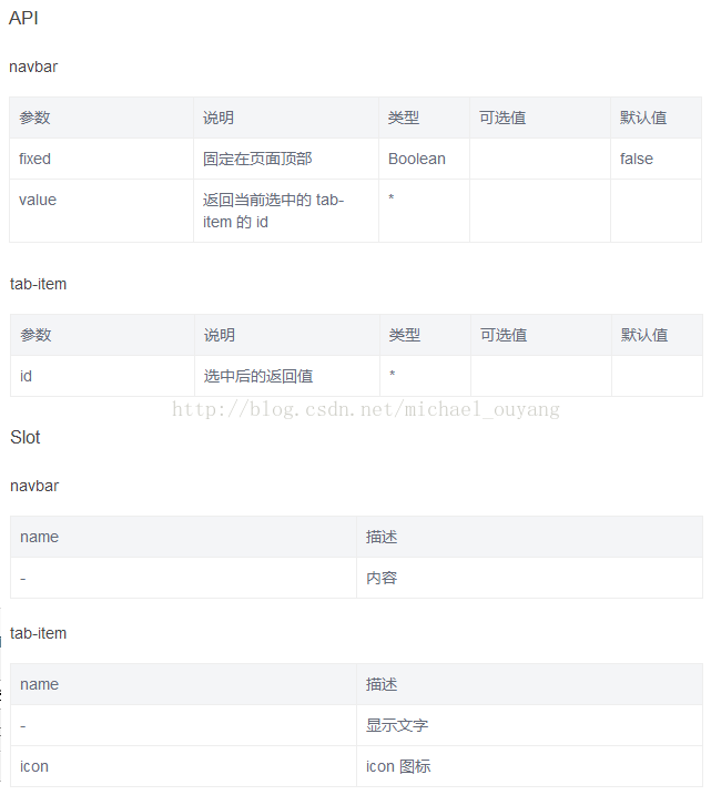
API
示例
示例一:
xxx.vue:
<template>
<div class="page-navbar">
<div class="page-title">Navbar</div>
<!-- navbar -->
<mt-navbar class="page-part" v-model="selected">
<mt-tab-item id="1">选项一</mt-tab-item>
<mt-tab-item id="2">选项二</mt-tab-item>
<mt-tab-item id="3">选项三</mt-tab-item>
</mt-navbar>
<div>
<mt-cell class="page-part" title="当前选中">{{ selected }}</mt-cell>
</div>
<!-- tabcontainer -->
<mt-tab-container v-model="selected">
<mt-tab-container-item id="1">
<mt-cell v-for="n in 10" :title="'内容 ' + n" />
</mt-tab-container-item>
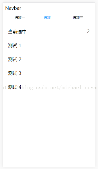
<mt-tab-container-item id="2">
<mt-cell v-for="n in 4" :title="'测试 ' + n" />
</mt-tab-container-item>
<mt-tab-container-item id="3">
<mt-cell v-for="n in 6" :title="'选项 ' + n" />
</mt-tab-container-item>
</mt-tab-container>
</div>
</template>
<script>
export default {
name: 'page-navbar',
data() {
return {
selected: '1'
};
}
};
</script>show:
点击选项二
demo链接:http://download.csdn.net/detail/michael_ouyang/9915075
使用前输入命令:
npm install
npm run dev