linear-gradient----渐变
CSS3 渐变(gradient)可以让你在两个或多个指定的颜色之间显示平稳的过渡。 以前,你必须使用图像来实现这些效果,现在通过使用 CSS3 的渐变(gradients)即可实现。此外,渐变效果的元素在放大时看起来效果更好,因为渐变(gradient)是由浏览器生成的。
1、语法
background: linear-gradient(direction, color-stop1, color-stop2, ...);
direction(角度),默认是to bottm,即从上到下的渐变。
stop,颜色的分布位置,默认是均匀分布,比如有三个颜色渐变,每个颜色的stop值为33.3%。
举个栗子:
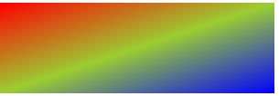
.smallbox{
    width:300px;
    height:100px;
    background-image:linear-gradient(to right,red,yellowgreen,blue);
}
效果:

direction的值自然还有其他三个,分别是to top 、to left 、 to bottom(默认)。
但是这仅仅是常规方向,比如你想斜着渐变,可以这样调整角度,比如从左上角向右下角渐变,可以:
.smallbox{
    width:300px;
    height:100px;
    background-image:linear-gradient(to right bottom,red,yellowgreen,blue);
}
效果:
扫描二维码关注公众号,回复:
2883468 查看本文章

类似值,还有,to right top、to left top、to left bottom。
可以使用具体角度值表示角度,单位deg:
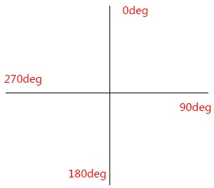
举个栗子,比如90deg(也就是to right):
.smallbox{
    width:300px;
    height:100px;
    background-image:linear-gradient(90deg,red,yellowgreen);
}
效果:

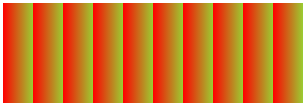
重复性渐变:repeating-linear-gradient
.smallbox{
    width:300px;
    height:100px;
    background-image: repeating-linear-gradient(90deg,red 10%,yellowgreen 20%);
}
效果:
渐变到透明:rgba
.smallbox{
    width:300px;
    height:100px;
    background-image: linear-gradient(to right, rgba(255, 0 ,0, 1), rgba(255, 0 ,0 , 0));
}
效果: