小程序的自定义组件的用法
本文的目的是将一个悬浮回主页的按钮封装成组建,在需要使用的页面的wxml文件中直接引入组件标签即可,并没有涉及在使用的页面调用组件中的方法或属性。这个组件的作用是用于用户从分享卡片或其他方式进入到小程序二级页面或者更深页面时,没有明显的返回主页的功能,虽然页面右上角的三个点可以回主页,但是不熟悉小程序的用户就不知道,所以自己做了一个明显的回主页的按钮
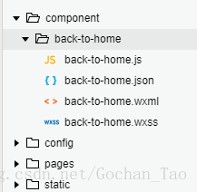
1.首先在项目根目录下创建component文件夹,里面用于放自定义组件。
下图是我创建的回主页按钮组件文件
back-to-home.js文件的代码如下:
// component/back-to-home/back-to-home.js
Component({
  /**
   * 组件的属性列表
   */
  properties: {

  },

  /**
   * 组件的初始数据
   */
  data: {
    show: false,
  },

  ready: function() {
    // console.log(getCurrentPages());
    this.setData({
      show: getCurrentPages().length === 1
    });
  },

  /**
   * 组件的方法列表
   */
  methods: {
    toHome: function() {
      wx.switchTab({
        url: '/pages/index/index',
      })
    },
  }
})
back-to-home.json文件的代码如下:
{
  "component": true,
  "usingComponents": {}
}
back-to-home.wxml文件的代码如下:
<!--component/back-to-home/back-to-home.wxml-->
<block wx:if="{{show}}">
  <view class='go-home' bindtap='toHome'>
    <image src='/static/images/gohome.png'></image>
  </view>
  <view class="wave"></view>
  <view class="wave2"></view>
</block>
back-to-home.wxss文件加了动画样式,所以比较多,代码如下:
/* component/back-to-home/back-to-home.wxss */

/*会主页按钮开始  */
view {
  box-sizing: border-box;
}
.go-home {
  position: fixed;
  font-size: 60rpx;
  /* background-color: #FE6200;
   border-radius: 100%;  */
  width: 100rpx;
  line-height: 100rpx;
  height: 100rpx;
  animation: mymove 2s infinite;
  color: #fff;
  bottom: 200rpx;
  left: 20rpx;
  text-align: center;
  z-index: 999999;
}

.go-home image {
  width: 100%;
  height: 100%;
}

@keyframes mymove {
  0% {
    width: 100rpx;
    height: 100rpx;
  }

  10% {
    width: 110rpx;
    height: 110rpx;
  }

  15% {
    width: 100rpx;
    height: 100rpx;
  }

  25% {
    width: 100rpx;
    height: 100rpx;
  }

  50% {
    width: 100rpx;
    height: 100rpx;
  }

  100% {
    width: 100rpx;
    height: 100rpx;
  }
}

.wave {
  position: fixed;
  bottom: 190rpx;
  left: 10rpx;
  width: 120rpx;
  height: 120rpx;
  border: 6px solid #ffd933;
  border-radius: 50%;
  opacity: 0;
  animation: waveCircle 2s ease-out;
  animation-iteration-count: infinite;
}

@keyframes waveCircle {
  0% {
    transform: scale(0.6);
    opacity: 0;
  }

  10% {
    transform: scale(0.7);
    opacity: 0.1;
  }

  20% {
    transform: scale(0.8);
    opacity: 0.1;
  }

  30% {
    transform: scale(0.9);
    opacity: 0.1;
  }

  75% {
    transform: scale(0.9);
    opacity: 0.1;
  }

  100% {
    transform: scale(1);
    opacity: 0;
  }
}

.wave2 {
  position: fixed;
  bottom: 170rpx;
  left: -10rpx;
  width: 160rpx;
  height: 160rpx;
  background-color: #ffd933;
  border: 6px solid #ffd933;
  border-radius: 50%;
  animation: waveCircle2 2s ease-out;
  animation-iteration-count: infinite;
}

@keyframes waveCircle2 {
  0% {
    transform: scale(0.6);
    opacity: 0;
  }

  10% {
    transform: scale(0.7);
    opacity: 0.1;
  }

  20% {
    transform: scale(0.7);
    opacity: 0.1;
  }

  30% {
    transform: scale(0.8);
    opacity: 0.1;
  }

  75% {
    transform: scale(0.9);
    opacity: 0.1;
  }

  100% {
    transform: scale(1);
    opacity: 0;
  }
}

/*会主页按钮结束  */
在需要引用的page页面引入组件,在这里我是在page/talentDetail/talentDetail页面引入

只需两步就可以引入之前写好的模板
1.在talentDetail.josn中加入usingComponents,引入组件,组件名字自己命名,这里我命名为back-to-home
{
  "navigationBarTitleText": "理财大咖",
  "enablePullDownRefresh": true,
  "onReachBottomDistance": 50,
  "usingComponents": {
    "back-to-home": "/component/back-to-home/back-to-home"
  }
}
2.在talentDetail.wxml中加入组件即可
<view>

  <back-to-home></back-to-home>
</view>
大功告成!
按钮的属性、方法和样式都封装在组件里,不需要引入的界面干预组件的逻辑,从而直接让组件逻辑和需要引入的页面完全分开来