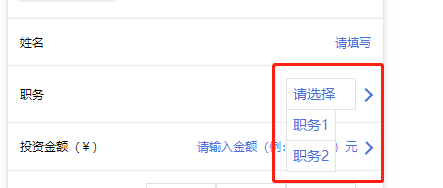
之前写过怎么使用小程序的组件,Weui,今天总结一下,怎么使用自定义组件,以 select 下拉框为例
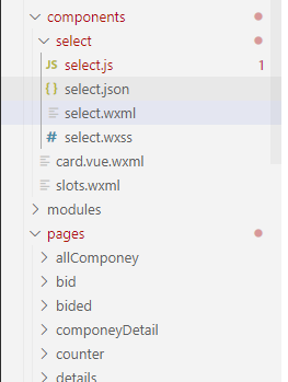
首先,自定义组件,肯定要有组件,我们先在 components 里面新建 select 文件夹 (如果是小程序原生的,里面文件应该会自动生成,我这里用的是 mpvue ,里面的文件 select.js , select.json , select.wxml , select.wxss 是要自己添加的)
select.wxml
<view class='com-selectBox'>
  <view class='com-sContent' bindtap='selectToggle'>
    <view class='com-sTxt'>{{nowText}}</view>
    <image class="" src="../../../../../static/images/user.png" class='com-sImg' animation="{{animationData}}"></image>
  </view>
  <view class='com-sList' wx:if="{{selectShow}}">
    <view wx:for="{{propArray}}" data-index="{{index}}" data-level='{{item.level}}' wx:key='index' class='com-sItem' bindtap='setText'>
      {{item.text}}
    </view>
  </view>
</view>
select.wxss
.com-sContent {
  border: 1px solid #e2e2e2;
  background: white;
  font-size: 24rpx;
  position: relative;
  height: 30px;
  line-height: 30px;
}

.com-sImg {
  position: absolute;
  right: 10px;
  top: 11px;
  width: 16px;
  height: 9px;
  transition: all .3s ease;
}

.com-sTxt {
  overflow: hidden;
  text-overflow: ellipsis;
  white-space: nowrap;
  padding: 0 20px 0 6px;
  font-size: 14px;
}

.com-sList {
  background: white;
  width: inherit;
  position: absolute;
  border: 1px solid #e2e2e2;
  border-top: none;
  box-sizing: border-box;
  z-index: 3;
  max-height: 120px;
  overflow: auto;
}

.com-sItem {
  height: 30px;
  line-height: 30px;
  border-top: 1px solid #e2e2e2;
  padding: 0 6px;
  text-align: left;
  overflow: hidden;
  text-overflow: ellipsis;
  white-space: nowrap;
  font-size: 14px;
}

.com-sItem:first-child {
  border-top: none;
}
select.json
{
  "component": true
}
select.js
// Componet/Componet.js
Component({
  /**
   * 组件的属性列表
   */
  properties: {
    propArray: {
      type: Array
    }
  },
  /**
   * 组件的初始数据
   */
  data: {
    selectShow: false, // 初始option不显示
    nowText: '请选择', // 初始内容
    animationData: {}, // 右边箭头的动画
  },
  /**
   * 组件的方法列表
   */
  methods: {
    // option的显示与否
    selectToggle: function () {
      var nowShow = this.data.selectShow // 获取当前option显示的状态
      // 创建动画
      var animation = wx.createAnimation({
        timingFunction: 'ease'
      })
      this.animation = animation
      if (nowShow) {
        animation.rotate(0).step()
        this.setData({
          animationData: animation.export()
        })
      } else {
        animation.rotate(180).step()
        this.setData({
          animationData: animation.export()
        })
      }
      this.setData({
        selectShow: !nowShow
      })
    },
    // 设置内容
    setText: function (e) {
      var nowData = this.properties.propArray // 当前option的数据是引入组件的页面传过来的,所以这里获取数据只有通过this.properties
      console.log('level============', this.properties.level)
      console.log(nowData)
      var nowIdx = e.target.dataset.index // 当前点击的索引
      var nowText = nowData[nowIdx].text // 当前点击的内容
      // 再次执行动画,注意这里一定,一定,一定是this.animation来使用动画
      this.animation.rotate(0).step()
      this.setData({
        selectShow: false,
        nowText: nowText,
        animationData: this.animation.export()
      })
      var nowDate = {
        id: nowData[nowIdx].id,
        text: nowText
      }
      this.triggerEvent('myget', nowDate)
    }
  }
})
到这里自定义组件的组件就写好了,然后我们在需要使用的页面引用

在需要使用的页面对应的 .json 文件里面添加
  "usingComponents": {
    "Select": "/components/select/select"
  }
<Select name='post' propArray='{{jobList}}' data-type='job' bind:myget='getProjectType'></Select>.js 里面 getProjectType 方法是和 组件里面的 myget 是对应的, 打印出 e.detail 就是组件里面设置的数据了,
  getProjectType: function (e) {
    console.log(e.detail)
  },
以上直接复制,稍微改改就可以看的明白了
现在讲一下细节
组件之间的传值
具体的可以看 官方文档对组件的解释


才疏学浅,如有不足,欢迎指出 ,不胜感激 (•̀ᴗ•́)و ̑̑