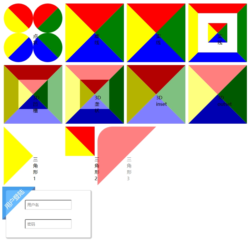
使用纯CSS绘制图片可以减少请求位图带来的网络开销,提高渲染速度。
CSS绘制三角形主要利用了——当元素的宽高慢慢缩小为0时,4个边框也会由梯形逐渐变为三角形。
常和before一起使用,用作聊天气泡前的三角形,或如下的三角边框装饰
<html>
<head>
<meta charset="utf8">
<style>
section {
    display:flex;
    flex-flow: row wrap;
    align-content: flex-start;
}
.triangle {
    margin: 5px;
    width: 0;
    height: 0;
    border-width: 100px;
    /* 上 右 下 左 */
    border-color: red green blue yellow;
}
.dotted {
    border-style: dotted;
}
.dashed {
    border-style: dashed;
}
.solid {
    border-style: solid;
}
.double {
    border-style: double;
}
.groove {
    border-style: groove;
}
.ridge {
    border-style: ridge;
}
.inset {
    border-style: inset;
}
.outset {
    border-style: outset;
}
.triangle1 {
    border-color: transparent transparent transparent yellow;
    border-style: solid;
}
.triangle2 {
    border-style: solid none none solid;
}
.triangle3 {
    border-color: red transparent transparent red;
    border-style: solid;
    border-top-left-radius:50px;
    opacity: 0.5;
}
.triangle_tag {
    position: absolute;
    float: top;
    opacity: 0.8;
    width: 0;
    height: 0;
    border-width: 3.5rem;
    border-color: #4AF transparent transparent #4AF;
    border-style: solid;
}
.triangle_box {
    z-index: -10;
    position: absolute;
    width: 7rem;
    height: 7rem;
    background-color: #57A;
}
.title {
    box-sizing: border-box;
    margin: 1.7rem 0 0 -1rem;
    position: absolute;
    width: 7rem;
    text-align: center;
    color: white;
    font-size: 1.3rem;
    font-weight: 500;
    transform-origin: center;
    transform:rotate(-45deg);
}
.content {
    margin: 0.8rem;
    width: 18rem;
    height: 10rem;
    background-color: white;
    border-radius: 0.2rem;
    box-shadow: 0.15rem 0.15rem 0.1rem 0.2rem #CCC;
    text-align: center;

}
input[type="text"], input[type="password"] {
    margin-top: 2rem;
    width: 10rem;
    padding: 0.4rem;
    border-radius: 0.2rem;
    border-color: #AAA;
    box-shadow: 0px 0px 0.1rem #CCC inset;
}
</style>
</head>
<body>
<section>
<!-- 还有none、hidden、inherit -->
<span class="triangle dotted">点状<!--chrome浏览器与firefox和Edge不同--></span>
<span class="triangle dashed">虚线</span>
<span class="triangle solid">实线</span>
<span class="triangle double">实线</span>
<span class="triangle groove">3D 凹槽</span>
<span class="triangle ridge">3D 垄状</span>
<span class="triangle inset">3D inset</span>
<span class="triangle outset">3D outset</span>
<span class="triangle triangle1">三角形1</span>
<span class="triangle triangle2">三角形2</span>
<span class="triangle triangle3">三角形3</span>
</section>
<section>
    <div>
        <div class="triangle_box"></div>
        <div class="triangle_tag"></div>
        <div class="title">用户登陆</div>
        <form class="content" action="https://www.baidu.com" method="get">
            <input type="text" placeholder="用户名" />
            <input type="password" placeholder="密码" />
        </form>
    </div>
</section>
</body>
</html>