实现三角形的绘制很简单。
第一步:新建一个div。
<div class="kailong"></div>第二步:为盒子添加样式。
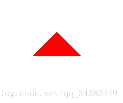
1.向上
.kailong{
	width:0;
        height:0;
	border-right:50px solid transparent;
	border-left:50px solid transparent;
	border-bottom:50px solid red;
}
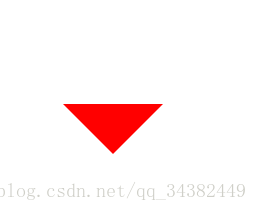
2.向下
.kailong{
	width:0;
	height:0;
	border-right:50px solid transparent;
	border-left:50px solid transparent;
	border-top:50px solid red;
}
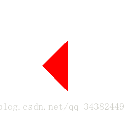
3.向左
.kailong{
    width:0;
    height:0;
    border-top:50px solid transparent;
    border-bottom:50px solid transparent;
    border-right:50px solid red;
}
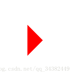
4.向右
.kailong{
    width:0;
    height:0;
    border-top:50px solid transparent;
    border-bottom:50px solid transparent;
    border-left:50px solid red;
}
至此css3实现三角形的绘制完成了。