一、绘制单变量分布
import numpy as np
import pandas as pd
import seaborn as sns
import matplotlib.pyplot as plt
from scipy import stats
sns.set(color_codes=True)  #设置背景
x = np.random.normal(size=100)
sns.distplot(x);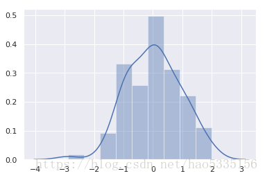
直方图
删除密度曲线并添加一个地图,在每次观察时绘制一个小的垂直刻度
sns.distplot(x, kde=False, rug=True);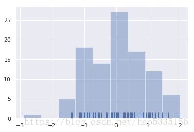
设置条形图的数量20
sns.distplot(x, bins=20, kde=False, rug=True);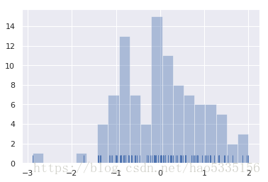
核密度估计
sns.distplot(x, hist=False, rug=True);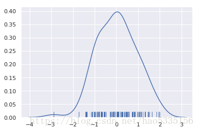
kdeplot()在seaborn中使用该函数:曲线进行归一化,使其下面的面积等于1
sns.kdeplot(x, shade=True);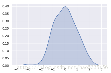
bwKDE 的bandwidth()参数控制估计与数据拟合的紧密程度,就像直方图中的bin大小一样。它对应于我们上面绘制的内核的宽度。
sns.kdeplot(x)
sns.kdeplot(x, bw=.2, label="bw: 0.2")
sns.kdeplot(x, bw=2, label="bw: 2")
plt.legend();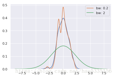
高斯KDE过程的性质意味着估计延伸超过数据集中的最大值和最小值。可以通过参数控制曲线绘制的极值之前的距离cut
min(x),max(x)sns.kdeplot(x, shade=True, cut=0)
sns.rugplot(x);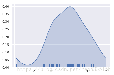
拟合参数分布
x = np.random.gamma(6, size=200)
sns.distplot(x, kde=False, fit=stats.gamma);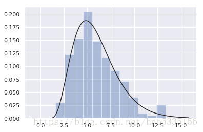
二、绘制双变量分布
mean, cov = [0, 1], [(1, .5), (.5, 1)]
data = np.random.multivariate_normal(mean, cov, 200)
df = pd.DataFrame(data, columns=["x", "y"])df.head(3)
.dataframe tbody tr th:only-of-type { vertical-align: middle; } .dataframe tbody tr th { vertical-align: top; } .dataframe thead th { text-align: right; }
| x | y | |
|---|---|---|
| 0 | -0.869325 | 2.107007 |
| 1 | 1.761775 | 1.846988 |
| 2 | 0.235551 | 2.516620 |
散点图
sns.jointplot(x="x", y="y", data=df);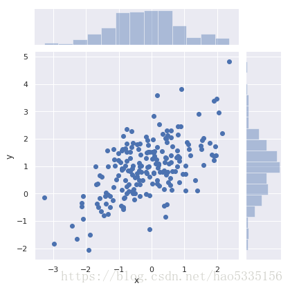
Hexbin图
直方图的双变量类比称为“hexbin”图,因为它显示了六边形区间内的观察计数。此图对于相对较大的数据集最有效。
x, y = np.random.multivariate_normal(mean, cov, 1000).T
with sns.axes_style("white"):
    sns.jointplot(x=x, y=y, kind="hex", color="k");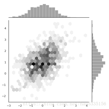
核密度估计
sns.jointplot(x="x", y="y", data=df, kind="kde");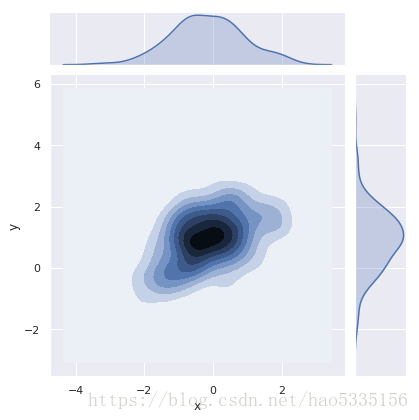
可以使用该kdeplot()函数绘制二维核密度图。这允许您将这种绘图绘制到特定的(可能已经存在的)matplotlib轴上,而该jointplot()函数管理自己的图形:
f, ax = plt.subplots(figsize=(6, 6))
sns.kdeplot(df.x, df.y, ax=ax)
sns.rugplot(df.x, color="g", ax=ax)
sns.rugplot(df.y, vertical=True, ax=ax);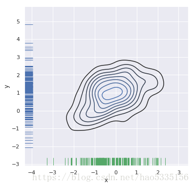
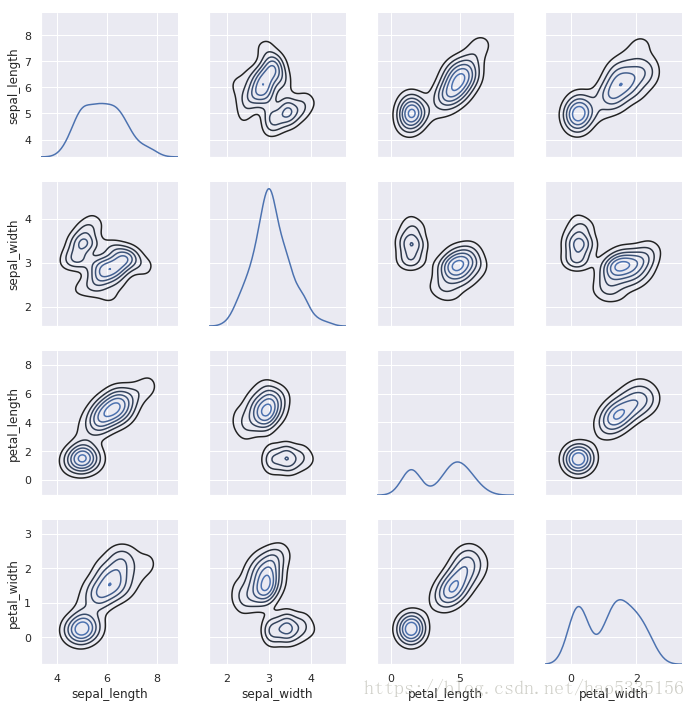
三、可视化数据集中的成对关系
要在数据集中绘制多个成对的双变量分布,可以使用该pairplot()函数;
这将创建一个轴矩阵,并显示DataFrame中每对列的关系(对角线都是自己
跟自己的分布,所有显示”单变量分布”)
iris = sns.load_dataset("iris")
iris.head(3)
.dataframe tbody tr th:only-of-type { vertical-align: middle; } .dataframe tbody tr th { vertical-align: top; } .dataframe thead th { text-align: right; }
| sepal_length | sepal_width | petal_length | petal_width | species | |
|---|---|---|---|---|---|
| 0 | 5.1 | 3.5 | 1.4 | 0.2 | setosa |
| 1 | 4.9 | 3.0 | 1.4 | 0.2 | setosa |
| 2 | 4.7 | 3.2 | 1.3 | 0.2 | setosa |
sns.pairplot(iris);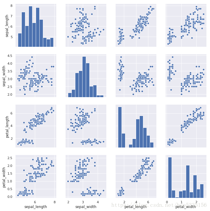
更多的灵活性
g = sns.PairGrid(iris)
g.map_diag(sns.kdeplot)
g.map_offdiag(sns.kdeplot, n_levels=6); # n_levels=6表示6个等高线