seaborn整体风格设置
sns.set() → 整体设置seaborn的主题,调色板,颜色代码等多个样式
# 设置cell多行输出

from IPython.core.interactiveshell import InteractiveShell
InteractiveShell.ast_node_interactivity = 'all' #默认为'last'

# 导入相关库
import numpy as np
import pandas as pd
import matplotlib.pyplot as plt
import seaborn as sns   # 导入seaborn库
import os
import warnings
%matplotlib inline

warnings.filterwarnings('ignore')
# 数据
years = [1950,1960,1970,1980,1990,2000,2010]
gdp = np.random.rand(7)*1000

data = pd.DataFrame(gdp,index=years)
# 整体设置seaborn的主题风格,调色板,颜色
sns.set(style='whitegrid',palette='muted',color_codes=True)
# style 主题风格 包括:"white", "dark", "whitegrid", "darkgrid", "ticks"
# palette 调色板
# color_codes 颜色代码
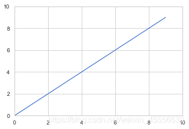
plt.plot(np.arange(10))
plt.xlim([0,10])
plt.ylim([0,10])
sns.set_style() → 切换seaborn图表风格
→ 单独改变seaborn的主题样式,seaborn有5种预先设计号的主题样式:
- darkgrid(默认使用该主题样式)
- dark
- whitegrid
- white
- ticks
sns.set_style('dark')   # 单独设置主题风格
plt.scatter(years,gdp,)  # 仍然可以使用matplotlib的参数

sns.despine() → 设置坐标轴
→ white,ticks主题有4个坐标轴,可以用sns.despine()将右侧和顶部的坐标轴去除
seaborn.despine(fig=None, ax=None, top=True, right=True, left=False, bottom=False, offset=None, trim=False)
- offset,设置与坐标轴之间的偏移
- trim,为True时,将坐标轴限制在数据最大最小值
sns.set_style('ticks')
plt.plot(np.random.rand(10))
sns.despine()  # 默认去掉顶部和右侧坐标轴
plt.plot(np.random.rand(20),color='r')
sns.despine(offset=10,trim=True)
# offset:与坐标轴之间的偏移
# trim,为True时,将坐标轴限制在数据最大最小值
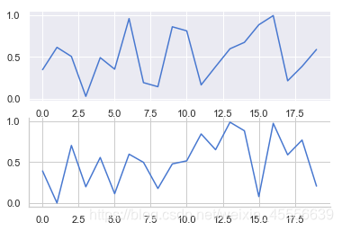
axes_style() → 设置局部图表风格
单独设置某个子图的风格
# 可和with配合的用法
with sns.axes_style("darkgrid"):
    plt.subplot(211)
    plt.plot(np.random.rand(20))
# 设置局部图表风格,用with做代码块区分

sns.set_style("whitegrid")
plt.subplot(212)
plt.plot(np.random.rand(20))
sns.despine()
# 外部表格风格
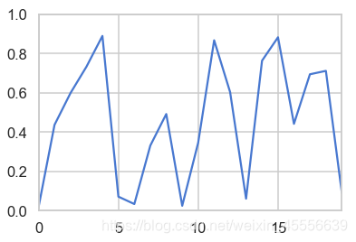
set_context() → 设置显示比例尺度
→ set_context()的选择包括:‘paper’, ‘notebook’, ‘talk’, ‘poster’,默认为notebook
sns.set_context('talk')
plt.plot(np.random.rand(20))
plt.xlim([0,19])
plt.ylim([0,1])
color_palette() → 设置调色盘
→对图表整体颜色、比例等进行风格设置,包括颜色色板等,调用系统风格进行数据可视化
color_palette()默认6种颜色:deep, muted, pastel, bright, dark, colorblind
seaborn.color_palette(palette=None, n_colors=None, desat=None)
其他颜色风格
风格内容:Accent, Accent_r, Blues, Blues_r, BrBG, BrBG_r, BuGn, BuGn_r, BuPu,
BuPu_r, CMRmap, CMRmap_r, Dark2, Dark2_r, GnBu, GnBu_r, Greens, Greens_r, Greys, Greys_r, OrRd, OrRd_r, Oranges, Oranges_r, PRGn, PRGn_r,
Paired, Paired_r, Pastel1, Pastel1_r, Pastel2, Pastel2_r, PiYG, PiYG_r, PuBu, PuBuGn, PuBuGn_r, PuBu_r, PuOr, PuOr_r, PuRd, PuRd_r, Purples,
Purples_r, RdBu, RdBu_r, RdGy, RdGy_r, RdPu, RdPu_r, RdYlBu, RdYlBu_r, RdYlGn, RdYlGn_r, Reds, Reds_r, Set1, Set1_r, Set2, Set2_r, Set3,
Set3_r, Spectral, Spectral_r, Wistia, Wistia_r, YlGn, YlGnBu, YlGnBu_r, YlGn_r, YlOrBr, YlOrBr_r, YlOrRd, YlOrRd_r, afmhot, afmhot_r……
# 设置调色板后,绘图创建图表
sns.color_palette('icefire_r')  # 设置调色板
sns.set_context('notebook')

def sinplot(flip=1):
    x = np.linspace(0, 14, 100)
    for i in range(1, 7):
        plt.plot(x, np.sin(x + i * .5) * (7 - i) * flip)
sinplot()
plt.xlim([0,14])
plt.ylim([-6,6])

# 绘制系列颜色
分布数据可视化
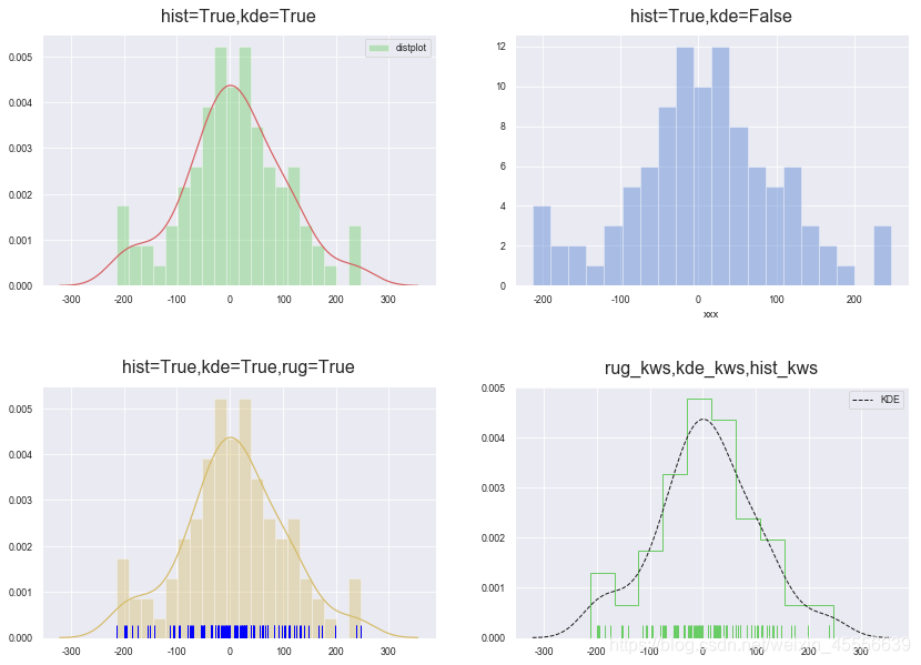
直方图 → sns.distplot()
→ sns.distplot(‘a’, ‘bins=None’, ‘hist=True’, ‘kde=True’, ‘rug=False’, ‘fit=None’, ‘hist_kws=None’, ‘kde_kws=None’, ‘rug_kws=None’, ‘fit_kws=None’, ‘color=None’, ‘vertical=False’, ‘norm_hist=False’, ‘axlabel=None’, ‘label=None’, ‘ax=None’)
- bins 箱数
- hist、ked 是否显示箱/密度曲线 (默认情况下hist=True,ked=True,直方图和密度图同时显示)
- norm_hist 直方图是否按照密度来显示
- rug 是否显示数据分布情况
- vertical 是否水平显示
- color 设置颜色
- label 图例
- axlabel x轴标注
- hist_kws 设置箱子的风格,线宽,透明度,颜色
- kde_kws 设置数据密度曲线颜色,线宽,标注,线形;风格包括:‘bar’, ‘barstacked’, ‘step’, ‘stepfilled’
- rug_kws 设置数据频率的相关参数
sns.set_style("darkgrid")
sns.set_context("paper")

rs = np.random.RandomState(10)
s = pd.Series(rs.randn(100)*100)
fig,ax = plt.subplots(2,2,figsize=(14,10))
ax1=ax[0,0]
sns.distplot(s,bins=20,ax=ax1,color='g',kde_kws={'color':'r'},label='distplot') # 默认hist=True,kde=True
ax1.legend()
ax1.set_title('hist=True,kde=True',fontsize=16,pad=12)

ax2=ax[0,1]
sns.distplot(s,bins=20,hist=True,kde=False,axlabel='xxx',ax=ax2)
ax2.set_title('hist=True,kde=False',fontsize=16,pad=12)

ax3=ax[1,0]
sns.distplot(s,bins=20,rug=True,ax=ax3,color='y',rug_kws={'color':'blue'})
ax3.set_title('hist=True,kde=True,rug=True',fontsize=16,pad=12)

ax4=ax[1,1]
sns.distplot(s,rug = True, rug_kws = {'color':'g'},kde_kws={"color": "k", "lw": 1, "label": "KDE",'linestyle':'--'},
            hist_kws={"histtype": "step", "linewidth": 1,"alpha": 1, "color": "g"})
            # 风格包括:'bar', 'barstacked', 'step', 'stepfilled'
ax4.set_title('rug_kws,kde_kws,hist_kws',fontsize=16,pad=12)

plt.subplots_adjust(wspace=0.2, hspace=0.4)  #调整子图间距
密度图 → sns.kdeplot()
→ sns.kdeplot(‘data’, ‘data2=None’, ‘shade=False’, ‘vertical=False’, “kernel=‘gau’”, “bw=‘scott’”, ‘gridsize=100’, ‘cut=3’, ‘clip=None’, ‘legend=True’, ‘cumulative=False’, ‘shade_lowest=True’, ‘cbar=False’, ‘cbar_ax=None’, ‘cbar_kws=None’, ‘ax=None’,)
- bw 控制拟合的程度,类似直方图的箱数
- shade,是否填充
- vertical,是否水平
- cbar,是否显示颜色图例
- cmap = ‘Reds’, 设置调色盘
- shade_lowest=False, 最外围颜色是否显示
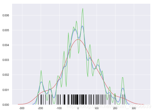
单个样本密度分布情况
# 数据
rs = np.random.RandomState(10)
s = pd.Series(rs.randn(100)*100)

# 绘图
plt.figure(figsize=(8,6))
sns.kdeplot(s,shade = False,color = 'r',linewidth=1.2)
sns.kdeplot(s,bw=10)
sns.kdeplot(s,bw=5,color='g')

# 数据频率分布图
sns.rugplot(s,height=0.1,color='black')
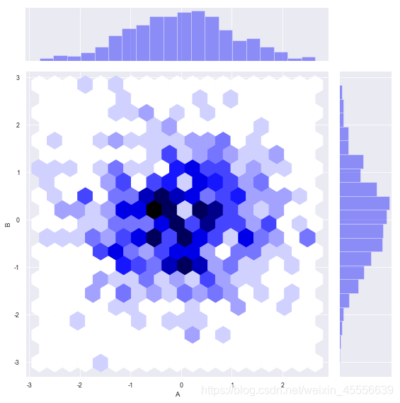
两个样本数据密度分布图
→ 两个维度数据生成曲线密度图,以颜色作为密度衰减显示
# 数据
rs = np.random.RandomState(2)  # 设定随机数种子
df = pd.DataFrame(rs.randn(100,2),
                 columns = ['A','B'])

fig,ax = plt.subplots(2,2,figsize=(14,12))
ax1 = ax[0,0]
sns.kdeplot(df['A'],df['B'],cmap='Reds',cbar=True,shade=True,ax=ax1,shade_lowest=False,n_levels=20)
ax1.set_title('shade_lowest=False',fontsize=16,pad=12)

ax2 = ax[0,1]
sns.kdeplot(df['A'],df['B'],cmap='Blues',cbar=True,shade=True,ax=ax2,shade_lowest=True,n_levels=10)
ax2.set_title('shade_lowest=True',fontsize=16,pad=12)
# shade_lowest=False, 最外围颜色是否显示
# n_levels = 10  曲线个数(如果非常多,则会越平滑)
# 两个维度数据生成曲线密度图,以颜色作为密度衰减显示

# 在x,y轴上绘制数据频率分布图
sns.rugplot(df['A'], color="g", axis='x',alpha = 0.5,ax=ax1)
sns.rugplot(df['B'], color="r", axis='y',alpha = 0.5,ax=ax1)

# 多个密度图
rs1 = np.random.RandomState(2)
rs2 = np.random.RandomState(5)
df1 = pd.DataFrame(rs1.randn(100,2)+2,columns = ['A','B'])
df2 = pd.DataFrame(rs2.randn(100,2)-2,columns = ['A','B'])
ax3=ax[1,0]
sns.kdeplot(df1['A'],df1['B'],ax=ax3,cmap='Greens',shade=True,n_levels=10,shade_lowest=False)
sns.kdeplot(df2['A'],df2['B'],ax=ax3,cmap='RdBu',shade=True,n_levelss=10,shade_lowest=False)

ax4=ax[1,1]
sns.kdeplot(df1['A'],df1['B'],ax=ax4,cmap='Reds_r',shade=True,n_levels=10,shade_lowest=False,cbar=True)
sns.kdeplot(df2['A'],df2['B'],ax=ax4,cmap='Blues',shade=True,n_levelss=10,shade_lowest=False,cbar=True)
fig.tight_layout(pad=1) # 调整图表整体空白,pad=1.08默认

散点图
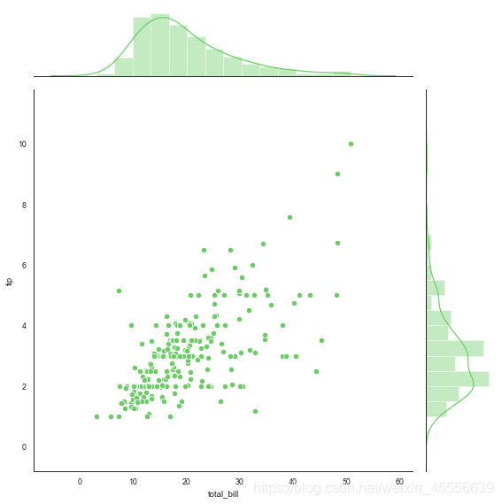
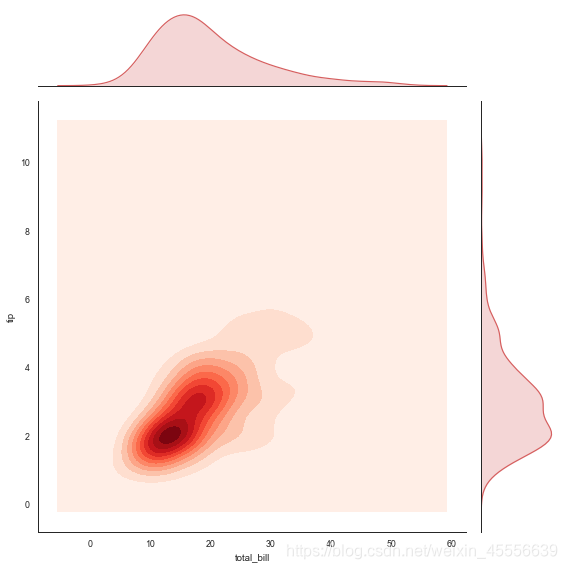
综合散点图 → sns.jointplot()
→ 一个多面板图,不仅能显示两个变量的关系,还可显示每个单变量的分布情况
→ sns.jointplot(‘x’, ‘y’, ‘data=None’, “kind=‘scatter’”, ‘stat_func=None’, ‘color=None’, ‘height=6’, ‘ratio=5’, ‘space=0.2’, ‘dropna=True’, ‘xlim=None’, ‘ylim=None’, ‘joint_kws=None’, ‘marginal_kws=None’, ‘annot_kws=None’)
- x,y 设置xy轴,显示columns名称
- data 设置数据
- color 设置颜色
- s 设置散点大小(只针对scatter)
- kind 设置类型:“scatter”、“reg”、“resid”、“kde”、“hex”
- space 设置散点图和顶部右侧的布局图的间距
- size图表大小(自动调整为正方形)
- ratio 散点图与布局图高度比,整型
- marginal_kws=dict(bins=15, rug=True) 设置柱状图箱数,是否设置rug
rs = np.random.RandomState(2)
df = pd.DataFrame(rs.randn(200,2),columns = ['A','B'])
# 散点图+分布图(直方图)
sns.jointplot(x=df['A'],y=df['B'],data=df,space=0.2,size=8,ratio=4,marginal_kws=dict(bins=20,rug=True,color='r'))
# marginal_kws=dict(bins=20,rug=True)设置柱状图箱数,是否设置rug

# 散点图(六边形图)+分布图(直方图)
df = pd.DataFrame(rs.randn(500,2),columns = ['A','B'])
sns.jointplot(x=df['A'], y=df['B'],data = df, kind="hex", color="blue",marginal_kws=dict(bins=20),size=8)
综合散点图 → sns.JointGrid()
→ sns.JointGrid()是可拆分绘制的散点图,利用plot_joint() + ax_marg_x.hist() + ax_marg_y.hist() 散点图+直方图
- plot.joint() 设置内图表
- ax_marg_x.hist() 设置x轴的布局图
- ax_marg_y.hist() 设置y轴的布局图
# 导入seaborn的自带数据集
tips = sns.load_dataset('tips')
tips.head()
| total_bill | tip | sex | smoker | day | time | size | |
|---|---|---|---|---|---|---|---|
| 0 | 16.99 | 1.01 | Female | No | Sun | Dinner | 2 |
| 1 | 10.34 | 1.66 | Male | No | Sun | Dinner | 3 |
| 2 | 21.01 | 3.50 | Male | No | Sun | Dinner | 3 |
| 3 | 23.68 | 3.31 | Male | No | Sun | Dinner | 2 |
| 4 | 24.59 | 3.61 | Female | No | Sun | Dinner | 4 |
sns.set_style('white')  # 设置风格
g = sns.JointGrid(x='total_bill',y='tip',data=tips,size=8) # 创建一个绘图表格区域,设置好x、y对应数据
g.plot_joint(plt.scatter,color='r')  # 设置内图
g.ax_marg_x.hist(tips['total_bill'],alpha=0.8,bins=20)
g.ax_marg_y.hist(tips['tip'],color='r',alpha=0.8,bins=20,orientation='horizontal')

from scipy import stats
g.annotate(stats.pearsonr)
# 设置标注,可以为pearsonr,spearmanr

→ sns.JointGrid()是可拆分绘制的散点图,利用plot_joint() + plot_marginals() 散点图+直方图+密度图、
- plot.marginals() 直接在x,y轴绘制局部图
g = sns.JointGrid(x='total_bill', y='tip',data=tips,size=8) # 创建一个绘图表格区域,设置好x、y对应数据
g = g.plot_joint(plt.scatter,color='g', s=40, edgecolor='white')   # 绘制散点图
g.plot_marginals(sns.distplot, kde=True, color='g')  # x,y轴绘制直方图
g = sns.JointGrid(x='total_bill', y='tip',data=tips,size=8) # 创建一个绘图表格区域,设置好x、y对应数据
g = g.plot_joint(sns.kdeplot,cmap='Reds',n_level=20,shade=True)   # 绘制密度图
g.plot_marginals(sns.kdeplot, shade=True, color='r')  # x,y轴绘制密度图
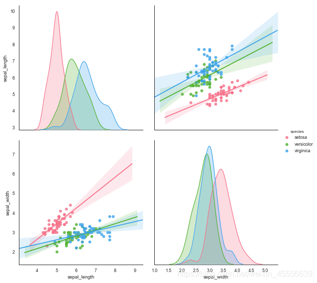
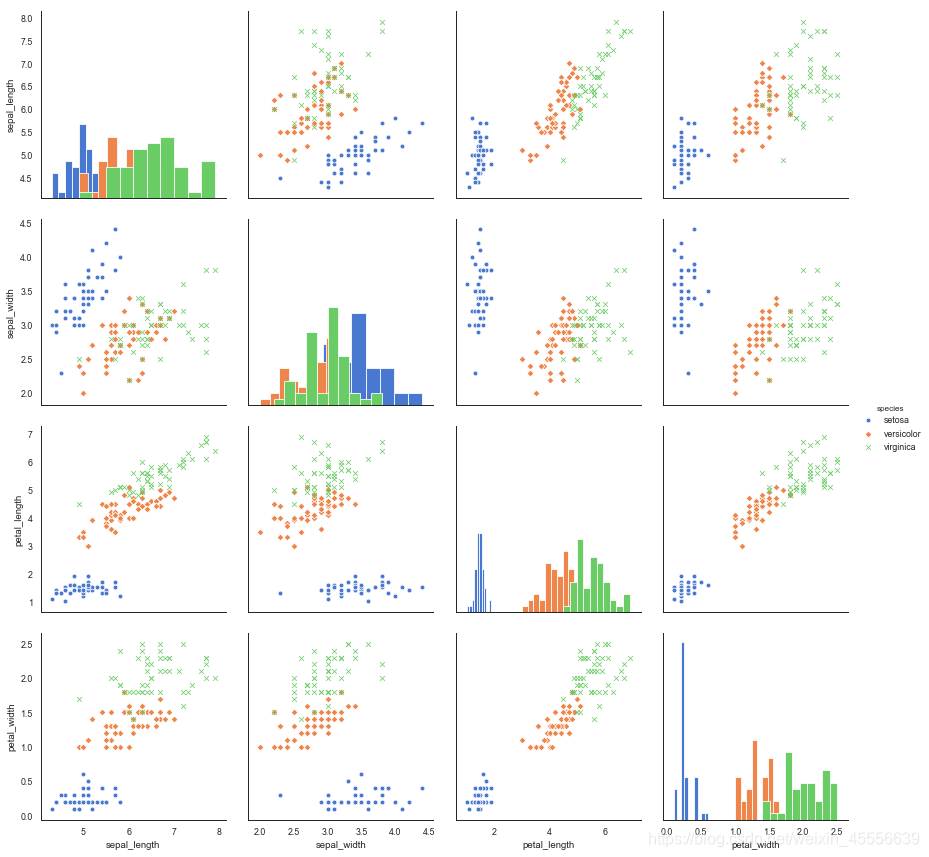
矩阵散点图 → sns.pairplot()
→ sns.pairplot()只对数值类型的列有效,其创建一个轴矩阵,以此显示DataFrame中每两列的关系,在对角上位单变量的分布情况
sns.pairplot(‘data’, ‘hue=None’, ‘hue_order=None’, ‘palette=None’, ‘vars=None’, ‘x_vars=None’, ‘y_vars=None’, “kind=‘scatter’”, “diag_kind=‘auto’”, ‘markers=None’, ‘height=2.5’, ‘aspect=1’, ‘dropna=True’, ‘plot_kws=None’, ‘diag_kws=None’, ‘grid_kws=None’, ‘size=None’)
- kind 散点图/回归分布图 {‘scatter’,‘reg’}
- diag_kind 对角线图类型设置,直方图/密度图 {‘hist’, ‘kde’}
- hue 按照某一字段进行分类
- palette 设置调色板
- markers 设置不同系列的点样式(要根据参考分类个数)
- size 图表大小
- vars 提取局部变量进行对比时设置
iris = sns.load_dataset("iris")
print(iris.head())

sns.color_palette('Blues_r')  # 设置调色板
sns.pairplot(iris,kind='scatter',diag_kind='hist',size=3,markers=['o','D','x'],hue='species')
   sepal_length  sepal_width  petal_length  petal_width species
0           5.1          3.5           1.4          0.2  setosa
1           4.9          3.0           1.4          0.2  setosa
2           4.7          3.2           1.3          0.2  setosa
3           4.6          3.1           1.5          0.2  setosa
4           5.0          3.6           1.4          0.2  setosa


[(0.044059976931949255, 0.3338869665513264, 0.6244521337946944),
 (0.16696655132641294, 0.48069204152249134, 0.7291503267973857),
 (0.3262898885044214, 0.6186236063052672, 0.802798923490965),
 (0.5356862745098039, 0.746082276047674, 0.8642522106881968),
 (0.7309496347558632, 0.8394771241830065, 0.9213225682429834),
 (0.8584083044982699, 0.9134486735870818, 0.9645674740484429)]
# 提取局部变量进行对比
sns.pairplot(iris,vars=['sepal_length','sepal_width'],kind='reg',diag_kind='kde',palette='husl',hue='species',size=4)