首先从echarts官网上下载echarts.js文件
<script src="echarts.js"></script>
<!doctype html>
<html lang="en">
<head>
<meta charset="UTF-8">
<meta name="viewport"
content="width=device-width, user-scalable=no, initial-scale=1.0, maximum-scale=1.0, minimum-scale=1.0">
<meta http-equiv="X-UA-Compatible" content="ie=edge">
<title>Document</title>
<script src="jquery1.3.2.min.js"></script>
<script src="echarts.js"></script>
</head>
<body>
<div id="product2" style="width: 30%;height: 300px;"></div><!--饼图容器-->
<script>
$(function(){
var datalist = [];
$.ajax({
type:'GET',
url:'test.json',
dataType:'json',
success:function(res){
datalist = res;
//产品的名称、数量、单价分别提取出来作为三个新数组
var namelist = [];
var countlist = [];
var pricelist = [];
$.each(datalist,function(index,val){
namelist.push(val.name);
countlist.push(val.counts);
pricelist.push(val.price);
});
/*
* 饼图 产品数量占比
*/
var productChart2 = echarts.init(document.querySelector('#product2'));
var option2 = {
title:{
text:'product -- 饼图',
textStyle:{fontSize:14}
},
tooltip:{},
legend:{
data:namelist,//顶部提示分类有哪些对应的是什么颜色、以及顶部提示的位置
x: 'right',// 'center' | 'left' | {number}
y: 'top'// 'center' | 'bottom' | {number}
},
/*xAxis:{},//饼图没有x,y轴
yAxis:{},*/
color:['#cff','#cfc','#fcf','#fcc','#ccf'],
series:{
type:'pie',
radius : ['40%', '66%'],//环状的饼图(如果不要这个参数,那就是一个实心圆,按自己需求取舍)
center : ['30%', '50%'],//图形在product2的div中的位置
itemStyle:{
normal: {
label:{ //饼图每个分类的解释
show:true,
formatter:'{b}:{c} ({d}%)'
}
}
},
lableLine: {normal: {show: true}},
emphasis: { //解释(即每个模块延伸出的文字和占比)的位置和样式
label: {
show: true,
formatter: "{b}\n{c} ({d}%)",
position: 'center',
textStyle: {
fontSize: '12',
fontWeight: '300'
}
}
},
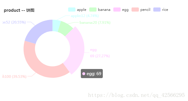
data:[//绘制的是数量占比,所以这里的value指的是数量
{value:'12',name:'apple'},
{value:'20',name:'banana'},
{value:'69',name:'egg'},
{value:'100',name:'pencil'},
{value:'52',name:'rice'}
]
}
};
// 使用刚指定的配置项和数据显示图表。
productChart2.setOption(option2);
window.onresize = function(){
productChart2.resize(); //使图表适应
};
}
});
})
</script>
</body>
</html>json文件:
[{
  "name": "apple",
  "counts": "12",
  "price": "10"
},
  {
    "name": "banana",
    "counts": "20",
    "price": "20"
  },
  {
    "name": "egg",
    "counts": "69",
    "price": "17"
  },
  {
    "name": "pencil",
    "counts": "100",
    "price": "6"
  },
  {
    "name": "rice",
    "counts": "52",
    "price": "8"
  }
]
绘制效果: