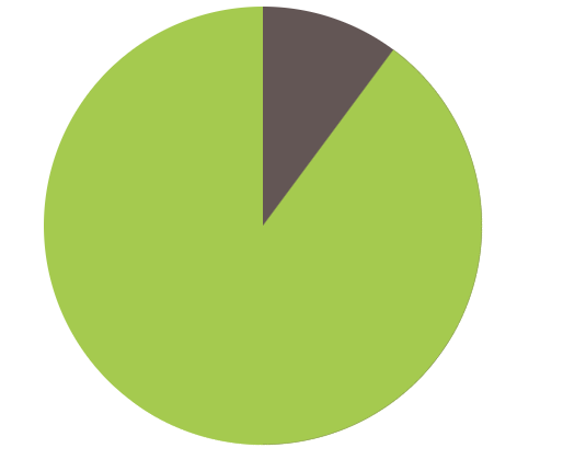
html
<div class="pie"></div>
css
  .pie{
    width: 200px;
    height: 200px;
    border-radius: 50%;
    background: yellowgreen;
    background-image: linear-gradient(to right,transparent 50%,#655 0);
  }
  @keyframes spin {
    to {transform: rotate(.5turn);}
  }
  @keyframes bg {
    50% {background: #655;}
  }
  .pie::before{
    content: '';
    display: block;
    margin-left: 50%;
    height: 100%;
    border-radius: 0 100% 100% 0 / 50%;
    background-color: inherit;
    transform-origin: left;
    animation: spin 5s linear infinite,
                bg 10s step-end infinite;

  }
成果图如下,设置的是十秒一圈的转动,可以自己在animation设置秒数,记住spin的秒数是bg的一半就可以了