一、安装画图模块
matplotlib是基于numpy的一套Python工具包。这个包提供了丰富的数据绘图工具,主要用于绘制一些统计图形。通过数据绘图。
二、代码
#!/usr/bin/env python
#coding:utf-8
'''''
功能:使用matplotlib实践数据可视化
介绍:
matplotlib是基于numpy的一套Python工具包。这个包提供了丰富的数据绘图工具,主要用于绘制一些统计图形。通过数据绘图,
我们可以将枯燥的数字转换成容易被人们接受的图表,从而让人留下更加深刻的印象。
这也就是“字不如图,图不如表”
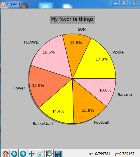
data.txt内容如下:
Apple 494025
SUN 299967
HUAWEI 457784
Flower 440376
Basketball 399080
Football 383402
Banana 293954
'''
from matplotlib import pyplot as plt
labels = []
quants = []
for line in open('E:\\个人文件\\6-desktop\\accounts.txt'):
info = line.split()
labels.append(info[0])
quants.append(float(info[1]))
plt.figure(1, figsize=(6,6))
def explode(label, target='China'):
if label == target: return 0.1
else: return 0
expl = list(map(explode,labels))
colors = ["yellow","orange","pink","coral"]
plt.pie(quants, explode=expl, colors=colors, labels=labels, autopct='%1.1f%%',pctdistance=0.8, shadow=True)
plt.title('My favorite things', bbox={'facecolor':'0.6', 'pad':4})
plt.show()
三、运行结果