在学习K-means聚类分析的过程,发现在客户特征分析图上的代码展示是没有的,所以这里对分析得到的结果进行雷达图的展示。
1、原始数据:
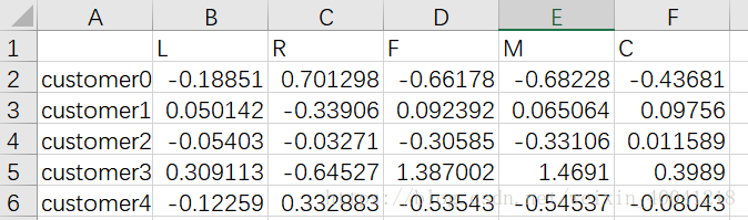
数据共有5类(customer0–customer5),数据标签共5个(L, R, F, M, C)
2、绘图:
def result_pic(result):
    """
    雷达图的绘制
    :param result: 分类数据
    :return: 雷达图
    """
    # 解析出类别标签和种类
    labels = ['L', 'R', 'F', 'M', 'C']
    kinds = list(result.iloc[:, 0])

    # 由于在雷达图中,要保证数据闭合,这里就再添加L列,并转换为 np.ndarray
    result = pd.concat([result, result[['L']]], axis=1)
    centers = np.array(result.iloc[:, 1:])

    # 分割圆周长,并让其闭合
    n = len(labels)
    angle = np.linspace(0, 2 * np.pi, n, endpoint=False)
    angle = np.concatenate((angle, [angle[0]]))

    # 绘图
    fig = plt.figure()
    ax = fig.add_subplot(111, polar=True)    # 参数polar, 以极坐标的形式绘制图形

    # 画线
    for i in range(len(kinds)):
        ax.plot(angle, centers[i], linewidth=2, label=kinds[i])
        # ax.fill(angle, centers[i])  # 填充底色

    # 添加属性标签
    ax.set_thetagrids(angle * 180 / np.pi, labels)
    plt.title('different kind')
    plt.legend(loc='lower right')
    plt.show()


if __name__ == '__main__':
    result = pd.read_csv('./data_7/cluster_center.csv', sep=',')
    result_pic(result)
结果展示:
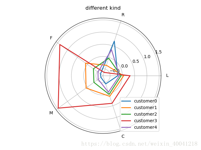
图比较丑,后面再改吧