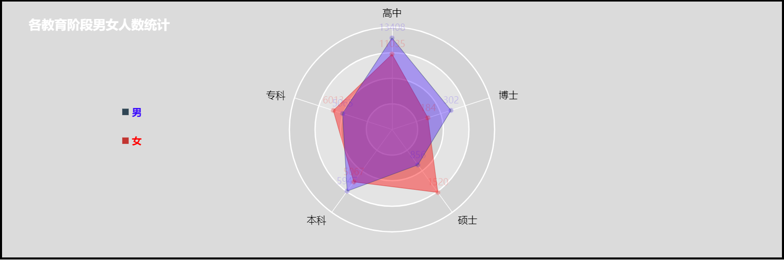
雷达图图表效果如下:
具体代码如下:
-
-
<html>
-
<head>
-
<meta charset="UTF-8">
-
<title>雷达图案例 </title>
-
<!-- 引入 ECharts 文件 -->
-
<script src="js/echarts4.0.js" type="text/javascript" charset="utf-8"> </script>
-
</head>
-
<body>
-
<!-- 为 ECharts 准备一个具备大小(宽高)的 容器 -->
-
<div id="chart1" style="width: 80%;height: 400px;top: 50px;left: 10%;border: 3px solid #000;"> </div>
-
</body>
-
</html>
-
<script type="text/javascript">
-
// 基于准备好的容器(这里的容器是id为chart1的div),初始化echarts实例
-
var chart1 = echarts.init( document.getElementById( "chart1"));
-
-
// 指定图表的配置项和数据
-
var option = {
-
backgroundColor: 'rgba(204,204,204,0.7 )', // 背景色,默认无背景 rgba(51,255,255,0.7)
-
-
title: {
-
text: '各教育阶段男女人数统计',
-
link: 'https://blog.csdn.net/gray_key',
-
target: 'blank',
-
top: '5%',
-
left: '3%',
-
textStyle: {
-
color: '#fff',
-
fontSize: 20,
-
}
-
},
-
-
legend: { // 图例组件
-
show: true,
-
icon: 'rect', // 图例项的 icon。ECharts 提供的标记类型包括 'circle', 'rect', 'roundRect', 'triangle', 'diamond', 'pin', 'arrow'也可以通过 'image://url' 设置为图片,其中 url 为图片的链接,或者 dataURI。可以通过 'path://' 将图标设置为任意的矢量路径。
-
top : '40%', // 图例距离顶部边距
-
left : '15%', // 图例距离左侧边距
-
itemWidth: 10, // 图例标记的图形宽度。[ default: 25 ]
-
itemHeight: 10, // 图例标记的图形高度。[ default: 14 ]
-
itemGap: 30, // 图例每项之间的间隔。[ default: 10 ]横向布局时为水平间隔,纵向布局时为纵向间隔。
-
orient: 'vertical', // 图例列表的布局朝向,'horizontal'为横向,''为纵向.
-
textStyle: { // 图例的公用文本样式。
-
fontSize: 15,
-
color: '#fff'
-
},
-
data: [{ // 图例的数据数组。数组项通常为一个字符串,每一项代表一个系列的 name(如果是饼图,也可以是饼图单个数据的 name)。图例组件会自动根据对应系列的图形标记(symbol)来绘制自己的颜色和标记,特殊字符串 ''(空字符串)或者 '\n'(换行字符串)用于图例的换行。
-
name: '男', // 图例项的名称,应等于某系列的name值(如果是饼图,也可以是饼图单个数据的 name)。
-
icon: 'rect', // 图例项的 icon。
-
textStyle: { // 图例项的文本样式。
-
color: 'rgba(51,0,255,1)',
-
fontWeight: 'bold' // 文字字体的粗细,可选'normal','bold','bolder','lighter'
-
}
-
},{
-
name: '女',
-
icon: 'rect',
-
textStyle: {
-
color: 'rgba(255,0,0,1)',
-
fontWeight: 'bold' // 文字字体的粗细,可选'normal','bold','bolder','lighter'
-
}
-
}],
-
},
-
-
radar: [{ // 雷达图坐标系组件,只适用于雷达图。
-
center: [ '50%', '50%'], // 圆中心坐标,数组的第一项是横坐标,第二项是纵坐标。[ default: ['50%', '50%'] ]
-
radius: 160, // 圆的半径,数组的第一项是内半径,第二项是外半径。
-
startAngle: 90, // 坐标系起始角度,也就是第一个指示器轴的角度。[ default: 90 ]
-
name: { // (圆外的标签)雷达图每个指示器名称的配置项。
-
formatter: '{value}',
-
textStyle: {
-
fontSize: 15,
-
color: '#000'
-
}
-
},
-
nameGap: 15, // 指示器名称和指示器轴的距离。[ default: 15 ]
-
splitNumber: 4, // (这里是圆的环数)指示器轴的分割段数。[ default: 5 ]
-
shape: 'circle', // 雷达图绘制类型,支持 'polygon'(多边形) 和 'circle'(圆)。[ default: 'polygon' ]
-
axisLine: { // (圆内的几条直线)坐标轴轴线相关设置
-
lineStyle: {
-
color: '#fff', // 坐标轴线线的颜色。
-
width: 1, // 坐标轴线线宽。
-
type: 'solid', // 坐标轴线线的类型。
-
}
-
},
-
splitLine: { // (这里是指所有圆环)坐标轴在 grid 区域中的分隔线。
-
lineStyle: {
-
color: '#fff', // 分隔线颜色
-
width: 2, // 分隔线线宽
-
}
-
},
-
splitArea: { // 坐标轴在 grid 区域中的分隔区域,默认不显示。
-
show: true,
-
areaStyle: { // 分隔区域的样式设置。
-
color: [ 'rgba(250,250,250,0.3)', 'rgba(200,200,200,0.3)'], // 分隔区域颜色。分隔区域会按数组中颜色的顺序依次循环设置颜色。默认是一个深浅的间隔色。
-
}
-
},
-
indicator: [{ // 雷达图的指示器,用来指定雷达图中的多个变量(维度),跟data中 value 对应
-
name: '高中', // 指示器名称
-
max: 15000, // 指示器的最大值,可选,建议设置
-
//color: '#fff' // 标签特定的颜色。
-
}, {
-
name: '专科',
-
max: 10000
-
}, {
-
name: '本科',
-
max: 8000
-
}, {
-
name: '硕士',
-
max: 2000
-
}, {
-
name: '博士',
-
max: 500
-
}]
-
}],
-
series: [{
-
name: '雷达图', // 系列名称,用于tooltip的显示,legend 的图例筛选,在 setOption 更新数据和配置项时用于指定对应的系列。
-
type: 'radar', // 系列类型: 雷达图
-
itemStyle: { // 折线拐点标志的样式。
-
normal: { // 普通状态时的样式
-
lineStyle: {
-
width: 1
-
},
-
opacity: 0.2
-
},
-
emphasis: { // 高亮时的样式
-
lineStyle: {
-
width: 5
-
},
-
opacity: 1
-
}
-
},
-
data: [{ // 雷达图的数据是多变量(维度)的
-
name: '女', // 数据项名称
-
value: [ 11035, 6013, 5067, 1520, 184], // 其中的value项数组是具体的数据,每个值跟 radar.indicator 一一对应。
-
symbol: 'circle', // 单个数据标记的图形。
-
symbolSize: 5, // 单个数据标记的大小,可以设置成诸如 10 这样单一的数字,也可以用数组分开表示宽和高,例如 [20, 10] 表示标记宽为20,高为10。
-
label: { // 单个拐点文本的样式设置
-
normal: {
-
show: true, // 单个拐点文本的样式设置。[ default: false ]
-
position: 'top', // 标签的位置。[ default: top ]
-
distance: 5, // 距离图形元素的距离。当 position 为字符描述值(如 'top'、'insideRight')时候有效。[ default: 5 ]
-
color: 'rgba(255,0,0,1)', // 文字的颜色。如果设置为 'auto',则为视觉映射得到的颜色,如系列色。[ default: "#fff" ]
-
fontSize: 14, // 文字的字体大小
-
formatter: function(params) {
-
return params.value;
-
}
-
}
-
},
-
itemStyle: { // 单个拐点标志的样式设置。
-
normal: {
-
borderColor: 'rgba(255,0,0,1)', // 拐点的描边颜色。[ default: '#000' ]
-
borderWidth: 3, // 拐点的描边宽度,默认不描边。[ default: 0 ]
-
}
-
},
-
lineStyle: { // 单项线条样式。
-
normal: {
-
opacity: 0.5 // 图形透明度
-
}
-
},
-
areaStyle: { // 单项区域填充样式
-
normal: {
-
color: 'rgba(255,0,0,0.6)' // 填充的颜色。[ default: "#000" ]
-
}
-
}
-
}, {
-
name: '男',
-
value: [ 13408, 5065, 5947, 856, 302],
-
symbol: 'circle',
-
symbolSize: 5,
-
label: {
-
normal: {
-
show: true,
-
position: 'top',
-
distance: 5,
-
color: 'rgba(51,0,255,1)',
-
fontSize: 14,
-
formatter: function(params) {
-
return params.value;
-
}
-
}
-
},
-
itemStyle: {
-
normal: {
-
borderColor: 'rgba(51,0,255,1)',
-
borderWidth: 3,
-
}
-
},
-
lineStyle: {
-
normal: {
-
opacity: 0.5
-
}
-
},
-
areaStyle: {
-
normal: {
-
color: 'rgba(51,0,255,0.5)'
-
}
-
}
-
}]
-
}, ]
-
};
-
-
// 使用刚指定的配置项和数据显示图表
-
chart1.setOption(option)
-
</script>
想要使用该图表,只需要 复制以上代码 ,再下载 echarts.js 在页面文件中引入即可.
echarts.js 下载链接: http://echarts.baidu.com/download.html