参考博客:阮一峰-Flex 布局教程:语法篇
Flex全程为Flexiable Box,翻译为“弹性布局”。传统的页面布局主要由 display+position+float,Flex布局是新提出的布局解决方案。
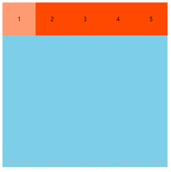
Flex布局主要有四个概念,即容器、项目、主轴、交叉轴

父元素称为“容器”,子元素称为“项目”,横轴为“主轴”,纵轴为“交叉轴”。
使用一下HTML代码进行学习实验
<!DOCTYPE html>
<html>
	<head>
		<title></title>
		<style type="text/css">

			.box-style {
				width: 500px;
				height: 500px;
				background: #7dcee9;
			}

			.item-style {
				width: 100px;
				height: 100px;
				background: #ff4900;
				text-align: center;
				line-height: 100px;
			}

			.box {
				display: flex; /* 子元素为行内元素使用,inline-flex  */
			}

			.item {

			}

			.box div:nth-of-type(1) {
				background: #ff9b73;
			}

		</style>
	</head>
	<body>

		<div class="box box-style">
			<div class="item item-style">1</div>
			<div class="item item-style">2</div>
			<div class="item item-style">3</div>
			<div class="item item-style">4</div>
			<div class="item item-style">5</div>
		</div>

	</body>
</html>
容器的属性
容器(父元素)的属性可以决定项目(子元素)如何排列、是否换行、对齐方式
flex-duration定义项目的排列方式(主轴or交叉轴),默认值为row(主轴正方向)


flex-wrap定于项目是否换行,默认值为nowrap(不换行)。若项目的总宽度超出容器的宽度,会对每一个项目的宽度进行等比例缩小
新增一个
<div class="item item-style">6</div>
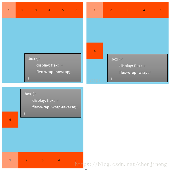
上图中的“6”项目不是紧跟着上一行,如何解决这个问题?
最上面提到,容器中含有主轴的概念,当没有换行时,容器只有一根主轴,换行之后,容器拥有两条主轴,需要定义主轴的对齐方式
align-content多根轴线的对齐方式,如果项目只有一根轴线,该属性不起作用

还有两个值,baseline、stretch不做演示,具体用法考考 阮一峰-Flex 布局教程:语法篇
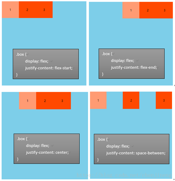
justify-content属性定义了项目在主轴上的对齐方式,默认值为flex-start(左对齐)
项目只剩保留前三个
<div class="item item-style">1</div>
<div class="item item-style">2</div>
<div class="item item-style">3</div>

align-items属性定义项目在交叉轴上如何对齐

还有两个值,baseline、stretch不做演示,具体用法考考 阮一峰-Flex 布局教程:语法篇
项目的属性
update...