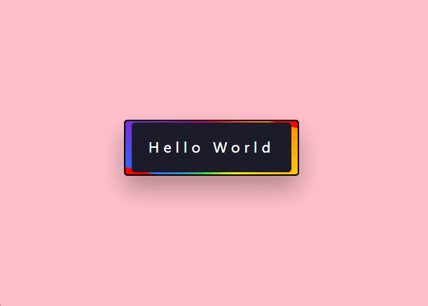
效果图
JS
import styles from './style.less'
const index = () =>
{


    return (
        <div className={

    styles.container}>
            <button data-spotlight="Hello World"></button>
        </div>
    );
};
export default index
CSS
.container {


  display: flex;
  align-items: center;
  justify-content: center;
  background: pink;
  height: 100vh;

  button {


    width: 250px;
    height: 80px;
    position: absolute;
    transform: translate(-50%, -50%);
    top: 50%;
    left: 50%;
    border-radius: 5px;
    box-shadow: 0 20px 35px rgba(0, 0, 0, 0.3);
    overflow: hidden;
    background-color: red;

    &::before {


      content: "";
      height: 150%;
      width: 150%;
      position: absolute;
      background: conic-gradient(#fd004c,
          #fe9000,
          #fff020,
          #3edf4b,
          #3363ff,
          #b102b7,
          #fd004c);
      left: -25%;
      top: -25%;
      animation: spin 1.5s infinite linear;
    }

    &::after {


      content: attr(data-spotlight);
      position: absolute;
      background-color: #1c1b29;
      height: 93%;
      width: 93%;
      top: 3.5%;
      left: 3.5%;
      border-radius: 5px;
      font-family: 'Poppins', sans-serif;
      color: #ffffff;
      font-size: 20px;
      letter-spacing: 6px;
      display: grid;
      place-items: center;
    }
  }

  @keyframes spin {


    100% {


      transform: rotate(-360deg);
    }
  }
}