Matplotlib绘图基础
最著名Python绘图库,主要用于二维绘图
- 画图质量高
- 方便快捷的绘图模块
- 绘图API—–pyplot模块 工作方式类似Matlab
集成库—–pylab模块(包含NumPy和pyplot中的常用函数) 偏重快速画图
心形图
# -*- coding: utf-8 -*-
"""
Demo of a PathPatch object.
"""
import matplotlib.path as mpath
import matplotlib.patches as mpatches
import matplotlib.pyplot as plt


fig, ax = plt.subplots()

Path = mpath.Path
path_data = [
    (Path.MOVETO, (1.58, -2.57)),
    (Path.CURVE4, (0.35, -1.1)),
    (Path.CURVE4, (-1.75, 2.0)),
    (Path.CURVE4, (0.375, 2.0)),
    (Path.LINETO, (0.85, 1.15)),
    (Path.CURVE4, (2.2, 3.2)),
    (Path.CURVE4, (3, 0.05)),
    (Path.CURVE4, (2.0, -0.5)),
    (Path.CLOSEPOLY, (1.58, -2.57)),
    ]
codes, verts = zip(*path_data)
path = mpath.Path(verts, codes)
patch = mpatches.PathPatch(path, facecolor='r', alpha=0.5)
ax.add_patch(patch)

# plot control points and connecting lines
x, y = zip(*path.vertices)
line, = ax.plot(x, y, 'go-')

ax.grid()
ax.axis('equal')
plt.show()

path_patch_demo.py
折线、散点、柱状图
实例1
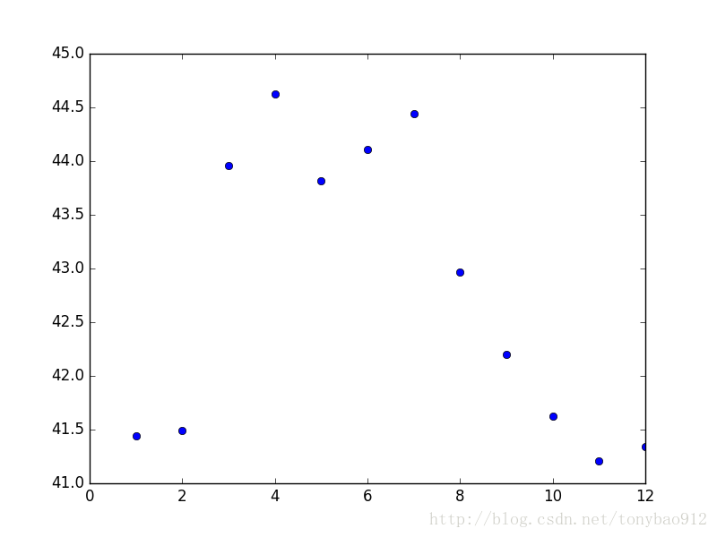
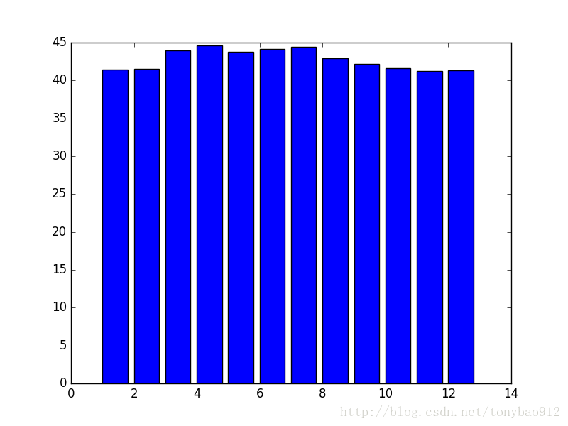
- 将Cocacosla近一年来股票收盘价的月平均价绘制成折线图,散点图,直方图(括号中参数为列表)
import time
from matplotlib.finance import quotes_historical_yahoo_ochl
from datetime import date
from datetime import datetime
import pandas as pd
import matplotlib.pyplot as plt     #导入pyplot模块

today = date.today()
start = (today.year-1, today.month, today.day)
quotes = quotes_historical_yahoo_ochl('KO', start, today)
fields = ['date','open','close','high','low','volume']

list1 = []
for i in range(0,len(quotes)):
    x = date.fromordinal(int(quotes[i][0]))
    y = datetime.strftime(x,'%Y-%m-%d')
    list1.append(y)
#print list1
quoteskodf = pd.DataFrame(quotes, index = list1, columns = fields)
quoteskodf = quoteskodf.drop(['date'], axis = 1)
#print quotesdf
listtemp = []
for i in range(0,len(quoteskodf)):
    temp = time.strptime(quoteskodf.index[i],"%Y-%m-%d")
    listtemp.append(temp.tm_mon)

print(listtemp)
tempkodf = quoteskodf.copy()
tempkodf['month'] = listtemp
closeMeansKO = tempkodf.groupby('month').mean().close     #【可口可乐公司近一年来股票收盘价的月平均价】作为【数据源】
listKO = []
for i in range(1,13):
    listKO.append(closeMeansKO[i])
listKOIndex = closeMeansKO.index
plt.plot(listKOIndex,listKO)
plt.plot(listKOIndex,listKO,'o')
plt.bar(listKOIndex,listKO) 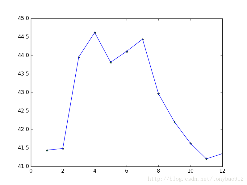
实例2
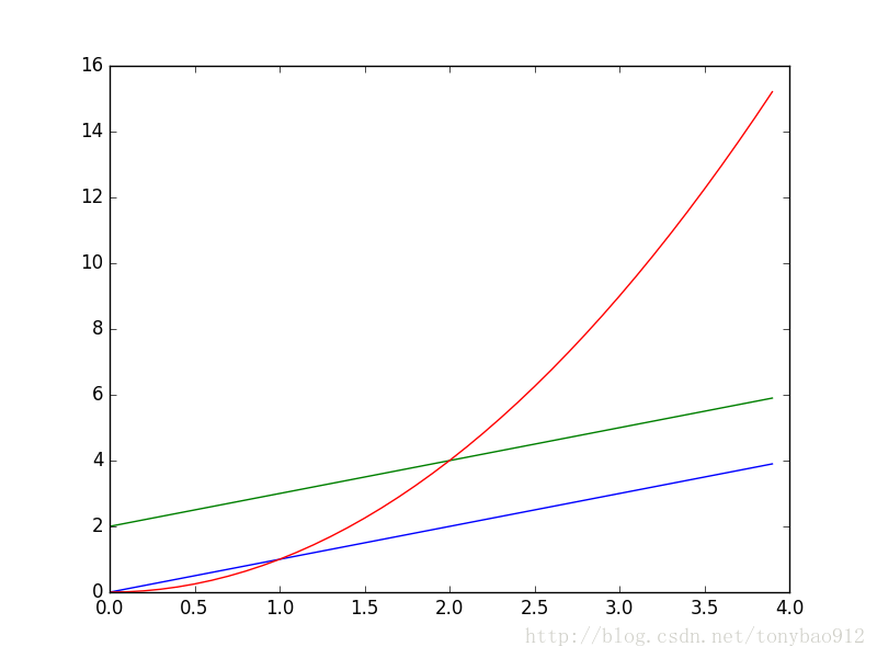
- Numpy数组也可作为Matplotlib的参数 和 pylab绘图
import numpy as np
import matplotlib.pyplot as plt

t = np.arange(0.,4.,0.1)
plt.plot(t,t,t,t+2,t,t**2)    #plot()参数只要是序列皆可,包括元组、列表、数组