Matplotlib数据可视化基础
一.读取数据与数据处理阶段
1.提取指定行中的数据
data=data[['year','quarter','pop','realgdp']]#提取所需要的四列数据
2.得到>指定数值的数据
data=data.loc[(data['year']>=1990),:]#使用1990年之后的数据
3.得到=指定值得数据
data=data.loc[data['quarter']==4,:]#使用第四季度的数据来画图
4.整体的数据处理:
data=pd.read_csv('./macrodata.csv')
data0=data
data=data[['year','quarter','pop','realgdp']]#提取所需要的四列数据
data_scatter=data
data=data.loc[(data['year']>=1990),:]#使用1990年之后的数据
data=data.loc[data['quarter']==4,:]#使用第四季度的数据来画图
二.画图函数
1.plt.subplots()
参数列表:
fig,ax=plt.subplots(1,2, figsize=(8, 4.8))#生成一个一行两列的子图 画布大小,高4.8,宽8
返回值
fig: matplotlib.figure.Figure 对象
ax:子图对象( matplotlib.axes.Axes)或者是他的数组
在matplotlib中,整个图像为一个Figure对象。在Figure对象中可以包含一个或者多个Axes对象。每个Axes(ax)对象都是一个拥有自己坐标系统的绘图区域
2.plt.subplots_adjust()
plt.subplots_adjust(left=0.15,bottom=0.14,right=0.95,top=0.65,hspace=0.12,wspace =0.25)#调整子图的参数
参数含义:
left, right, bottom, top:子图所在区域的边界。
3.设置x轴y轴的刻度和标签
ax[0].set_xlim(1989, 2009)#x的刻度范围
ax[0].set_ylim(7000,14000)#y的刻度范围
ax[0].set_xticks(yearxticks)#添加x轴刻度标签


plt.xlim(240,320)
plt.ylim(7000,14000)
plt.xticks(np.arange(240,321,20),fontsize=14)#生成x轴刻度
plt.yticks(fontsize=14)
4.使用中文标题在作图时
plt.rcParams[‘font.sans-serif’] = [‘SimHei’] # 用来正常显示中文标签
三.画折线图(plot)
print('画折线图')
from matplotlib import pyplot as plt
fig,ax=plt.subplots(1,2, figsize=(8, 4.8))#生成一个一行两列的子图  画布大小,高4.8,宽8

yearxticks=[i for i in range(1990,2010,2)]#x轴的刻度标签
plt.subplots_adjust(left=0.15,bottom=0.14,right=0.95,top=0.65,hspace=0.12,wspace =0.25)#调整子图的参数

ax[0].set_xlim(1989, 2009)#x的刻度范围
ax[0].set_ylim(7000,14000)#y的刻度范围
ax[0].set_xticks(yearxticks)#添加x轴刻度标签
ax[0].plot(data['year'],data['realgdp'],'o-')#在第一幅子图中画出年份与GDP的图像
ax[0].set_xticklabels(yearxticks,rotation=30)#x轴刻度标签旋转(避免重合)
ax[0].set_ylabel('GDP (${10^{4}}$ USD)')#y轴标签
ax[0].set_title('(a) GDP (1990-2009)')#设置标题


ax[1].set_ylim(240,320)
ax[1].set_xticks(yearxticks)
ax[1].plot(data['year'],data['pop'],'o-')#在第二幅子图中画出年份与POP的图像
ax[1].set_xticklabels(yearxticks,rotation=30)
ax[1].set_ylabel('Population (${10^4}$)')
ax[1].set_title('(b) Population (1990-2009)')
plt.show()
四.画散点图(scatter)
print('画散点图')
plt.figure(figsize=(8, 7.2))#要求图幅大小,宽8,高7.2
plt.scatter(data_scatter['pop'],data_scatter['realgdp'],marker='o',color='blue',edgecolors='k', s=100)#画散点图,颜色为空,标记为O,边缘颜色为黑色
plt.xlim(240,320)
plt.ylim(7000,14000)
plt.xticks(np.arange(240,321,20),fontsize=14)#生成x轴刻度
plt.yticks(fontsize=14)
plt.title('Population versus GDP',fontsize=18)
plt.xlabel('Population (${10^4}$)',fontsize=14)
plt.ylabel('GDP (${10^{4}}$ USD)',fontsize=14)
plt.show()
五.画拟合曲线
拟合线方程中的参数可以使用numpy.polyfit(x, y, degree)函数来确定
图例使用 plt.legend(loc = 4,fontsize = fontsize2) 其中4表示放置位置,fontsize表示字体大小。
文本使用plt.text(xPosition, yPostion, text, fontdict ={…})来添加,其中xPosition, yPostion表示文本左上角在坐标系中的实际坐标,并非比例因子;text表示需要添加的文本或字符串;fontdict表示一个参数字典,用于确定文本字体的大小、是否加粗、字体等
1.拟合指数R方
t=np.polyfit(x,y,1)#多项式拟合 阶数为1阶即线性拟合
f=np.poly1d(t)#获得拟合多项式的系数
xvals=np.arange(np.min(x),np.max(x))#生成x的范围
yvals=f(xvals)#生成y的范围
r2=np.around(r2_score(y,f(x)),decimals=2)#计算r2
t=np.around(t, decimals=2)#保留两位小数
print('画拟合曲线')
from sklearn.metrics import r2_score
#np.set_printoptions(suppress=True)
x=data['pop']
y=data['realgdp']

t=np.polyfit(x,y,1)#多项式拟合 阶数为1阶即线性拟合
f=np.poly1d(t)#获得拟合多项式的系数
xvals=np.arange(np.min(x),np.max(x))#生成x的范围
yvals=f(xvals)#生成y的范围
r2=np.around(r2_score(y,f(x)),decimals=2)#计算r2

t=np.around(t, decimals=2)#保留两位小数
plt.figure(figsize=(8, 7.2))
p1=plt.scatter(x,y,marker='o',color='blue',edgecolors='k', s=200)
p2=plt.plot(xvals,yvals,'k')
plt.xlim(240,320)
plt.ylim(7000,14000)
plt.xticks(np.arange(240,321,20),fontsize=14)
plt.yticks(fontsize=14)
plt.title('Population versus GDP',fontsize=18)
plt.xlabel('Population (${10^4}$)',fontsize=14)
plt.ylabel('GDP (${10^{4}}$ USD)',fontsize=14)
plt.legend(['Fitted line','Sample'],loc=4,fontsize='xx-large')#添加图例信息,在图片右下角
text='y='+str(t[0])+'x'+str(t[1])
plt.text(250,13500, text,fontsize=12)#添加文本 拟合的多项式
text='${R^2}$='+str(r2)
plt.text(250,13000,text,fontsize=12)#添加计算的R2
plt.show()
六.画箱线图
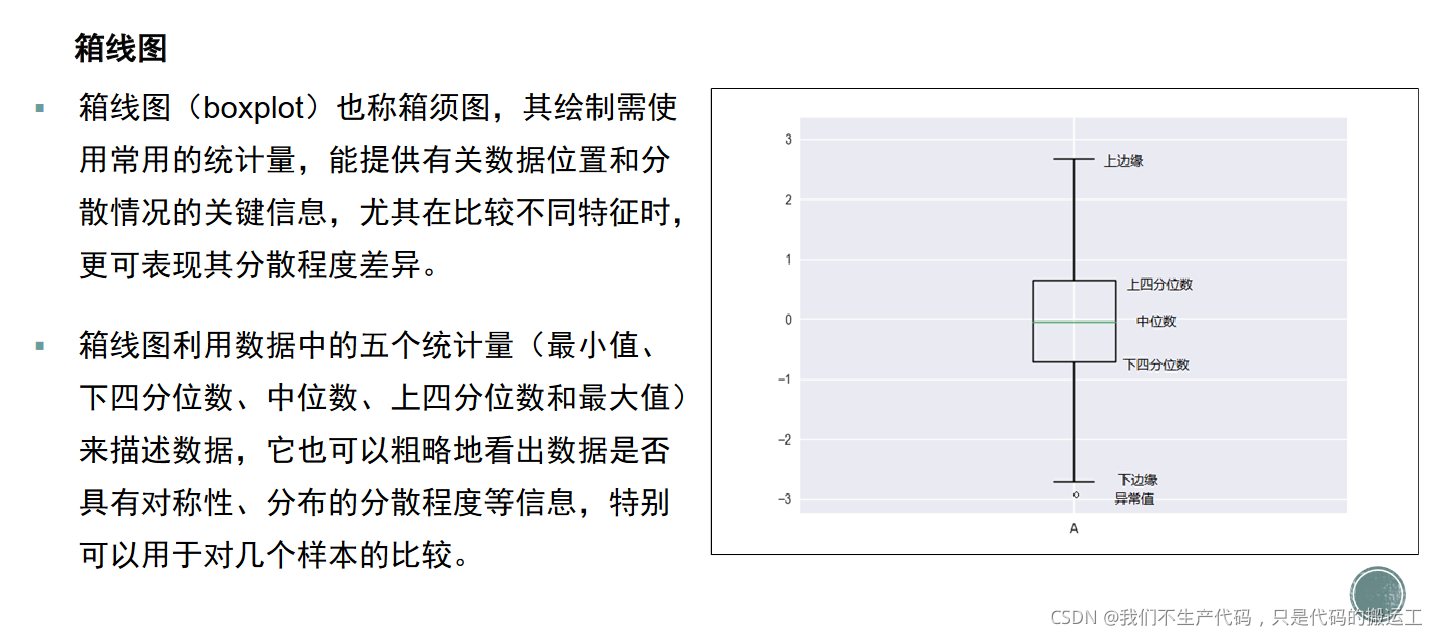
print('画箱线图')
fig,ax=plt.subplots(1,2, figsize=(10, 4.8))#生成一个一行两列的子图
infl_by_quarter=[data0.loc[data0['quarter']==i,:]['infl'] for i in range(1,5)]#嵌套列表 列表中有四个子列表,分别对应1234季度的infl值
realint_by_quarter=[data0.loc[data0['quarter']==i,:]['realint'] for i in range(1,5)]#嵌套列表 列表中有四个子列表,分别对应1234季度的realint值

titles=['Rectangular box plot','Notched box plot']#子图标题
bplot0=ax[0].boxplot(infl_by_quarter,patch_artist=True)#获得子图1的句柄,一定要设置patch_artisit=True 不然后面无法上色
bplot1=ax[1].boxplot(realint_by_quarter,patch_artist=True,notch=True)#获得子图2的句柄
for i in range(0,2):
    ax[i].grid(axis='y')#显示网格线
    ax[i].set_title(titles[i])#添加标题
    ax[i].set_ylabel('Observed values')
    ax[i].set_xlabel('Season')

colors = ['pink', 'lightblue', 'lightgreen', 'lightcyan']#每个箱子对应的颜色
for bplot in (bplot0,bplot1): # bplot1和bplot2时绘图的句柄
    #print(bplot)
    for patch, color in zip(bplot['boxes'], colors):
        patch.set_facecolor(color)
plt.show()
七.画直方图(hist)与柱状图(bar)
print('画直方图与柱状图')
infl_quarter_mean=data0.groupby(by='quarter').agg({

    'infl':np.mean})#根据季度分组,对于每一组求其平均值
fig,ax=plt.subplots(1,2,figsize=(12,4.8))


ax[0].hist(data0['infl'],bins=20,density=True,color='g')#直方图
ax[0].set_title('Histogram of infl')
ax[0].set_xlabel('infl')
ax[0].set_ylabel('Probability')
ax[0].set_xticks([-5,0,5,10])


ax[1].bar(np.arange(1,5),infl_quarter_mean['infl'],width=0.5,color='g')#柱状图
ax[1].legend(['infl'],loc=1)#添加图例
ax[1].set_title('Bar of Seasonal infl')
ax[1].set_xlabel('infl')
ax[1].set_ylabel('Probability')
ax[1].set_xticks([1,2,3,4])
ax[1].set_xticklabels(['1','2','3','4'],rotation=90)#设置x轴标签 旋转90度
plt.show()
input('按回车键结束')
整体代码实现
#!/usr/bin/env python
# coding: utf-8

# In[33]:


import numpy as np
import pandas as pd

data=pd.read_csv('./macrodata.csv')
data0=data
data=data[['year','quarter','pop','realgdp']]#提取所需要的四列数据
data_scatter=data

data=data.loc[(data['year']>=1990),:]#使用1990年之后的数据
data=data.loc[data['quarter']==4,:]#使用第四季度的数据来画图

print('读入数据')

# In[34]:

print('画折线图')
from matplotlib import pyplot as plt
fig,ax=plt.subplots(1,2, figsize=(8, 4.8))#生成一个一行两列的子图

yearxticks=[i for i in range(1990,2010,2)]#x轴的刻度标签
plt.subplots_adjust(left=0.15,bottom=0.14,right=0.95,top=0.65,hspace=0.12,wspace =0.25)#调整子图的参数

ax[0].set_xlim(1989, 2009)#x的刻度范围
ax[0].set_ylim(7000,14000)#y的刻度范围
ax[0].set_xticks(yearxticks)#添加x轴刻度标签
ax[0].plot(data['year'],data['realgdp'],'o-')#在第一幅子图中画出年份与GDP的图像
ax[0].set_xticklabels(yearxticks,rotation=30)#x轴刻度标签旋转(避免重合)
ax[0].set_ylabel('GDP (${10^{4}}$ USD)')#y轴标签
ax[0].set_title('(a) GDP (1990-2009)')#设置标题
ax[1].set_ylim(240,320)
ax[1].set_xticks(yearxticks)
ax[1].plot(data['year'],data['pop'],'o-')#在第二幅子图中画出年份与POP的图像
ax[1].set_xticklabels(yearxticks,rotation=30)
ax[1].set_ylabel('Population (${10^4}$)')
ax[1].set_title('(b) Population (1990-2009)')
plt.show()


# In[35]:

print('画散点图')
plt.figure(figsize=(8, 7.2))
plt.scatter(data_scatter['pop'],data_scatter['realgdp'],marker='o',color='blue',edgecolors='k', s=100)#画散点图,颜色为空,标记为O,边缘颜色为黑色
plt.xlim(240,320)
plt.ylim(7000,14000)
plt.xticks(np.arange(240,321,20),fontsize=14)#生成x轴刻度
plt.yticks(fontsize=14)
plt.title('Population versus GDP',fontsize=18)
plt.xlabel('Population (${10^4}$)',fontsize=14)
plt.ylabel('GDP (${10^{4}}$ USD)',fontsize=14)
plt.show()


# In[36]:

print('画拟合曲线')
from sklearn.metrics import r2_score
#np.set_printoptions(suppress=True)
x=data['pop']
y=data['realgdp']

t=np.polyfit(x,y,1)#多项式拟合 阶数为1阶即线性拟合
f=np.poly1d(t)#获得拟合多项式的系数
xvals=np.arange(np.min(x),np.max(x))#生成x的范围
yvals=f(xvals)#生成y的范围
r2=np.around(r2_score(y,f(x)),decimals=2)#计算r2

t=np.around(t, decimals=2)#保留两位小数
plt.figure(figsize=(8, 7.2))
p1=plt.scatter(x,y,marker='o',color='blue',edgecolors='k', s=200)
p2=plt.plot(xvals,yvals,'k')
plt.xlim(240,320)
plt.ylim(7000,14000)
plt.xticks(np.arange(240,321,20),fontsize=14)
plt.yticks(fontsize=14)
plt.title('Population versus GDP',fontsize=18)
plt.xlabel('Population (${10^4}$)',fontsize=14)
plt.ylabel('GDP (${10^{4}}$ USD)',fontsize=14)
plt.legend(['Fitted line','Sample'],loc=4,fontsize='xx-large')#添加图例信息,在图片右下角
text='y='+str(t[0])+'x'+str(t[1])
plt.text(250,13500, text,fontsize=12)#添加文本 拟合的多项式
text='${R^2}$='+str(r2)
plt.text(250,13000,text,fontsize=12)#添加计算的R2
plt.show()


# In[37]:


print('画箱线图')
fig,ax=plt.subplots(1,2, figsize=(10, 4.8))#生成一个一行两列的子图
infl_by_quarter=[data0.loc[data0['quarter']==i,:]['infl'] for i in range(1,5)]#嵌套列表 列表中有四个子列表,分别对应1234季度的infl值
realint_by_quarter=[data0.loc[data0['quarter']==i,:]['realint'] for i in range(1,5)]#嵌套列表 列表中有四个子列表,分别对应1234季度的realint值

titles=['Rectangular box plot','Notched box plot']#子图标题
bplot0=ax[0].boxplot(infl_by_quarter,patch_artist=True)#获得子图1的句柄,一定要设置patch_artisit=True 不然后面无法上色
bplot1=ax[1].boxplot(realint_by_quarter,patch_artist=True,notch=True)#获得子图2的句柄
for i in range(0,2):
    ax[i].grid(axis='y')#显示网格线
    ax[i].set_title(titles[i])#添加标题
    ax[i].set_ylabel('Observed values')
    ax[i].set_xlabel('Season')

colors = ['pink', 'lightblue', 'lightgreen', 'lightcyan']#每个箱子对应的颜色
for bplot in (bplot0,bplot1): # bplot1和bplot2时绘图的句柄
    #print(bplot)
    for patch, color in zip(bplot['boxes'], colors):
        patch.set_facecolor(color)
plt.show()

# In[38]:
print('画直方图与柱状图')
infl_quarter_mean=data0.groupby(by='quarter').agg({

    'infl':np.mean})#根据季度分组,对于每一组求其平均值
fig,ax=plt.subplots(1,2,figsize=(12,4.8))
ax[0].hist(data0['infl'],bins=20,density=True,color='g')#直方图
ax[0].set_title('Histogram of infl')
ax[0].set_xlabel('infl')
ax[0].set_ylabel('Probability')
ax[0].set_xticks([-5,0,5,10])
ax[1].bar(np.arange(1,5),infl_quarter_mean['infl'],width=0.5,color='g')#柱状图
ax[1].legend(['infl'],loc=1)#添加图例
ax[1].set_title('Bar of Seasonal infl')
ax[1].set_xlabel('infl')
ax[1].set_ylabel('Probability')
ax[1].set_xticks([1,2,3,4])
ax[1].set_xticklabels(['1','2','3','4'],rotation=90)#设置x轴标签 旋转90度
plt.show()
input('按回车键结束')