一直很喜欢新海诚的作品,前几天又温故了一遍《天气之子》,还是会被阳莱和帆高的故事感动。
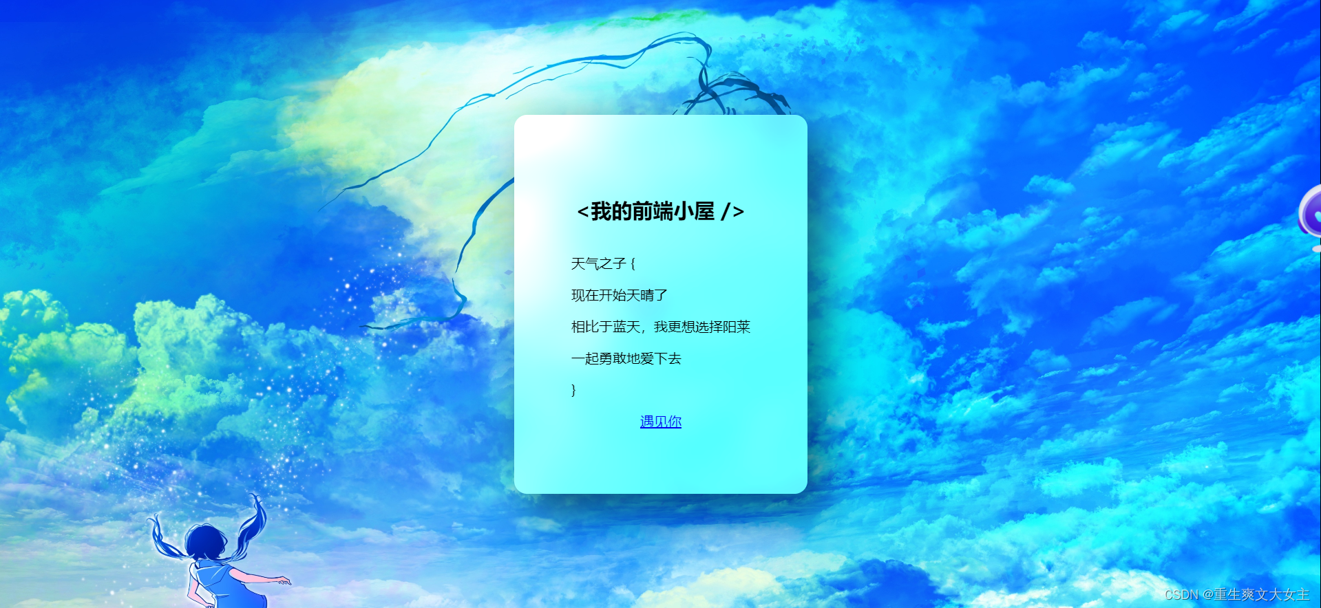
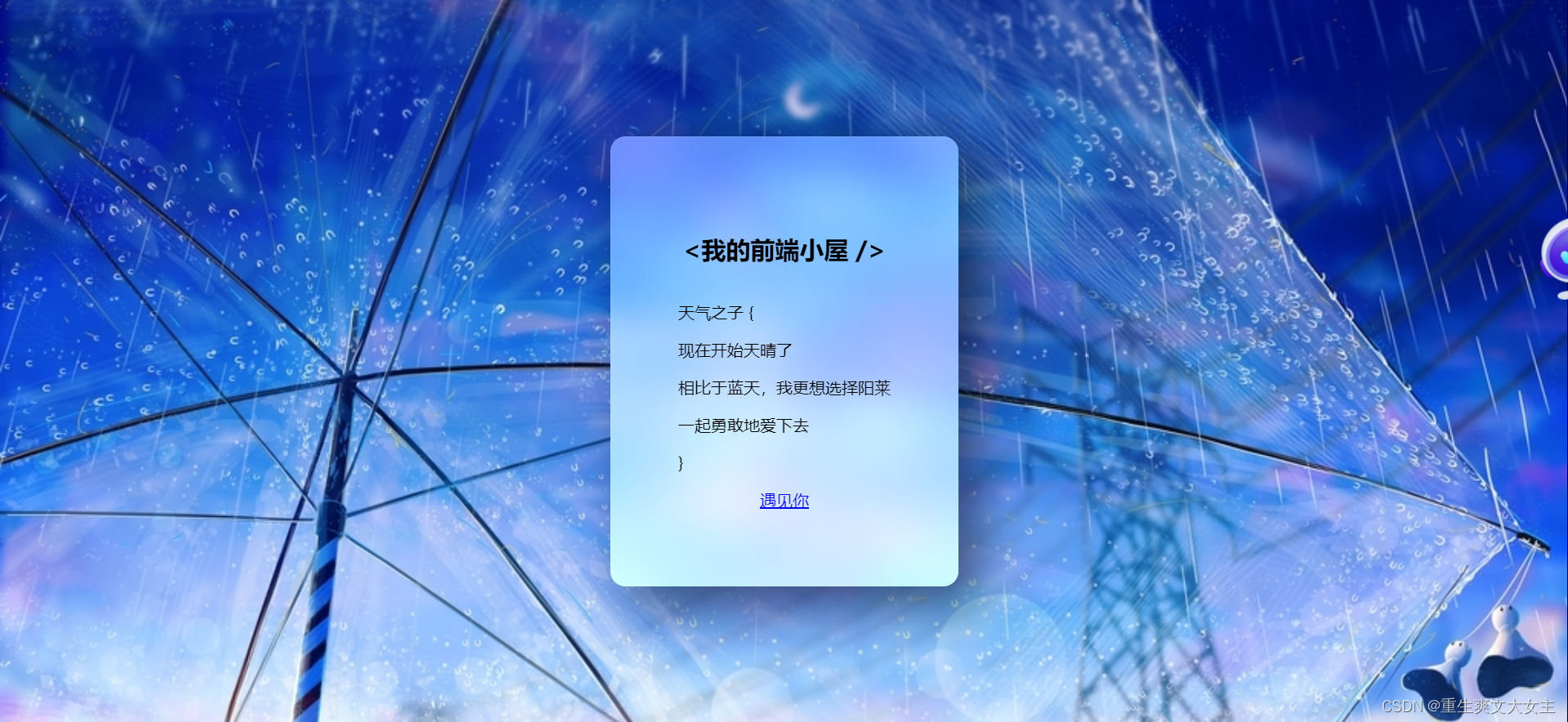
效果图:


废话少说,直接上代码
html部分
<div class="card">
        <h2 class="gradient">
            <我的前端小屋 />
        </h2>
        <div>
            <p>天气之子 {</p>
            <p class="indent">现在开始天晴了</p>
            <p class="indent">相比于蓝天,我更想选择阳莱</p>

            <p class="indent"> 一起勇敢地爱下去</p>
            <p>}</p>
        </div>
        <a href="#" class="gradient">遇见你</a>
    </div>
css(scss)部分
 body {
            display: flex;
            justify-content: center;
            align-items: center;
            margin: 0;
            padding: 0;
            width: 100vw;
            min-height: 100vh;
            /* 可以自由切换背景图片 */
            /* background: url(https://img-baofun.zhhainiao.com/fs/6c13373f7a3c287d8894e2d1c691fada.jpg) no-repeat; */
            /* background: url(https://pic2.zhimg.com/v2-66c4cff472ec4619168c08d30947b562_r.jpg) no-repeat; */

            /* background: url(https://pic4.zhimg.com/v2-d1090cd198b454cc60b7fc96d6ecf6a1_r.jpg?source=1940ef5c) no-repeat; */
            background: url(https://pic.ntimg.cn/file/20191112/27586652_142450670084_2.jpg) no-repeat;
            background-size: cover;
        }

        .card {
            display: flex;
            flex-direction: column;
            justify-content: center;
            align-items: center;
            padding: 20px;
            width: 300px;
            height: 400px;
            box-shadow: 20px 20px 50px rgba(0, 0, 0, 0.5);
            border-top: 1px solid rgba(255, 255, 255, 0.1);
            border-left: 1px solid rgba(255, 255, 255, 0.1);
            border-radius: 15px;
            background: rgba(255, 255, 255, .9);

            /* background: rgba(255, 255, 255, .3); */
            /* backdrop-filter: blur(20px) brightness(150%); */
            @supports (backdrop-filter: blur(20px) brightness(150%)) {
                background: rgba(255, 255, 255, .3);
                backdrop-filter: blur(20px) brightness(150%);
            }

            h2 {
                font-size: 1.8em;
                color: transparent;
                -webkit-background-clip: text;
                background-clip: text;
            }

            p {
                font-size: 1em;
                color: #1b263b;
                font-weight: 300;

                &.indent {
                    text-indent: 1em;
                }
            }

            a {
                padding: 15px 50px;
                border-radius: 30px;
                color: white;
                text-decoration: none;
                font-weight: 500;
                /* // background-image: linear-gradient(
                //     45deg,
                //     hsl(220deg 67.24% 60%),
                //     hsl(333.91deg 50% 60%)
                // ); */
                box-shadow: 0 5px 15px rgba(0, 0, 0, 0.3);
                transition: filter .5s;

                &:hover {
                    filter: brightness(120%);
                }
            }
        }
js部分
  function rgbToHsl(r, g, b) {
            r /= 255;
            g /= 255;
            b /= 255;

            let max = Math.max(r, g, b);
            let min = Math.min(r, g, b);
            let h, s, l = (max + min) / 2;

            if (max === min) {
                h = s = 0;
            } else {
                let d = max - min;
                s = l > 0.5 ? d / (2 - max - min) : d / (max + min);

                switch (max) {
                    case r:
                        h = (g - b) / d + (g < b ? 6 : 0);
                        break;
                    case g:
                        h = (b - r) / d + 2;
                        break;
                    case b:
                        h = (r - g) / d + 4;
                        break;
                }

                h /= 6;
            }

            return [h * 360, s * 100, l * 100];
        }
        const gradientBtn = () => {
            const img = new Image();
            img.addEventListener('load', function () {
                const colorThief = new ColorThief();
                let palette = colorThief.getPalette(img, 3);
                palette.forEach((item, index) => {
                    palette[index] = rgbToHsl(...item);
                })
                // document.getElementById('button').style.backgroundImage = `linear-gradient(
                //     45deg,
                //     hsl(${palette[1][0]}deg 60% 60%),
                //     hsl(${palette[2][0]}deg 60% 60%)
                // )`;
                document.querySelectorAll('.gradient').forEach(el => el.style.backgroundImage = `linear-gradient(
            45deg,
            hsl(${palette[1][0]}deg 60% 60%),
            hsl(${palette[2][0]}deg 60% 60%)
        )`);
                // document.getElementById('button').style.backgroundImage = `linear-gradient(
                //     45deg,
                //     hsl(${palette[1][0]}deg ${palette[1][1]}% ${palette[1][2]}%),
                //     hsl(${palette[2][0]}deg ${palette[2][1]}% ${palette[2][2]}%)
                // )`;
                // document.getElementById('button').style.backgroundImage = `linear-gradient(
                //     45deg,
                //     rgb(${palette[1][0]}, ${palette[1][1]}, ${palette[1][2]}),
                //     rgb(${palette[2][0]}, ${palette[2][1]}, ${palette[2][2]})
                // )`;
            });
            img.crossOrigin = 'anonymous';
            img.src = 'https://static.animpen.com/u/320/bg/134c7cddf81c803ebd0876925f319f40_6631276759320516950.png';
        }

        gradientBtn();
电影中十分打动我的台词
能遇见你,真的是太好了
天气因你逆转,世界因你天晴
无论你在哪里,我一定拼劲全力去见你
我只是想再一次的见到她啊